MACHAS
News - All the latest news straight from the artists themselves
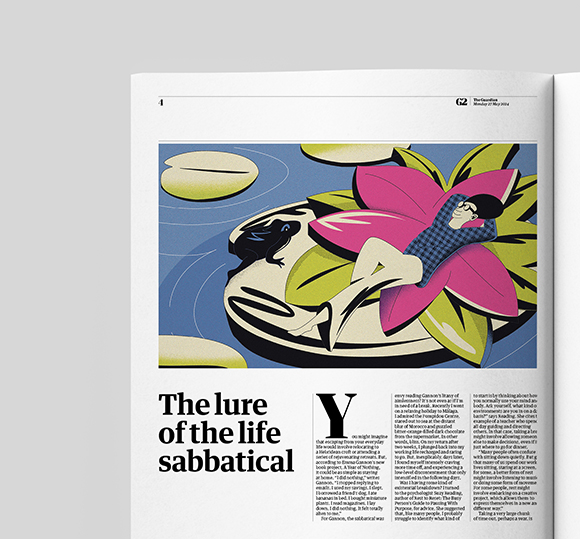
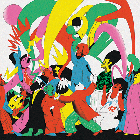
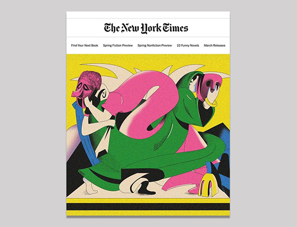
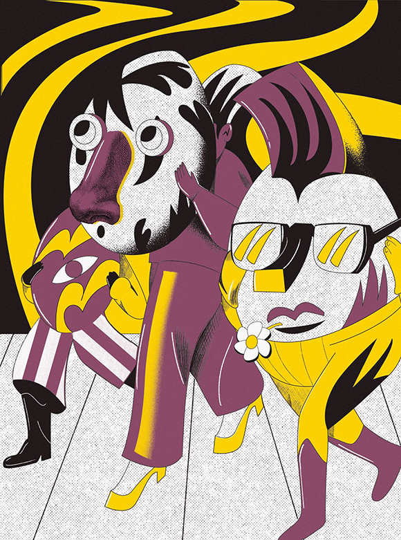
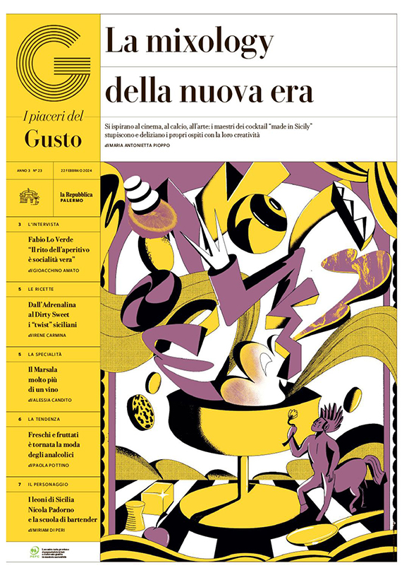
Editorial illustrations by Alberto Casagrande
With his surreal and playful approach to illustration, Machas artist Alberto Casagrande has made significant contributions to major international publications across the UK, the US, and Italy, showcasing his unique talent on a global stage.
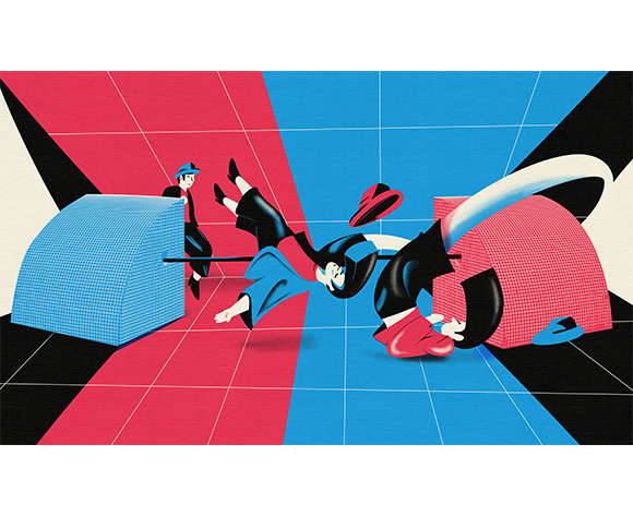
Alberto made his debut on the pages of The Guardian with an illustration featuring his distinctive palette and textures. The artwork perfectly captured the serene essence of a sabbatical, establishing his style and marking the esteemed British newspaper’s first commission.
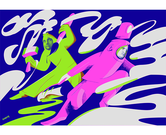
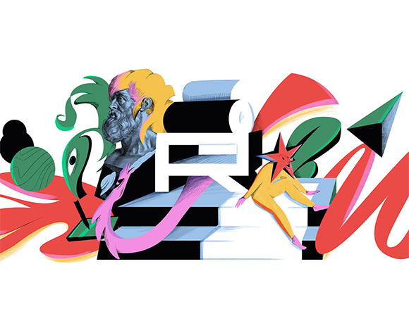
For the New York Times, Alberto crafted a bold artwork for the review of Glorious Exploits, Ferdia Lennon’s debut novel. His image vividly conveyed the novel’s darkly comic twist on Greek tragedy, demonstrating Casagrande’s ability to portray the surreal with an engaging, playful edge that resonated well with readers.
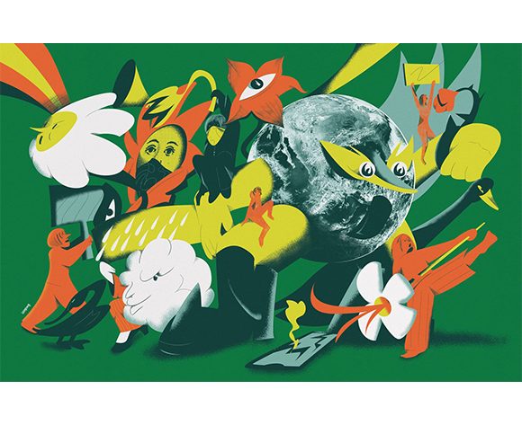
In another piece for The New York Times Opinion section, Alberto created an illustration that adeptly represented the diversity of languages spoken across America. This dense and dynamic composition celebrated multiculturalism and highlighted the vibrancy of the nation’s linguistic landscape.
Alberto’s ongoing collaboration with La Repubblica has been equally compelling. His illustrations for the ‘Il Gusto’ series cover a wide range of engaging topics—from chic Easter eggs to futuristic cocktails—seamlessly blending his vibrant visuals with culinary culture, creating an enticing fusion of art and gastronomy.
See more of Alberto’s work here!
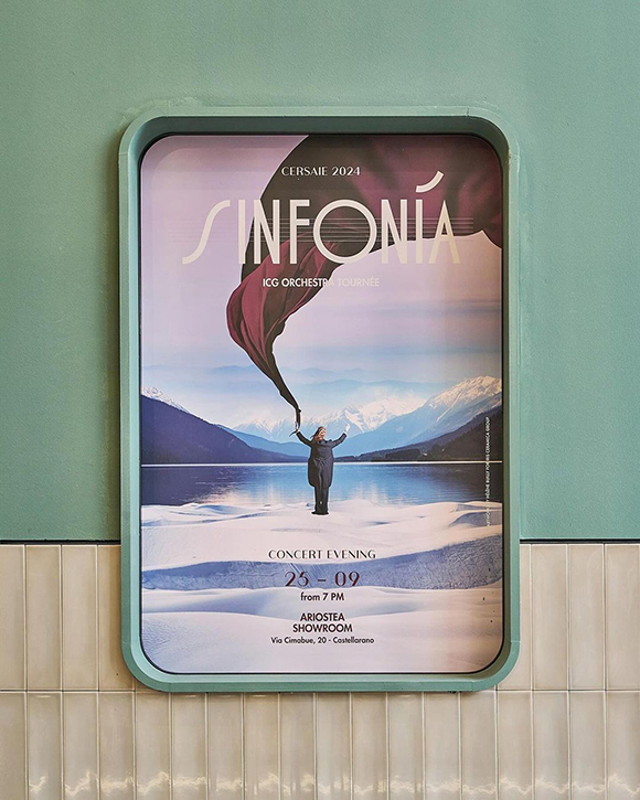
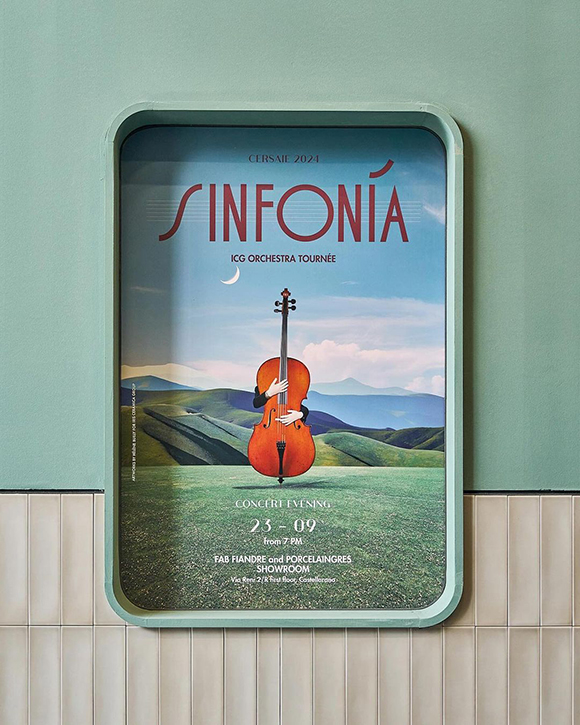
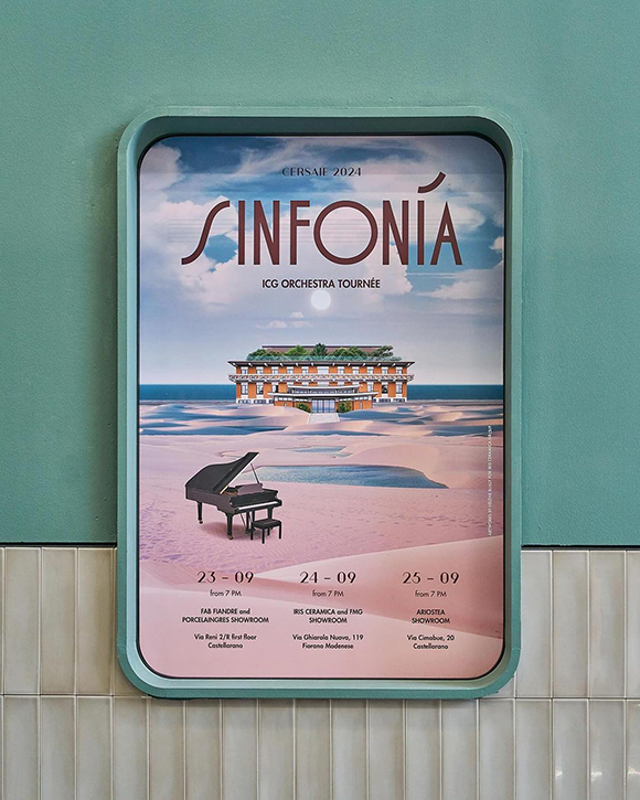
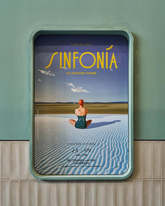
Sinfonia: Hélène Builly x Iris Ceramica Group
Mixed-media artist Hélène Builly once again captivated audiences with her sophisticated and poetic approach to collage, this time for Iris Ceramica Group’s presence at Cersaie, the international ceramic trade show.
With her distinctive style, Builly created a series of surreal artworks that showcased her unique talent for weaving together fragments of reality into harmonious and ethereal new compositions.
Drawing inspiration from the “Sinfonia” concept, a metaphor for the harmonious diversity of the Group’s people showcased at the Cersaie trade show, Builly created four captivating artworks featuring a few selected elements emerging from expansive, calm spaces in an enhanced perception of the surrounding environment.
From the enigmatic figure of the Maestro conducting a magnificent mountain landscape to the playful depiction of the Cello, Builly’s artworks exemplify a brilliant interplay of elements that exist in a transient yet perfect balance, evoking a gentle sense of vertigo and timeless beauty.
To further enhance the experience, animator Stefano Carugati brought the artworks to life, transforming them into looping animated posters, which were projected onto screens at the booth and in the Group’s showrooms.
Builly’s creations for Iris Ceramica Group demonstrate her exquisite ability to elevate the medium of collage into an art form that not only captivates the viewers but also reshapes how we see the world.
See more of Helene Builly’s work here.
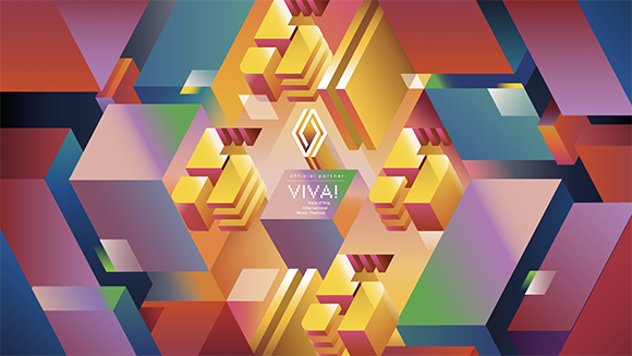
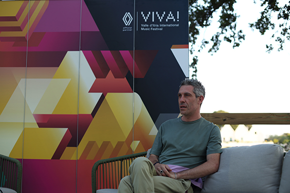
Ray Oranges’ collaboration with Renault unveiled at Viva Festival
On the occasion of Viva Festival 2024, held in the vibrant and picturesque town of Locorotondo, in the Itria Valley, Italy, the debut collaboration between Ray Oranges and Renault transformed the town’s extensive skyline into an extraordinary visual experience.
The five-minute video mapping show turned the town itself into an expansive piece of art, stretching over 300 metres and bringing vivid imagery to life that captivated festival-goers and seamlessly integrated with the historic architecture and natural beauty of the area.
The show explored themes of transformation, innovation, sustainability, and connectivity. Ray Oranges, known for his minimalist yet impactful artworks, crafted with the support of Diceart animation studio, a fluid, organic and striking narrative energized with and upbeat French-electronic soundtrack.
Oranges used a nuanced blend of abstract and figurative elements, combining dynamic forms, bold shapes, and detailed visual motifs to evoke a sense of timelessness while simultaneously pointing to a bright, innovative future. The careful interplay of vivid colours and stark negative space depicted a cohesive universe that bridged the past with an aspirational, forward-looking vision, allowing viewers to experience both continuity and progression.
“This year, through the artistry of Ray Oranges, we gave the festival audience an extraordinary visual and sensory experience,” stated Raffaele Fusilli, CEO of Renault Italy Art. “Art, much like music, is a powerful and effective medium of communication that transcends words, capable of delving into the language of emotions in all its subtleties. It serves as a means of giving shape to ideas, dreams, and beauty. When we succeed in delivering all of this, we reconnect with the profound meaning and values that distinguish us as a brand”.
Ray Oranges’ work at Viva Festival represents more than just a visual feast; it illustrates how art and technology can unite to craft emotionally powerful and visually captivating narratives.
The collaboration between Ray Oranges and Renault, crafted in partnership with LePub Milan, is just beginning—stay tuned for more exciting projects yet to be unveiled!
See more of Ray Oranges’ work here.
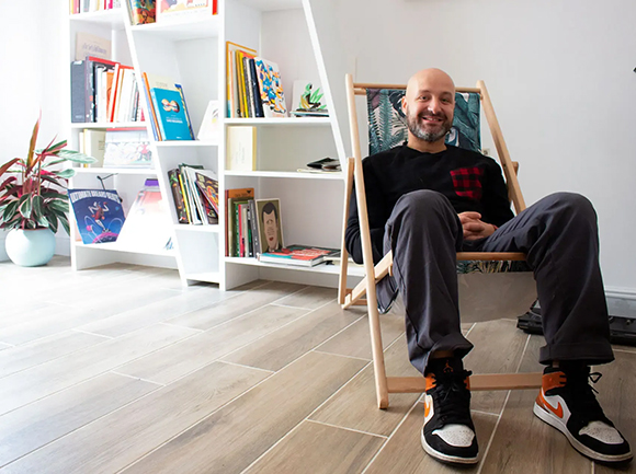
Machas Welcomes Alberto Casagrande
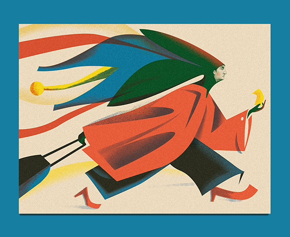
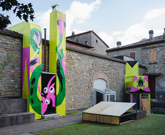
Machas is thrilled to introduce Alberto Casagrande as the newest addition to its roster. Alberto’s art immediately captivated us with its distinct approach, often blending illustration with graphic design, typography and collage, and seamlessly incorporating influences from futurism and constructivism into a contemporary vision.
Recently honoured with a gold and a silver medal from the Society of Illustrators, Alberto is undoubtedly one of the most interesting up-and-coming artists — and his story is as unique as his style. Unlike many artists who started their creative journey in childhood, Casagrande has followed a unique path: he began with a degree in languages and literature, transitioned into graphic design, and eventually found his passion in illustration. We had the opportunity to catch up with him, delving into his background, love for art, and what lies ahead.
Hello Alberto, you began your venture into graphic design and illustration at 26. What motivated you to pursue this artistic path and to believe in your abilities?
I was looking for a job! I graduated in literature in 2013, and the job market was really tough. I had plenty of free time between uninspiring job interviews, so I started thinking about a career change, and graphic design felt like a calling to me. I liked everything about it: its pragmatic approach, problem-solving, and ability to provoke or soothe, shout or speak softly depending on the message. So, I dove into it, studying and experimenting.
You first developed a passion for typography and lettering. What drew you to these aspects of design?
For me, letters are the fundamental building blocks of a project. I believed that by understanding how they function, I could better understand how graphic design works. It might have been the impostor syndrome that comes with being self-taught, but I immediately felt the need to comprehend their function.
Your illustrations often incorporate lettering. How would you describe the interplay between these two elements in your compositions?
Integrating lettering came naturally with my background, but finding an approach that worked with my illustrative style wasn’t easy. Futurism, visual poetry, and constructivist posters inspired me, and I started experimenting with different lettering styles. Now, I mix hand-drawn letters, existing fonts, and even scanned wooden types—there’s no rule, just as long as everything works together!
In my opinion, an illustrator who can integrate lettering with their style has an additional tool to add more depth and credibility to their artworks. If the project allows it, I enjoy bringing the graphic design aspect to life, such as with packaging.
“TRAM” was a turning point in defining your style, transitioning from a primarily graphic approach to a more illustrative one. How did you navigate this shift?
I didn’t think I could draw, but I was drawn to illustration. When I was the in-house graphic designer at the European Institute of Design, a colleague who became my partner proposed to work together on a book called “TRAM!”. The “Carrelli tram” in Milan has a unique and iconic look. Since it was put into service in 1928, it has a decidedly 1930s mood, which matched well with a style of graphic illustration and vaguely futuristic style I was working on. So, I started working on my style right from there!
Your style clearly references futurism and constructivism but elaborates on a strictly individual and contemporary vision. How would you describe it, and from what need did this style arise?
I’ve always been fascinated by historical avant-garde movements. Visiting Casa Depero during my literature studies was a memorable experience. Depero’s talent for creating whimsical universes where everything resembles a mechanical object, along with distortions of perspective and expressive use of minimal colours, intrigues me. Constructivist posters also captivate me with their dynamic movement, spatial distortion, graphic potency, and rich experimentation with collage and various media — a trait also seen in the editing of early 20th-century Soviet cinema. However, I’m not interested in mere revival. I blend these influences to create a contemporary, engaging, and distinctly personal language. An art director once told me, “I like your work because it seems to come from an extremely old era but at the same time is very contemporary!” and I think it’s the best compliment I’ve ever received!
You often use a distinctive technique, skillfully mixing illustration with collage elements. How did you develop this approach?
I started blending photographic elements and “sampling” from old archive engravings into my work, juxtaposing my graphic style with these intricately detailed elements. This approach is akin to my approach of combining lettering, fonts, and movable type—using diverse sources and stylization levels, textures, and flat elements. It’s not traditional collage but an organic fusion with my drawing, blurring the lines between what’s drawn and what’s glued. Here, too, I didn’t invent anything new; surrealism, particularly the works of Max Ernst, served as a guide to develop my language.
How does your background as a graphic designer influence your creative process when approaching an illustration project?
I work a lot on solid shapes and negative space, composition as a fundamental aspect of drawing, and stylization. However, I didn’t embrace the idea that less is more; on the contrary, I tend to overload and hyper-elaborate. I don’t believe decoration is a crime; sometimes, it can help tell stories.
Which project are you most proud of to date and why?
I’m deeply attached to “Era una Nuvola,” my second book, as it seamlessly blends storytelling, graphic design, lettering, and illustration. “Un giardino in città,” my personal project, holds a special place as it marked my foray into the collage technique. “What better place than here, what better time than now?” stands out stylistically and in communication, earning a gold medal from the Society of Illustrators. Yet, I pour maximum effort into every project, so my illustrations for the New York Times best represent my current approach.
Music, literature, and cinema have influenced your artistic journey. Who and what has particularly influenced you?
I am a big music fan (I play in a band and am interested in home recording), and Peter Saville is the designer who got me into graphic design — his work for Factory Records has always fascinated me. To think about it, he also recontextualized the signs and ways of historical avant-gardes! When it comes to illustration, I really love the work of BlexBolex and Push Pin Studios (Milton Glaser, Seymour Chwast…). I’m also super keen on the Valvoline Group (Mattotti, Igort, Brolli, Carpinteri, Jori and Kramsky), who formed in Bologna back in the early 80s and mixed futurism and constructivism with the underground, punk, and psychedelia in a very cool and still unmatched way. With his free but precise forms and extremely limited palettes, Jim Flora also influenced me significantly. I’ve also recently become interested in the work of Antonio Rubino. Whenever I see one of his images, I would like to look into his head while he is drawing!
Your career began in publishing but has expanded into various areas such as packaging, branding, advertising, and ambient. How do you adapt your stylistic approach to these diverse fields, and why is it essential to express yourself across different mediums?
Various mediums possess distinct technical and communicative traits. The designers I mentioned developed a language, not just a style, that they adeptly adjusted to different project requirements while maintaining a strong identity. Today’s market often prioritizes consistency, verging on repetition, but some artists maintain diversity while remaining recognizable. As I evolve, I aim to tackle diverse projects, ensuring effective variations of my language each time and prioritizing project effectiveness above all else. It’s a much more exhausting process, but it allows you to grow and not get bored, and I hope it will bring me to the level I want to reach!
Can you share your reasons for joining Machas and how you see it contributing to the evolution of your career?
I liked Machas for its multimedia and international approach. You have remarkable clients, but above all, you have projects of different natures, some on a large scale and a great focus on design. I also like its selected and diversified roster; I hope it helps me find the right space for my art.
Lastly, what is your dream project?
Who knows! I hope my dream project comes along and surprises me, but there is always room for another dream!
See more of Alberto Casagrande’s work here.
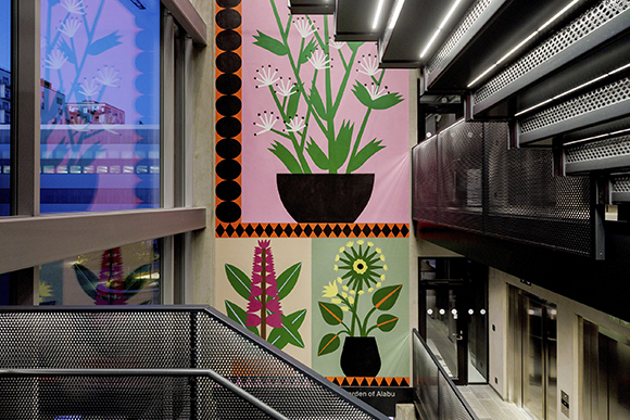
Exploring Aalborg’s Botanical Tapestry: The Garden of Alabu by Agostino Iacurci
Agostino Iacurci’s multidisciplinary practice, characterized by a site-specific approach and a penchant for storytelling, breathes new life into the urban landscape of Aalborg.
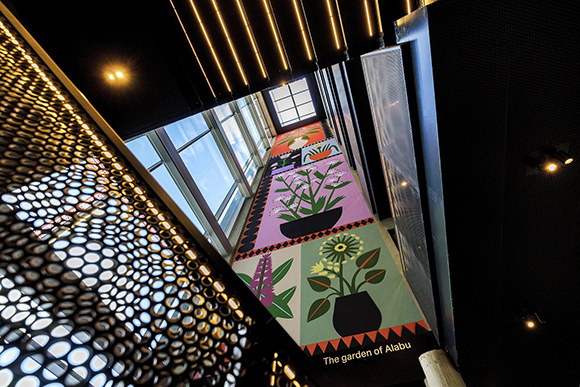
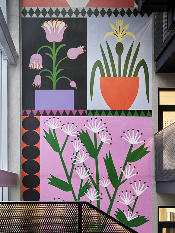
Nestled within the Kent building in Aalborg’s Østre Havn district in Denmark, Agostino Iacurci’s mural lies a captivating tribute to the city’s natural heritage. Entitled “The Garden of Alabu”, the site-specific mural painting serves as a vibrant ode to Aalborg’s botanical legacy, intricately weaving together art, nature, and history.
Drawing inspiration from the surrounding landscape, Iacurci collaborated with nature guide Esben Buch and landscape architect Karen Luise Winther Høgsbro to meticulously select six indigenous plants for his motif. From the graceful Hemp deer’s comforter to the vibrant Yellow iris, each plant was carefully chosen to reflect the unique flora that flourishes in the vicinity of Østre Havn.
As one navigates through the Kent building, “The Garden of Alabu” emerges as a supporting element, seamlessly integrated into the architectural framework. Viewers are invited to embark on a sensory journey, experiencing the artwork up close from the sculptural steel staircase leading to the Sky Lounge on the top floor.
Here, amidst the building’s sleek lines and modern aesthetics, Iacurci’s mural serves as a vibrant focal point, captivating the imagination and igniting a deeper appreciation for Aalborg’s natural surroundings.
Beyond its aesthetic appeal, the title “The Garden of Alabu” carries profound historical significance, invoking the city’s origins and enduring connection to the fjord. Rooted in the earliest coins struck in 1035, the name Alabu—derived from Aalabur—serves as a poignant reminder of Aalborg’s rich cultural heritage and deep-seated ties to the land.
Through “The Garden of Alabu,” Iacurci celebrates the beauty of nature and invites viewers to embark on a journey of exploration and discovery, where art, architecture, and history converge in a harmonious symphony of creativity.
See more of Agostino Iacurci’s work here.
Hand in Hand: A Fusion of Art, Architecture and Community
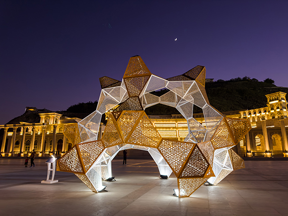
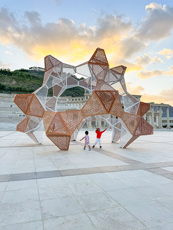
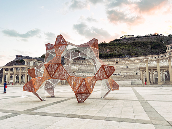
Kaz Shirane made his fourth appearance at the Sharjah Islamic Arts Festival to reveal Hand in Hand, a captivating interactive sculpture designed in collaboration with US-based architect Diana Nee.
Nestled within the scenic surroundings of the Khorfakkan Amphitheater in the UAE, the installation seamlessly blends artistic expression with architectural ingenuity, serving as a testament to creativity, connectivity, and community engagement.
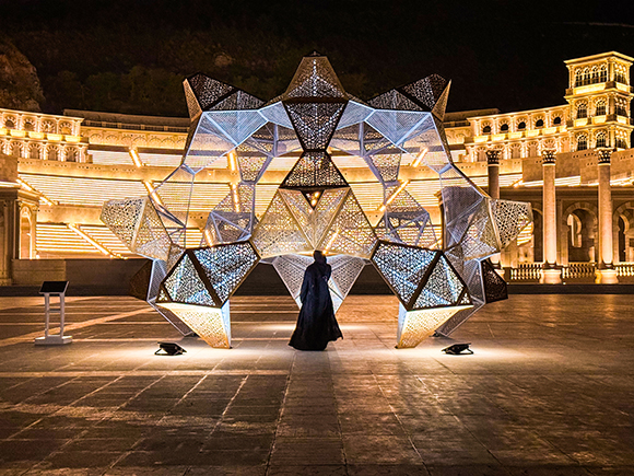
At its essence, Hand in Hand embodies the spirit of unity, beckoning individuals to come together, explore, and deeply connect with their environment meaningfully. Consisting of fifteen identical units intricately fused, the installation serves as a vibrant focal point, gracefully framing and enhancing the natural allure of its surroundings.
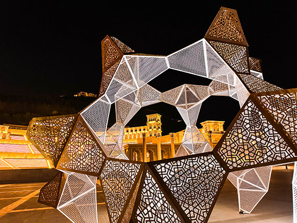
By day, the structure provides playful shelter from the sunlight, while by night, it metamorphoses into a radiant lantern, captivating observers with its mesmerizing glow. The design, adorned with locally-inspired geometric motifs etched into plywood panels and metallic mesh interiors, pays homage to the region’s rich cultural heritage, seamlessly blending tradition with innovation.
What sets Hand in Hand apart is its adaptability and scalability. Designed as a series of connected units, the structure can be disassembled and reconfigured into new, diverse iterations, each unique yet inherently connected to its predecessors. This inherent adaptability not only allows for endless creative possibilities but also fosters a sense of ownership and participation within the community, inviting individuals to contribute to the ongoing evolution of the project.
For Shirane and Nee, Hand in Hand represents more than just a temporary installation; it is a catalyst for change, a seed from which future collaborations and permutations will blossom.
See more of Kaz’s work here.
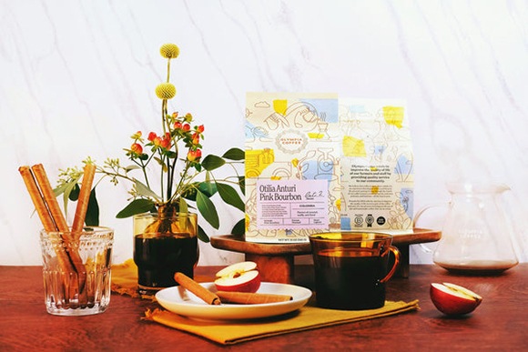
Jonathan Calugi illustrates Olympia Coffee’s new packaging
Renowned for his distinctive and minimal style, Jonathan Calugi can distill an idea to its raw essence and manifest it into striking artworks.
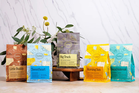
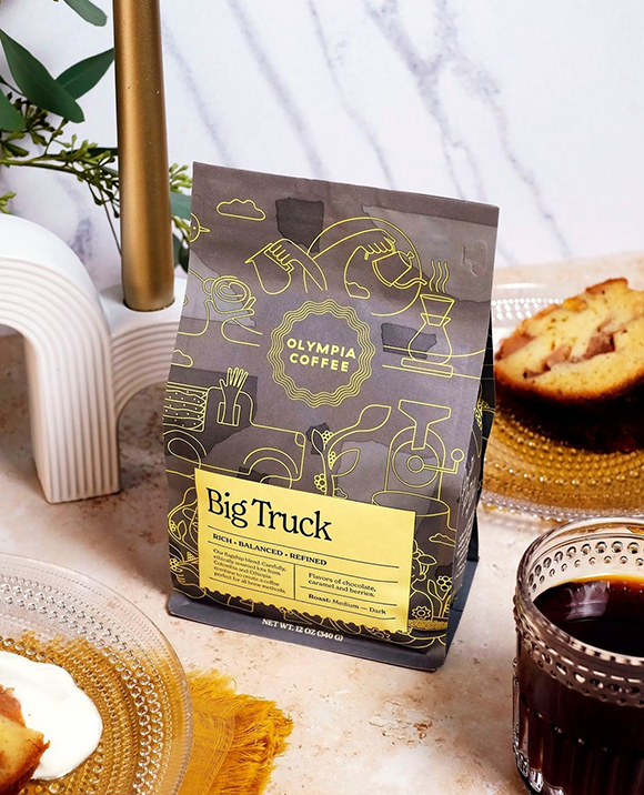
In a recent collaboration with American coffee brand Olympia Coffee, he crafted a modern, wrap-around illustration for their new packaging.
The artwork seamlessly intertwines fluid and harmoniously balanced elements, showcasing Jonathan’s signature one-line style punctuated with geometric shapes.
The illustration serves as an ode to the intricate coffee-making journey, narrating the seed-to-cup story at the heart of Olympia Coffee’s mission.
See more of Jonathan Calugi’s work here!
Agostino Iacurci Ruinenlust
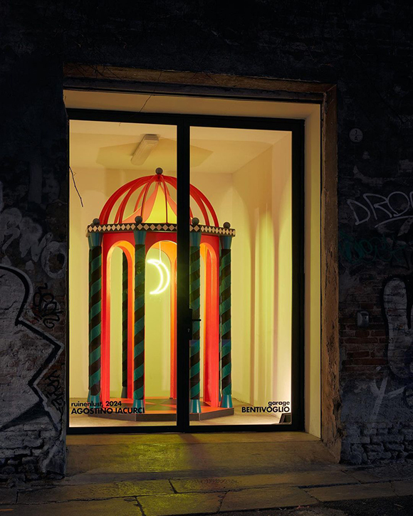
Following the success of his January show at the Los Angeles Design Center, Agostino Iacurci unveils his latest creation, Ruinenlust, at Garage Bentivoglio in Bologna on the occasion of the 12th edition of Art City, a cultural program coinciding with Artefiera, the international art fair of Bologna.
The installation, inspired by a sketch from Giani, an 18th-century painter and architect linked to Palazzo Bentivoglio, aims to establish a dialogue between the artist’s contemporary vision and Palazzo Bentivoglio’s historical heritage and the city itself.
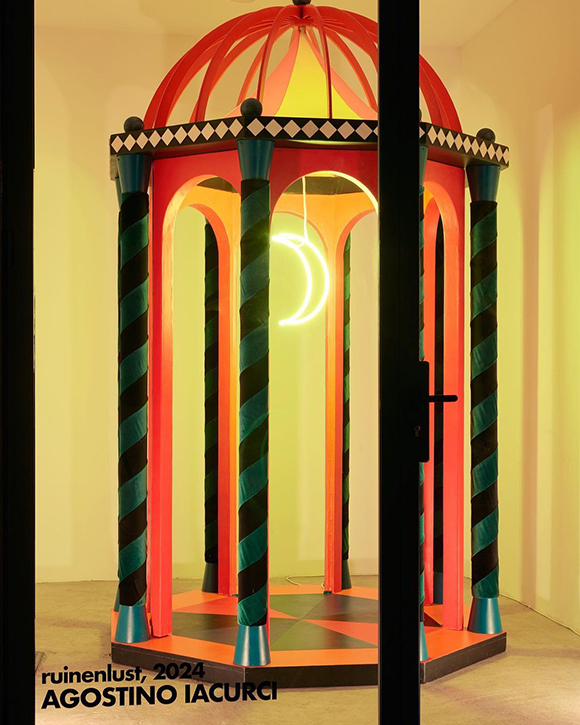
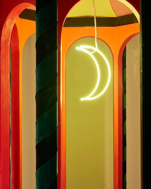
Ruinenlust is, in fact, visible from the street through a sizable window and presents a painted temple constructed from wood, felt, and iron and accentuated by the glow of a neon moon.
The installation’s bright colours and textured materials, coupled with the “untraditional” expositive space, beckon the viewer into a reflection on time. Ruinenlust is a German term that stems from Ruinen (ruins) + Lust (desire), expressing the irresistible attraction towards dilapidated buildings and abandoned places. “Ruinenlust is a feeling of nostalgic pleasure,” explains Iacurici, “peculiar to German pre-romanticism, which can be extended, in an existential key, to that kind of sensation of melancholy mixed with pleasure that one experiences in self-indulgence for their own failures.”
For Iacurci, this contemplation transforms the installation into a ruin of the future within the walls of one of the most magnificent ancient palaces in the city. Despite evoking a theatrical set, the temple will not host performances or actors but invites passersby to venture inside, offering an immersive encounter with the juxtaposition of ancient and modern, real and imaginary, past and present.
Ruinenlust is on view from January 31 to February 24, 2024, at Palazzo Bentivoglio, Bologna.
Nature Unveiled: Exploring Pollen Pixels with Cao Yuxi
Machas Artist Cao Yuxi explores the beauty of nature in his newest creation, Pollen Pixels, unveiling a world of exquisite textures and vibrant layers.
Pollen Pixels, Cao Yuxi’s latest installation, magnifies the hidden wonders of pollen, transforming microscopic particles into a captivating visual symphony. Microscopic particles come to life on digital canvases, providing the audience with a profound understanding of the microstructure of these tiny elements.
As a visual spectacle unfolds, these particles converge to craft a breathtaking bouquet that dances across expansive LED screens. From Marigolds to Peonies, Calla Lilies to Anemones, Pollen Pixels seamlessly weaves the small and grand into a fusion of art and nature.
Pollen Pixels invites spectators on a journey to experience a new and harmonious interaction between the microscopic and macroscopic realms. Cao Yuxi’s ingenuity lies not just in the beauty of his art but in its ability to bridge worlds—both cultural and dimensional. Through the fusion of digital finesse and cultural nuance, Pollen Pixels becomes a testament to the limitless possibilities when innovation and tradition converge.
Explore more of Cao’s work here.
Agostino Iacurci x Barilla
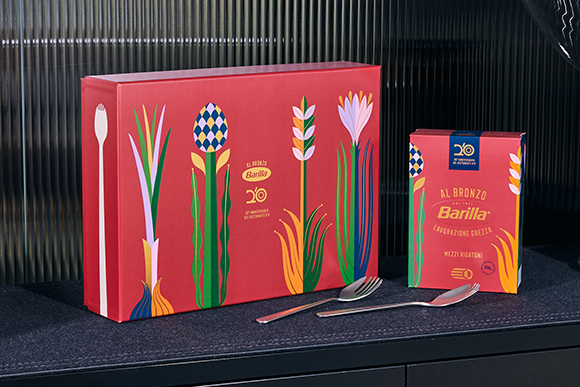
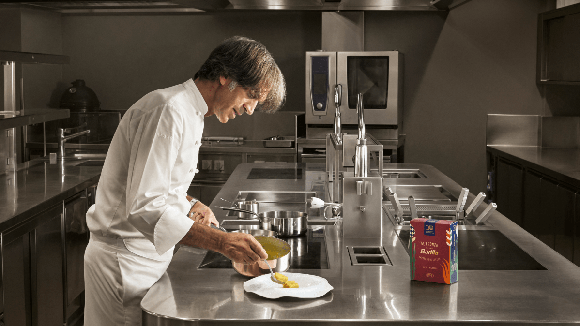
Italian Artist Agostino Iacurci teamed up with Barilla on their limited edition box of Al Bronzo pasta, to celebrate the 20th anniversary of Chef Davide Oldani’s restaurant, D’O.
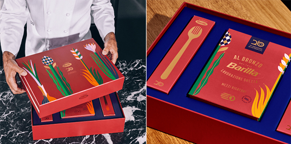
The box is beautifully decorated with Iacurci’s bold, vibrant and colorful artworks and contains a pack of Mezzi Rigatoni Al Bronzo, a recipe card, and two sets of special cutlery.
Using simple shapes and bright colors, Agostino drew inspiration from the recipe’s ingredients. The delicate ear of corn represents the pasta’s essence, while the spring onion and saffron depict Chef Oldani’s signature ingredients.
The result is a truly special, enchanting, and luxurious box that will delight pasta lovers everywhere!
See more of Agostino’s work here.


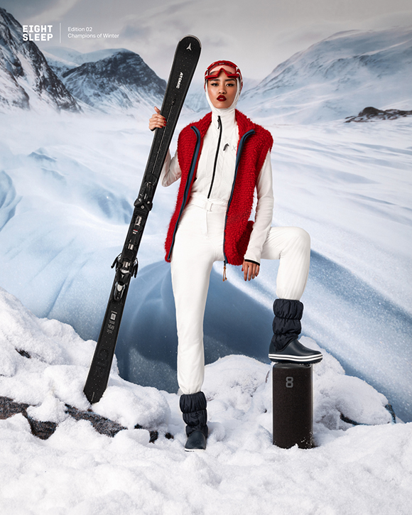
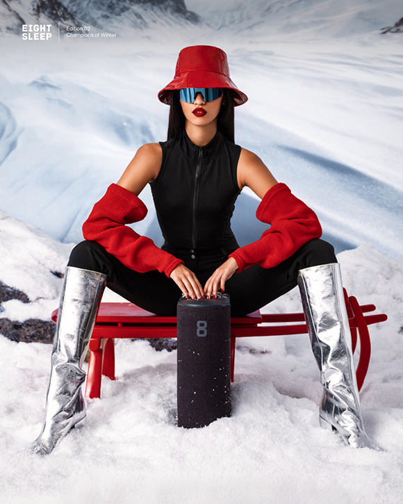
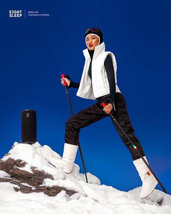
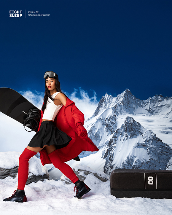

Champions of Winter: Elena Iv-Skaya for Eight Sleep
Building on the success of her summer campaign for Eight Sleep, Machas photographer Elena Iv-Skaya has teamed up with the American Smart Mattress brand once again!
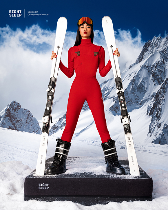
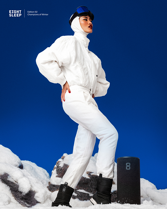
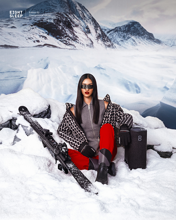
This time, she brought her unique vision to Eight Sleep’s latest campaign, celebrating how the Pod pulls us through Winter’s extreme weather.
With this new photo series, aptly titled “Champions of Winter”, Elena skillfully captures eye-catching, graphic and contrasted images, striking a balance between high-fashion and cutting-edge technology.
True to her signature colourful style, she takes us on a visual journey depicting how the Pod’s sleep-improving technology helps us conquer the cold season, with model Hilary Jocson posing with strength and self-confidence against snowy mountain backdrops.
Winter champions – it’s time to embrace the cold season with energy and style!
Full credits:
Client: Eight Sleep
Agent & Producer: Céline Vignes at Machas
Photographer: Elena Iv-Skaya
Model: Hillary Jocson
Stylist: Eleonora Papetti
Hair & Make-up: Daniella Isabella Valenzi
Hair & Make-up assistant: Arabela Buljevic
Prop stylist and set design: Table Top
Prop stylist and set design assistant: Noemi Brolatti
Light assistant: Nicola Rucci
Digi tech assistant: Irene Guastella
See more of Elena’s work here.
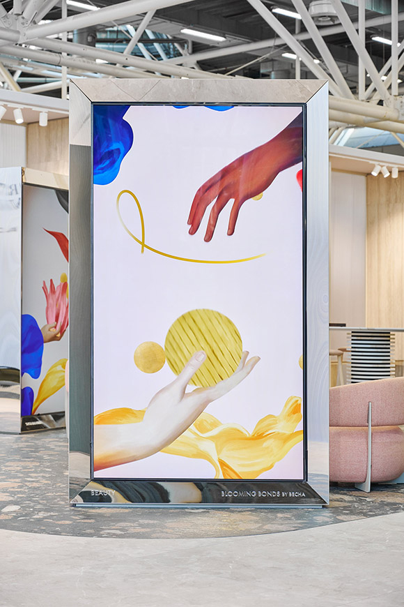
Blooming Bonds: Becha x Iris Ceramica Group
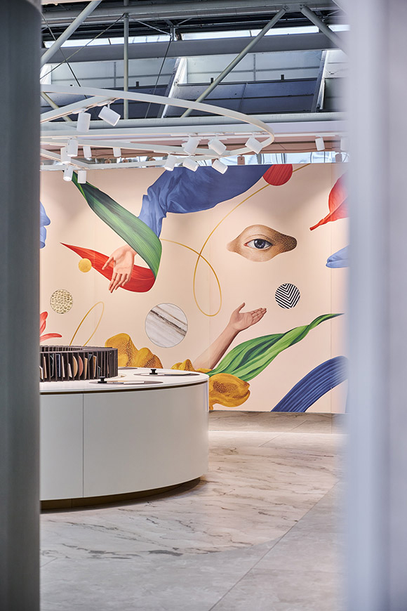
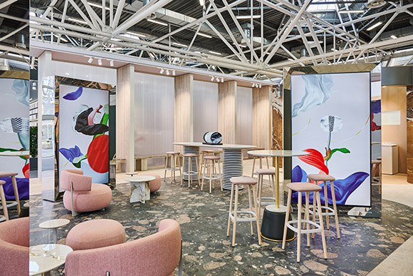
Machas consulted the Iris Ceramica Group on connecting their ethos through contemporary art by curating a series of meaningful, cutting-edge multi-site exhibitions during the Cersaie trade show 2023 in Italy.
After presenting a comprehensive selection of artists and potential creative approaches, Iris Ceramica Group chose mixed-media artist Becha for her refined and delicate aesthetic to transform their booth into an art gallery.
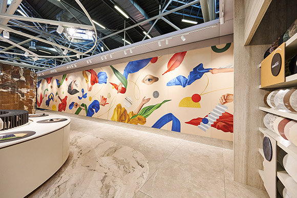
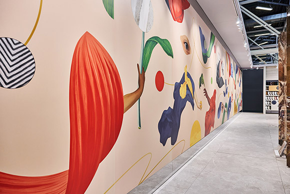
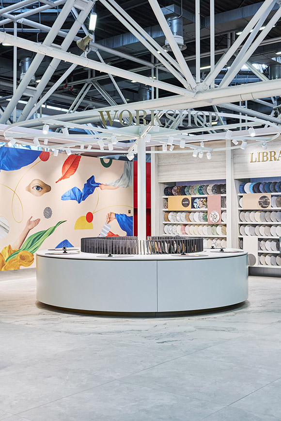
For this occasion, BECHA created the “Blooming Bonds” series, featuring an astonishing interactive, large-scale tiled mural and three video installations showcasing the artist’s distinctive mixed-media universe.
Using a harmonious fusion of collaged and digitally painted elements, Becha depicted a landscape with human and natural figures seemingly suspended in space, embodying the values of beauty, innovation and sustainability with elegance and depth.
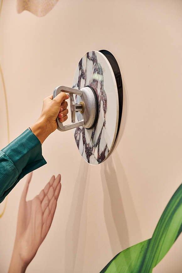
The 18-meter artwork was crafted on large ceramic tiles employing ICG’s patented Design Your Slab printing technology and fixed to walls with the innovative Attract magnetic system, which was introduced at Cersaie. This innovation allowed the mural to be removed and reused and empowered visitors to interact with the artwork by modifying and replacing a few elements to suit their preferred texture and colour.
“For me,” BECHA explains, “the value of creating a collage was always about that special moment when the whole composition is altered by changing just one element and realising, “That’s the one!” — although it does not have to be only one, there can be many combinations!
So when visitors choose a tile of their liking from the library and make their choice, they follow the principle of modularity and participate in the collage process - in a way, they become co-creators.”
“Blooming Bonds” also featured three video installations animated by Željko Katanić, scored by London-based musician Stefano Ritteri, and produced by Machas. The video installations, centring on beauty, innovation, and sustainability themes, had their own distinct sound identity, and when experienced as a whole, they come together to form a harmonious chord.
The “Blooming Bonds” installations will be displayed in the Iris Ceramica Group showrooms worldwide.
Credits:
Artwork: BECHA
Animation: Željko Katanić
Sound Design: Stefano Ritteri
Production & Art Consultancy: Machas
See more of Becha’s work here!
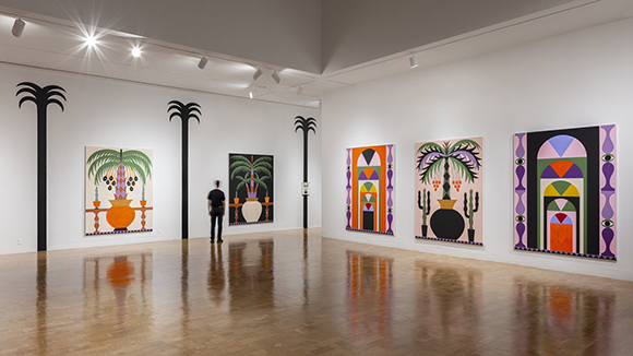
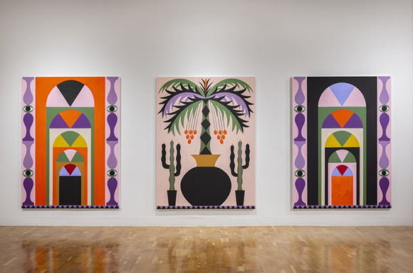
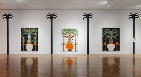
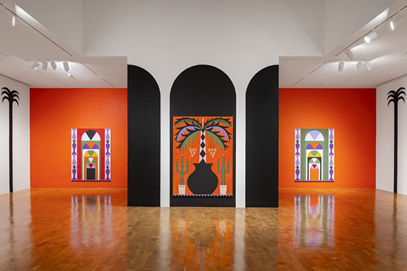
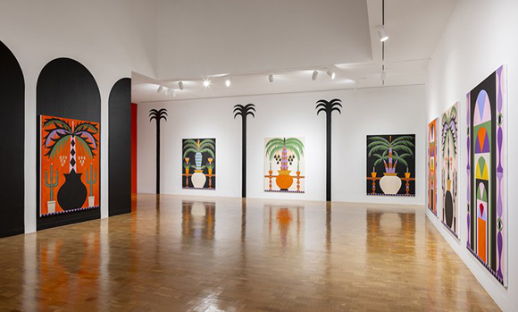
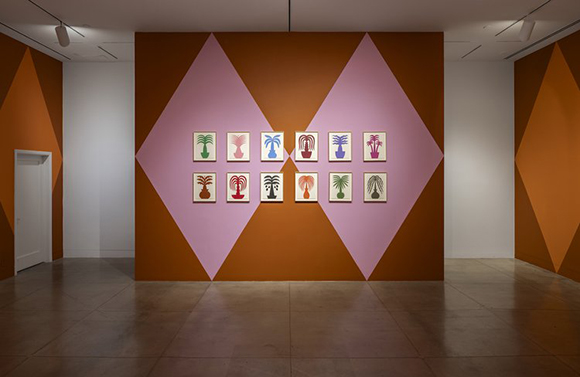
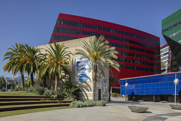
“The Traveling Landscape” by Agostino Iacurci is now open at the Pacific Design Center in L.A.
Following his highly acclaimed immersive installation, “Dry Days, Tropical Nights,” showcased at Salone del Mobile earlier this year, Agostino Iacurci now takes over the Pacific Design Center Gallery in Los Angeles with his latest solo exhibition titled “The Traveling Landscape.”
Continuing his exploration of botanical themes, Iacurci masterfully converts the gallery’s interiors into a vibrant oasis populated by palm trees. “I’ve been using palm trees as a subject for my paintings for a long time, but never thinking of the location. I’ve always been approaching them as a more symbolic object”, he shares. “I first came to L.A. several years ago, and of course, I became super fascinated by the landscape. So when the opportunity to do this project came up, I thought it was the perfect place to show palm trees.”
This new body of work traverses a rich cultural spectrum, spanning from ancient to Post-Modern eras. It delves into the multifaceted symbolism of the palm tree, representing its cultural and mythological significance, as well as its role as a poignant symbol of colonial history and the industrial exploitation of nature. Iacurci also portrays the palm tree as a timeless and adaptable traveler, capable of thriving in diverse environments. He elucidates, “There are several reasons why I am interested in the palm tree. The first is personal, in that they are very common in my hometown, Foggia. Most of them were torn down by the Second World War bombings, but few survived, and they were an important part of my childhood. The second is that palm trees have been traveling and colonizing the entire world, across borders and even across time.”
The exhibition’s basement showcases a series of works on paper, each presenting an array of palm tree shapes and silhouettes in varying colours. In contrast, the upper floor transforms into a viewing platform adorned with palm trees and columns reminiscent of cloisters, monastery courtyards, or Mediterranean villas. Large-scale paintings featuring palms and potted cacti are thoughtfully interspersed amidst the palm murals, playing with an array of shapes and colours.
Inspired by cycloramas, those grand panoramic paintings that gained popularity in the 19th century, typically featuring historical, mythological, or natural landscapes, as well as technological advancements, “The Traveling Landscape” reimagines and reinvigorates this art form for the contemporary audience.
With “The Traveling Landscape”, Iacurci creates a place of beauty and contemplation, a visual reverie for the crisis-ridden Anthropocene. The exhibition is on view from 28 September 2023 to 12 January 2024.
See more of Iacurci’s work here.
Jonathan Calugi x Monoprix
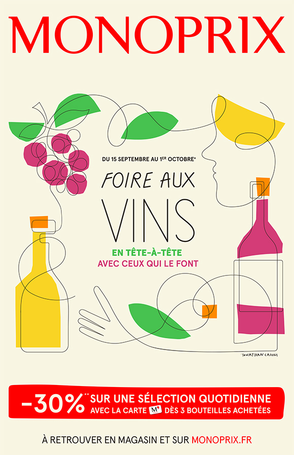
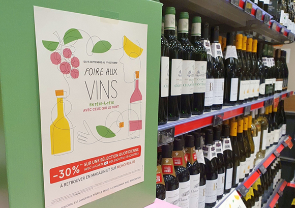
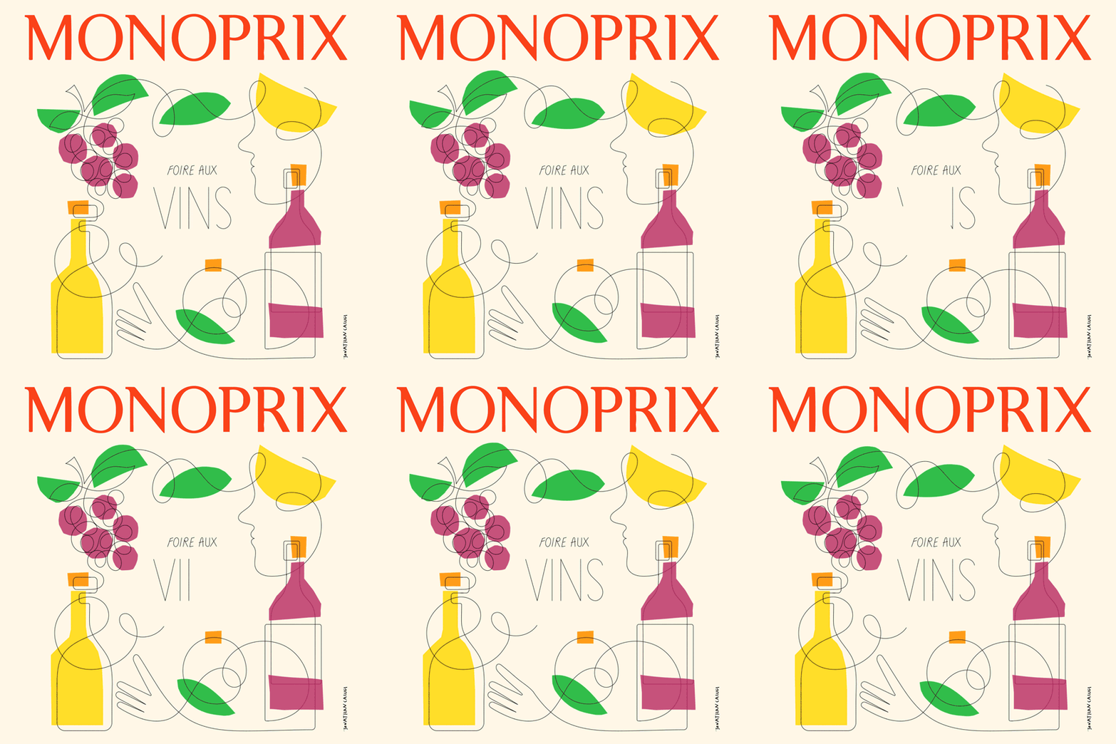
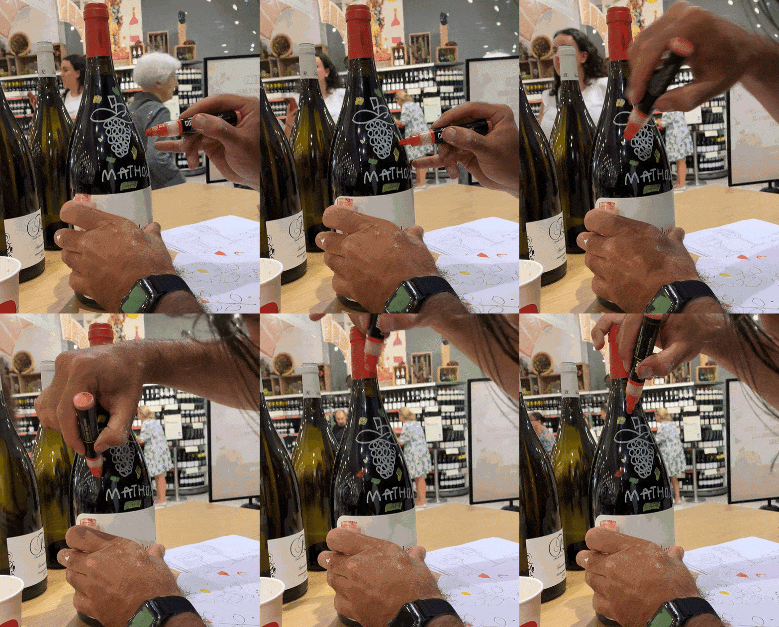
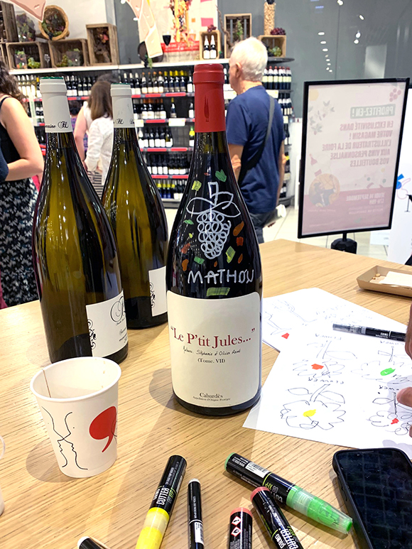
With his distinctive modern, sophisticated one-line art, Jonathan Calugi expertly brings together visual elements with a flowing, elegant line. Monoprix, known for its yearly Wine Fair, sought an artist to create a vibrant and eye-catching artwork for their artistic poster and brochure, and Jonathan Calugi’s signature style was the natural choice. The result is a cheerful and polished poster that stands out amidst the traditionally styled retail communications. It also pays tribute to independent winegrowers and the journey from producers to customers.
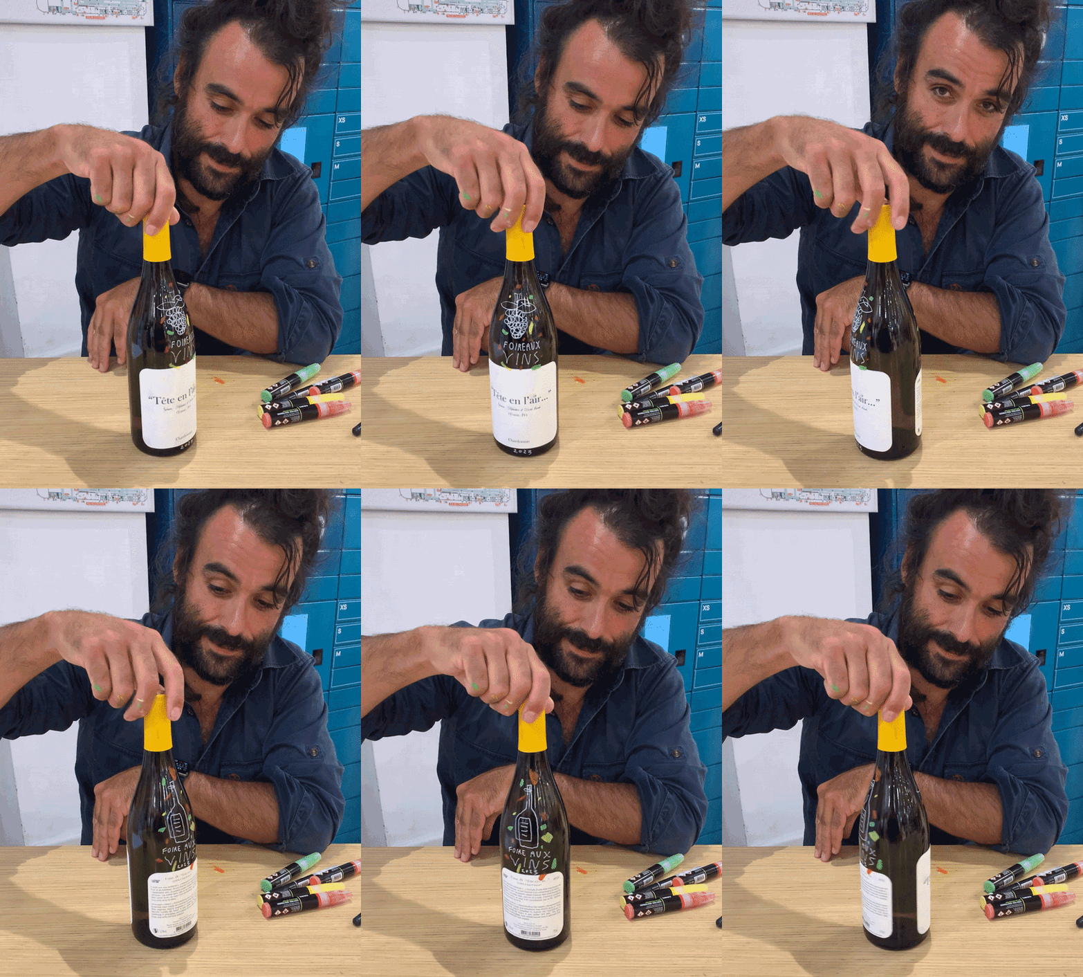
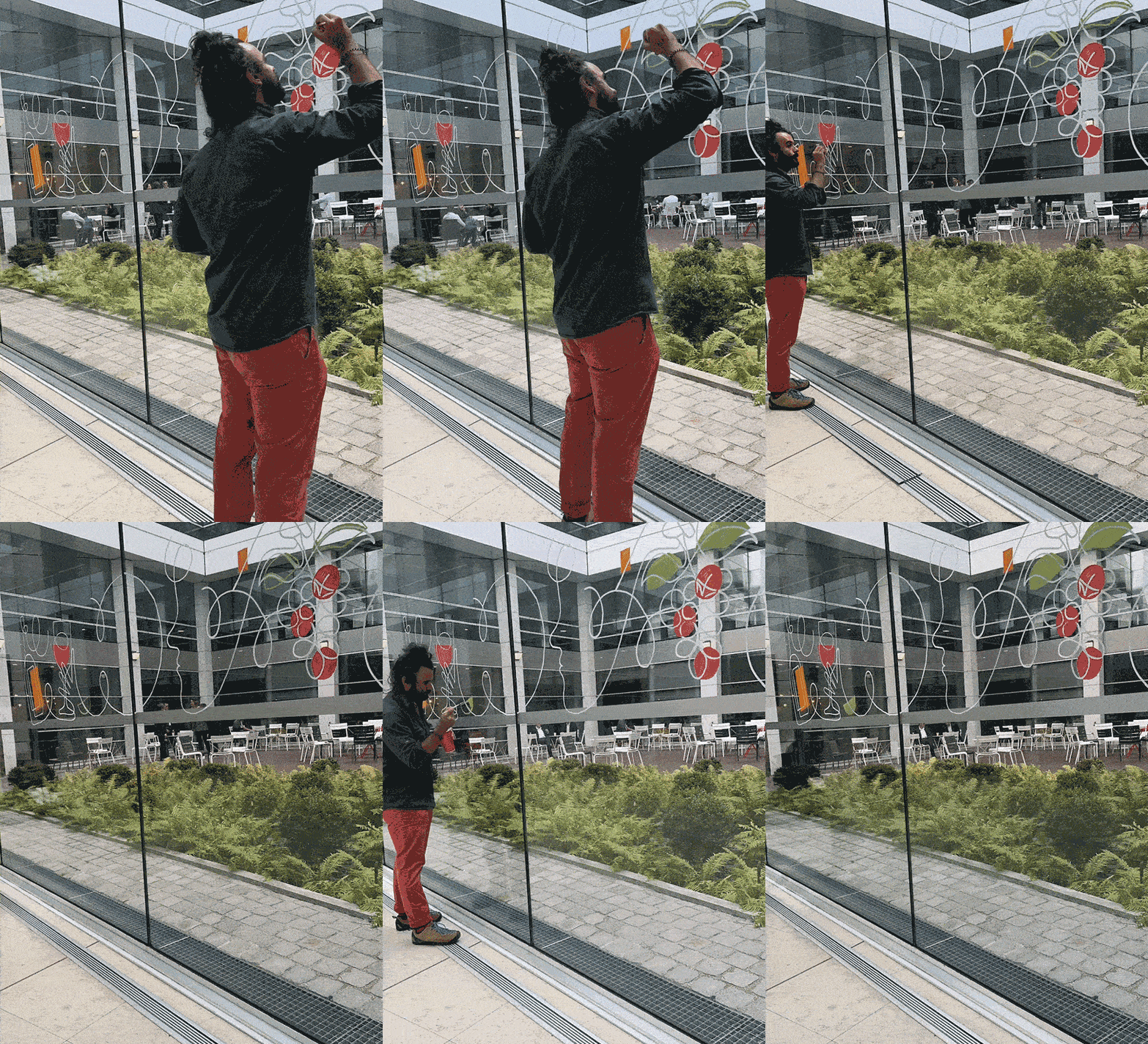
As part of the communication campaign, Jonathan was invited to host two live drawing sessions in Paris. He took over one of Monoprix HQ’s large entrance windows, crafting a hand-painted mural for the internal Wine Fair presentation. Later on, at the in-store launch event, Jonathan performed live customizations, giving corporate guests and lucky clients the chance to have their bottles personally customized by the artist.
Animation by Simone Brillarelli.
See more of Jonathan Calugi’s work here!
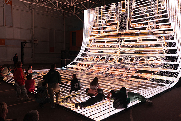
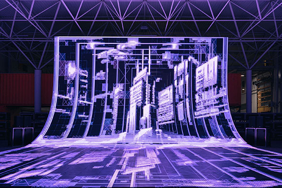
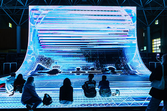
Palindrome Codex by Cao Yuxi
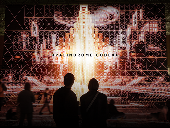
Cao Yuxi keeps exploring New Media art’s boundless creativity and conceptual depth with a new astonishing, immersive artwork presented at this year’s Intervals Festival.
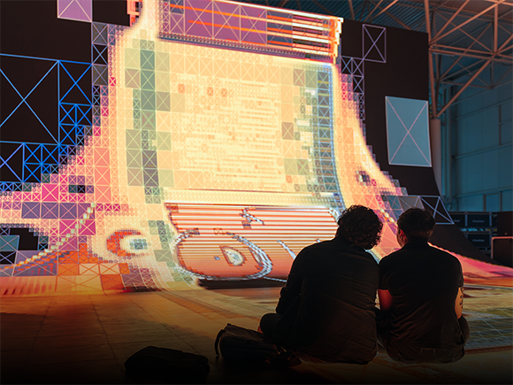
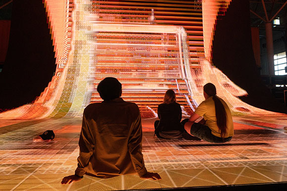
Palindrome Codex is an audiovisual installation that challenges the notion of linear time, representing an immersive tapestry where one can experience the flow of time both forward and backward.
The artwork draws inspiration from the enigmatic geometry of the Sator Square to create a mesmerizing audiovisual landscape.
Using innovative artificial intelligence techniques, Palindrome Codex produces shimmering, dislocated visuals interwoven with retro-futuristic elements and an elaborate soundtrack that resonates with the timeless themes of the installation.
By fusing ancient symbolism with cutting-edge technology, Palindrome Codex offers a reflective and transcendent experience where the boundaries between beginnings and endings dissolve into a timeless continuum.
See more of Cao Yuxi’s work here!
Art meets Technology: Becha x Honor 90
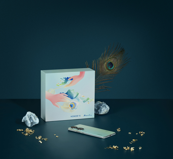
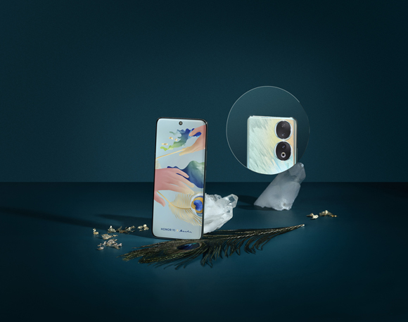
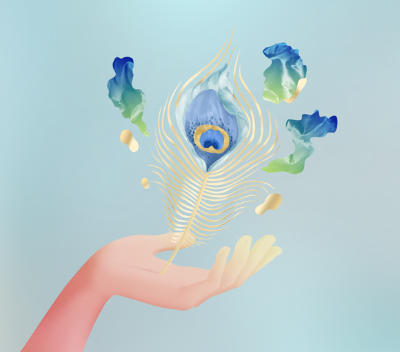
Renowned for her vibrant and poetic style, Machas Artist Becha has collaborated with Honor to unveil the new H90 Peacock Blue smartphone, featuring a captivating limited-edition gift box.
As a digital collage master, the Serbian-based artist was invited as part of Honor’s “Share your Vibe” campaign, which champions creativity, authenticity, and an open spirit through art.
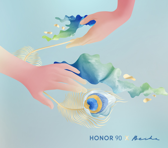
For the Honor 90 Peacock Blue, Becha explored the delicate intricacies of peacock feathers and the iridescence of opal gemstones, and she crafted a limited-edition gift box that exuded a sense of poetry and romance.
Drawing inspiration from the smartphone’s haute-couture jewelry origins, Becha imagined a delicate, modern artwork that enlivens the box. “The phone’s model name, mesmerizing gradients, and color palette served as the starting point for creating the artwork”, explains Becha. “The peacock feather is such a fascinating object that not only catches the eye but also invites the sense of touch — and I tried to represent that sensory experience when feathers and fingers meet, drawing a fascinating parallel to how we cradle our phones in our hands.”
The stunning gift box doubles up as a jewelry case, featuring a set of bespoke compartments. Becha notes, “Designing this box was not merely about crafting packaging, but about evoking emotions tied to a new device that will capture future moments. It needed to emanate dreaminess and elegance, evoking a sense of serenity. The golden accents encapsulate these moments of preciousness, considering the box’s dual role as a jewelry case.”
To complement the gift box, Honor released a wallpaper with Becha’s dreamy digital collage, bridging the gap between the physical and digital worlds.
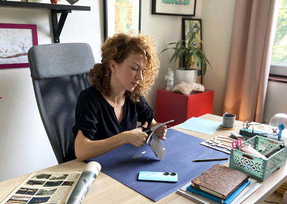
When asked about the impact of technology on her artistic journey, Becha reflects: “My first attempts at collage, during my formative years, were characterized by scissors, glue, an abundance of papers, and various textures—a mix of raw energy in a single artwork. Later, technology enabled me to refine those creative impulses and express them in a new way. Today, my work relies on all kinds of devices and software, although I love to add a touch of authenticity through handmade pieces..”
The gorgeous limited edition gift box was unveiled at IFA Berlin, the world’s premier consumer electronics and home appliances trade show, and is now available exclusively in Europe.
See more of Becha’s work here!

A Summer in Paris: Ray Oranges for Les Echos
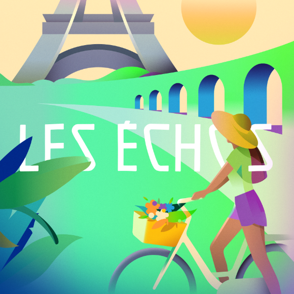
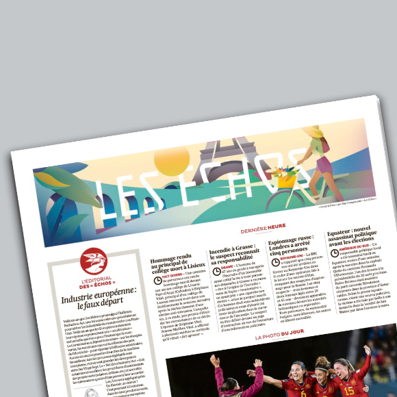
Ray Oranges, celebrated for his vibrant urban landscapes, collaborates again with the French magazine Les Echos, lending his artistic vision to capture the essence of a Parisian summer.
Known for his affinity for architectural subjects, Ray Oranges skillfully weaved the iconic Eiffel Tower and the publication’s logo into a dynamic and minimalist composition.
The result is a striking and evocative artwork that beautifully depicts the French capital basking under the summer sun.
See more of Ray Oranges’ work here.
Seasonal Proximities: Cao Yuxi’s first exhibition in Madrid
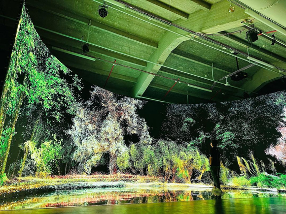
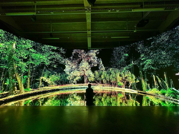
Cao Yuxi was invited by Madrid’s Veranos de la Villa festival and the Chinese Cultural Center to exhibit one of his iconic installations, Seasonal Proximities.
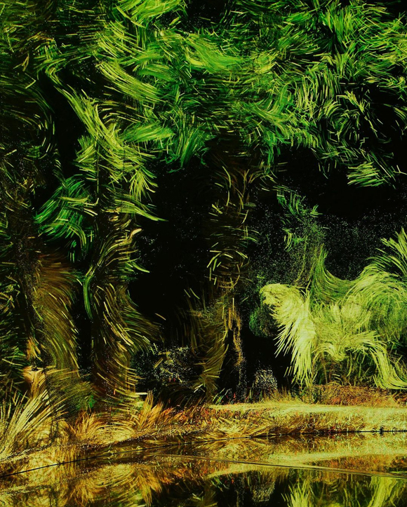
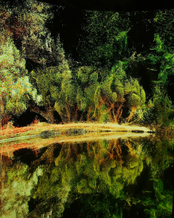
On the occasion of the festival, Yuxi and his team created a new chapter of the Seasonal Proximities by capturing 3D scans of the trees and plants from the Parque del Retiro in Madrid, which were then integrated into the artwork’s visuals.
The installation, merging Spanish and Chinese nature through a multitude of fascinating, moving digital particles recalling a digital Impressionist masterpiece, explores the influence of technology and the digital age on our perception of reality and welcomes visitors into an immersive 360-degree cinematic experience.
The exhibition will be open to the public until 6th August 2023.
See more of Cao Yuxi’s work here.
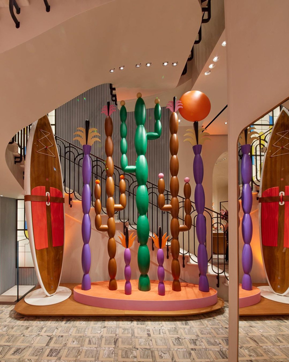
Four Landscapes Plus One: Agostino Iacurci’s Hermès installations
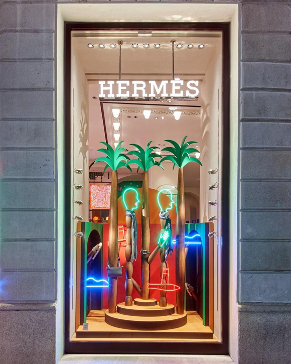
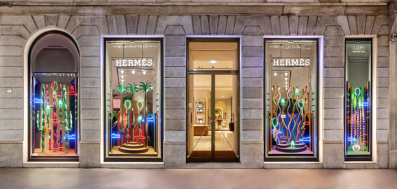
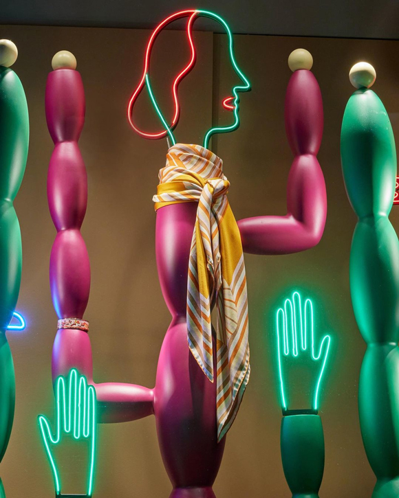
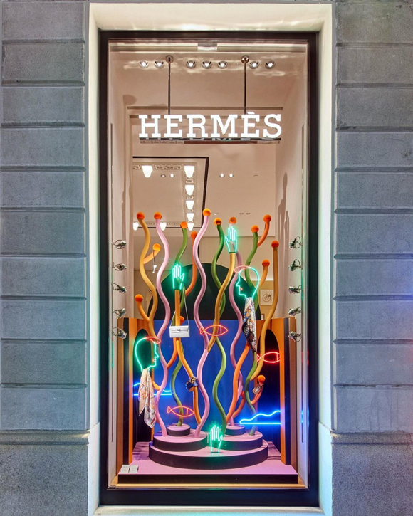
After signing the impressive decor for Hermès’ “Hotel Faubourg”, Agostino Iacurci continues collaborating with the French luxury house, unveiling a stunning new series of installations designed for their iconic Milan flagship store.
“Four Landscapes Plus One” comprises four artist windows overlooking the iconic Via Monte Napoleone, where colourful cacti and corals cohabit with graceful palm trees, floating clouds and neon silhouettes, and a larger sculpture inside the store.
Iacurci’s elegant and joyful artworks will be on view until September 2023.
Find more of Iacurci’s work here!
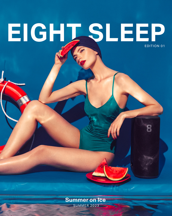
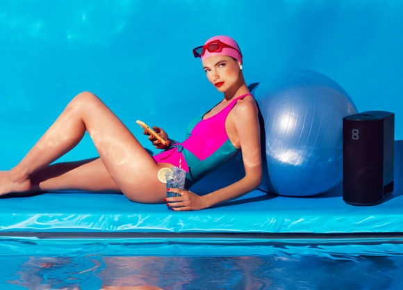
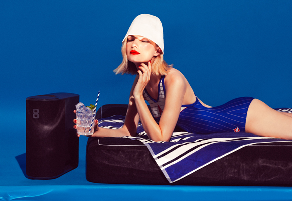
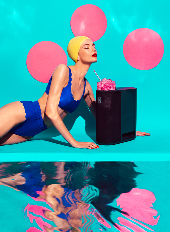

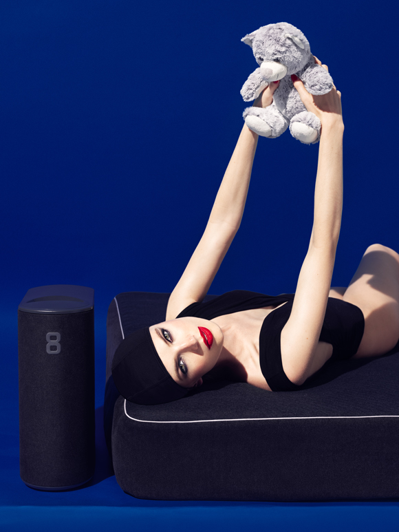
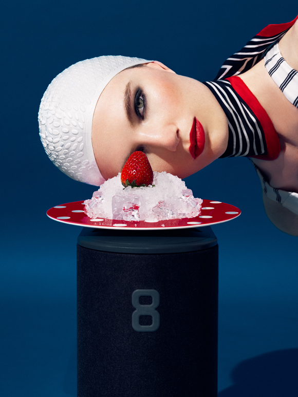
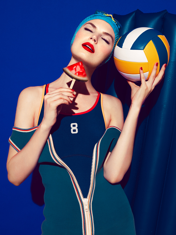
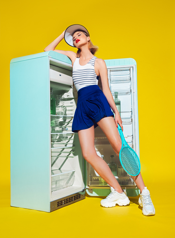
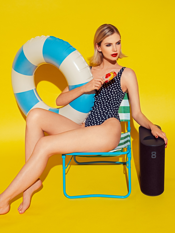
Summer on Ice: Elena Iv-Skaya for Eight Sleep
Who better than Elena Iv-Skaya could capture the essence of a delightful, fresh summer day for US Smart Mattress brand Eight Sleep?
For the summer campaign featuring their auto-regulating temperature mattress, the American brand was looking to channel how refreshing a good night of rest could be.
Bringing her distinctive vision to the world of sleep fitness tech, Elena Iv-Skaya created a series of vibrant and playful photographs that perfectly captured the playful and joyful optimism of those refreshing summer moments.
Full credits:
Client: Eight Sleep
Agent & Producer: Céline Vignes at Machas
Photographer: Elena Iv-Skaya
Model: Beck Billman
Stylist: Chiara Tarantino
Hair & Make-up: Daniella Isabella Valenzi
Hair & Make-up assistant: Arabela Buljevic
Prop stylist: Table Top
Digi tech assistant: Luca Petraroli
Light assistant: Riccardo Girardin
See more of Elena’s work here.
Jonathan Calugi x The Anthem Awards
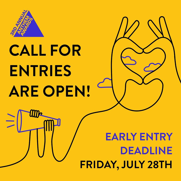
As a winner of a Webby Award in 2015, who best than one-line maestro Jonathan Calugi to collaborate with the latest edition of their Anthem Awards that champion the humans worldwide that have strived for a more purpose-driven society?
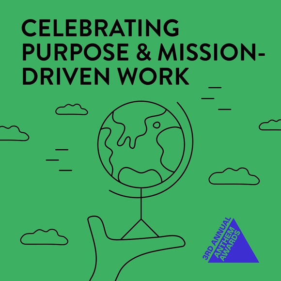
The Anthem Awards, bought by The Webby Awards, honors the purpose & mission-driven work of people, companies, and organizations all around the globe.
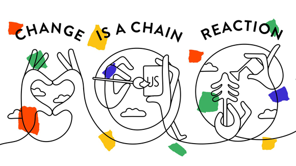
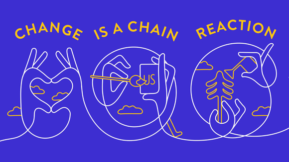
Jonathan was invited to collaborate on creating a series of illustrations for the 2023 award’s visual identity and campaign and give shape to the concept “Change is a chain reaction”.
Jonathan created an engaging series of interconnected, fluid artworks by imagining a playful and inclusive world of shapes and lines.
See more of Jonathan’s work here!
Agostino Iacurci’s “Bouquet” for San Marzano Wines
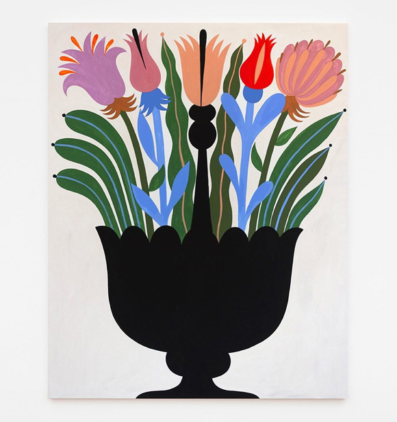
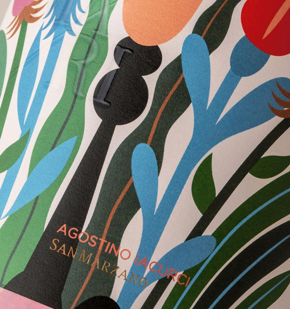
The “Bouquet” by Agostino Iacurci is a fine example of a delightful encounter between art and wine.
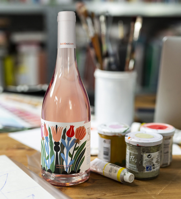
Invited by San Marzano Wines as part of their TramArt project, the Italian Machas artist developed an artwork that resonates with the Tramari tasting experience.
Agostino interpreted the wine maker’s label with a floral still life painting, evoking the wine’s scents and aromas through the energy and vibrations of a vivid juxtaposition of colours.
The collaboration resulted in the painting entering San Marzano Wines’ collection and gracing their limited edition Tramari bottles.
Find more of Iacurci’s work here.
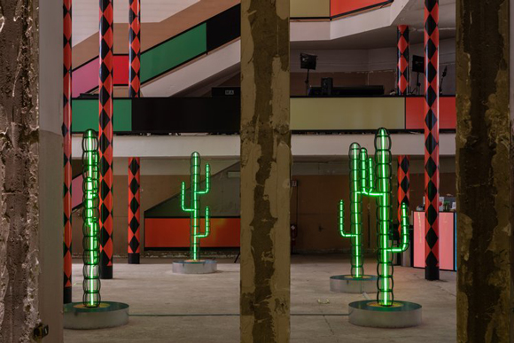
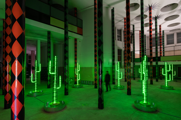
“Dry Days, Tropical Nights”: Agostino Iacurci’s immersive exhibition unveiled in Milan
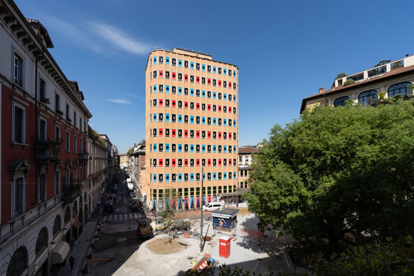
From the exterior facade to its raw interior, Iacurci signs an impressive art intervention on the soon-to-be-demolished tower in Largo Treves, Milan.
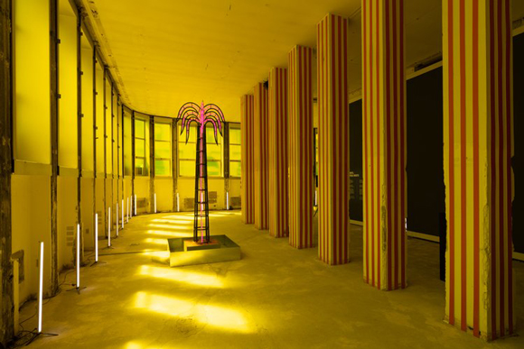
“Dry Days - Tropical Nights’’ is a site-specific project that transformed the architecture of the iconic building designed by Arrigo Arrighetti inside and out. From the striking and enigmatic pattern of the facade to the impressive inner landscape of neon trees and cacti, Iacurci’s intervention is an enchanting multi-sensorial experience that underlines an ominous message.
The installation borrows its name from two environmental indicators outlined in the book Journey Through Italy in the Anthropocene, in which philosopher and evolutionist Telmo Pievani and geographer Mauro Varotto imagine Italy in the year 2786. According to these indicators, within a few hundred years, the Po Valley and Italy will turn into a small piece of land with tropical weather.
“The project is imagined as a hallucination that dialogues with the architecture of the iconic building designed by Arrigo Arrighetti in the heart of Milan, transforming it into a sort of oasis that is both a sparkling mirage and a disturbing omen of a near future, “said Iacurci. “I wanted it to be a Las Vegas scenario with all these shiny, attractive lights, but there’s a dark feeling underneath,” he says. “I wanted it to be seductive, but at the same time, haunting. There’s a subtle dark element.”
The project, which included a soundscape designed by Lechuga Zafiro, enthralled the Guests with an immersive experience that heightened the duality of the message: an explosion of bright colours whose cheerfulness contrasts sharply with the urgency of the theme addressed.
“I had the idea of creating a sculpture with iron and LED tubes,” Iacurci explains. “Even though the building is gigantic, it is quite unique in its interiors: beautiful sky windows, and tall columns which made me think of a palm forest… Cities are evolving, landscapes are evolving. I was thinking, ‘How would Milan look in 1000 years?’”
“Dry Days - Tropical Nights” received a Fuorisalone Award, which selects and promotes the most memorable installations.
Find more of Iacurci’s work here.
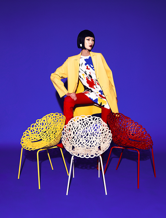
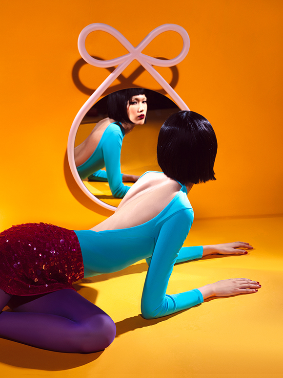
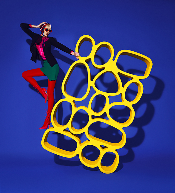
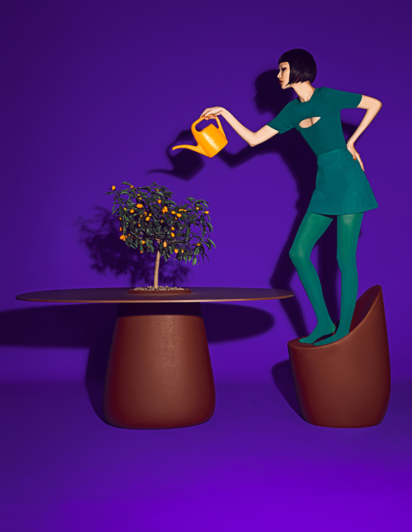
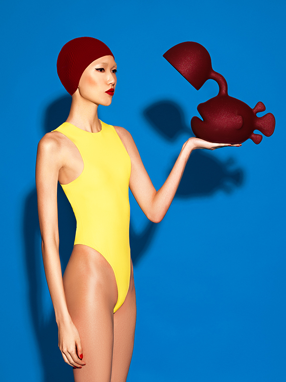
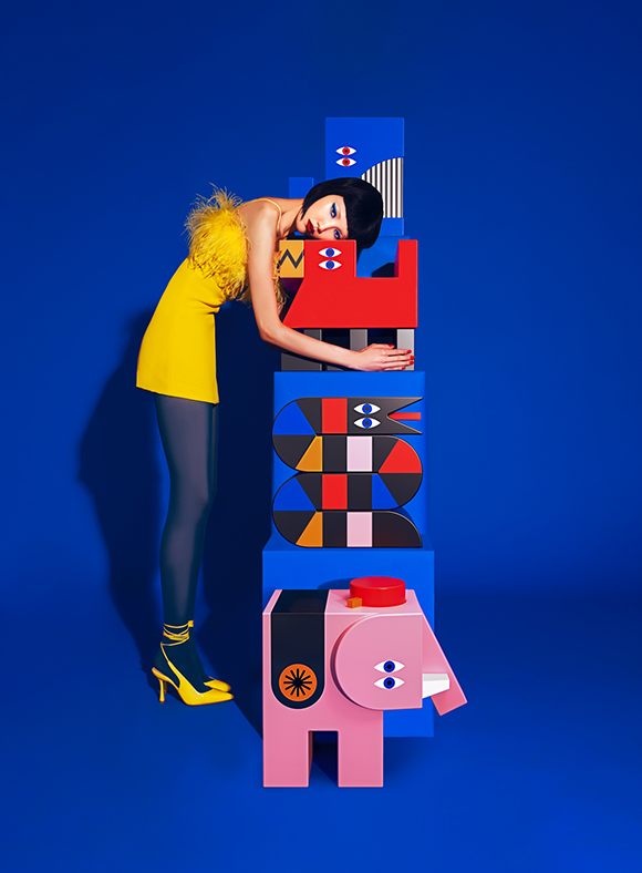
Qeeboo x Elena Iv-Skaya
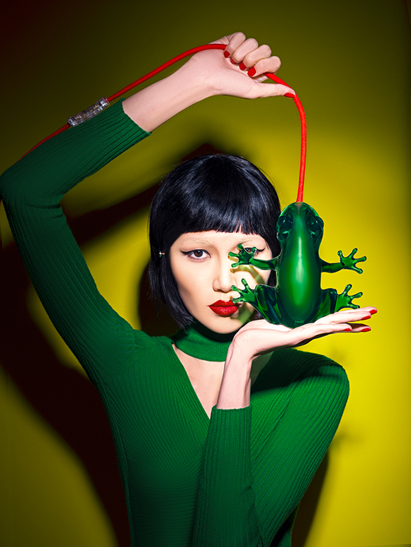
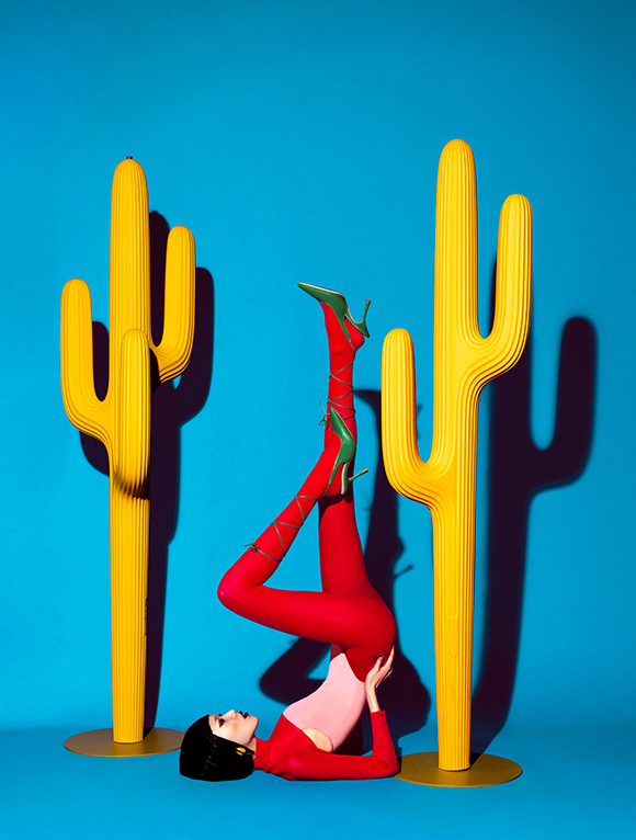
Machas photographer Elena Iv-Skaya comes back with a bang! Unveiled during Salone Del Mobile, her latest collaboration with Qeeboo is a vibrant take on the brand’s latest collection.
For the third year in a row, the Machas photographer delivers eye-catching images, encapsulating Qeeboo’s spirit and playfulness with her inimitable graphic and colourful signature style.
The result is a beautiful series, more pop and playful than ever!
Full credits:
Client: Qeeboo
Agent & Producer: Céline Vignes at Machas
Photographer: Elena Iv-Skaya
Model: Minji Lee
Stylist: Chiara Tarantino
Stylist assistant: Fernando Echeverria
Hair & Make-up: Daniella Isabella Valenzi
Hair & Make-up assistant: Arabela Buljevic
Digi tech assistant: Giovanni Varlonga
Light assistant: Mattia Marchesi
Find more of Elena Iv-Skaya’s work here.
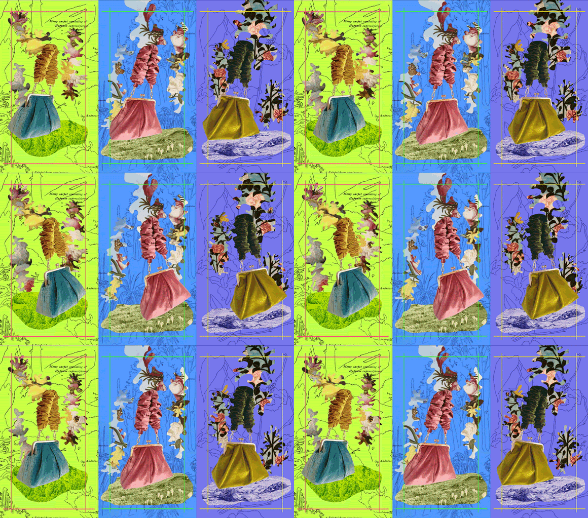
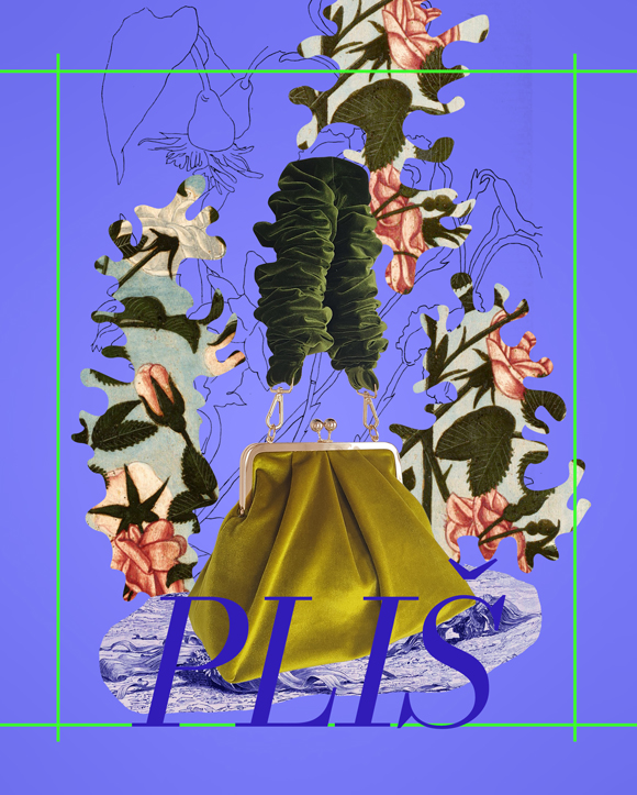
BECHA x pliš
Machas Artist BECHA continues her fashion collaborations, this time with a new project for Belgrade-based accessories label Pliš.
With her distinctive, sophisticated and elegant approach, BECHA produced a series of digital collages featuring the brand’s new bag, colourful floral cutouts and handmade drawings that she then animated.
The result is a contemporary and eye-catchy series of blooming artworks, released just in time for Spring!
See more of Becha’s work here.
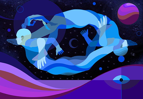
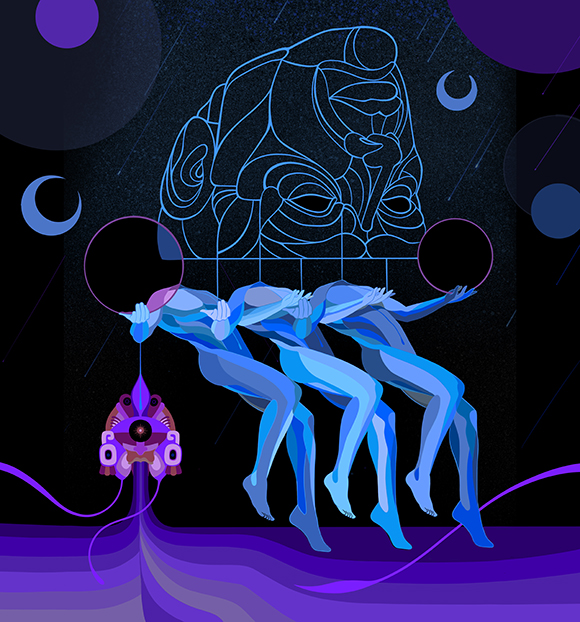
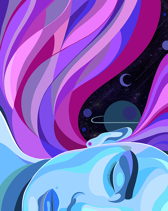
Fernando Chamarelli for Les Echos Week-End
Machas Artist Fernando Chamarelli continues collaborating with the French newspaper Les Echos with three beautiful, dreamy artworks.
Fernando’s poetic aesthetic and vivid colours accompanied the newspaper’s Week-End supplement advice for a restful night of sleep, capturing the fascinating nuances of this mysterious topic.
Find more of Fernando’s work here!
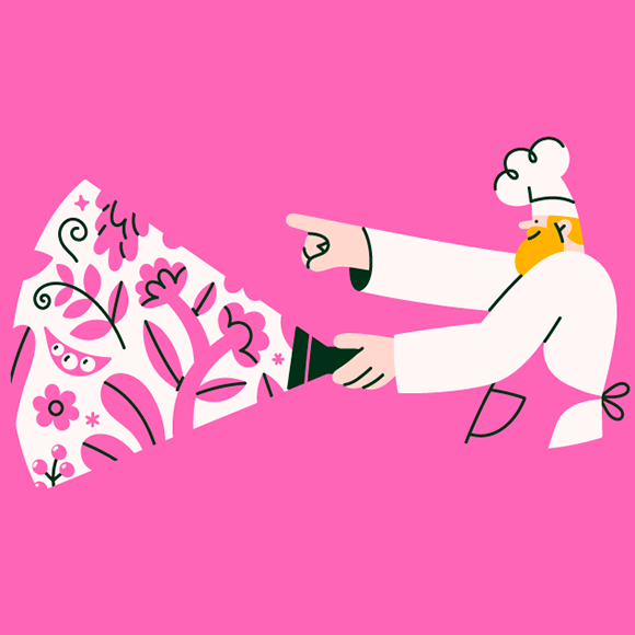
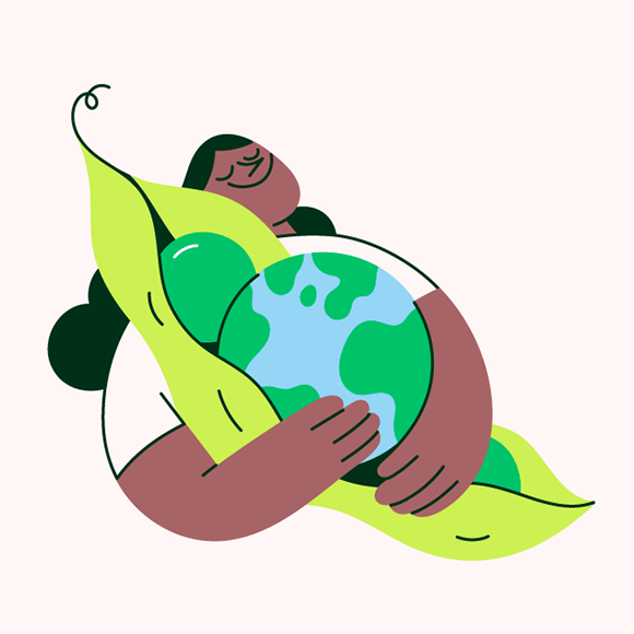
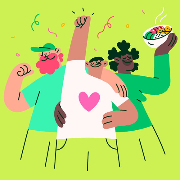
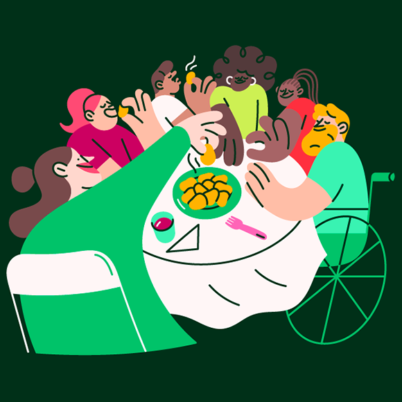
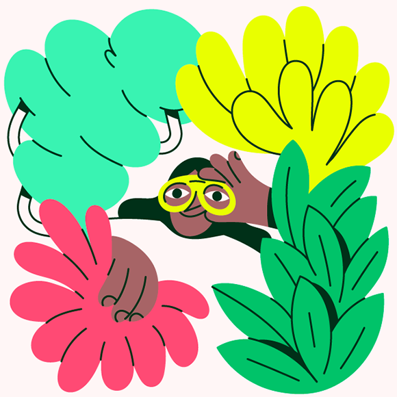
Miguel Angel Camprubi’s flavourful illustrations for Eat Curious
Machas Artist Miguel Angel Camprubi continues exploring the world of food with a new series of illustrations packed with goodness - just like Eat Curious’ plant-based products.
For their market launch, the British food company wanted to create unique, colourful artworks to spice up their visual identity, convey their brand message and promote innovative meat-free products.
With his upbeat, inclusive and playful approach, Miguel Angel Camprubi came into play and imagined a series of five inspiring illustrations - tempting everyone to eat more plants.
See more of Miguel’s here!
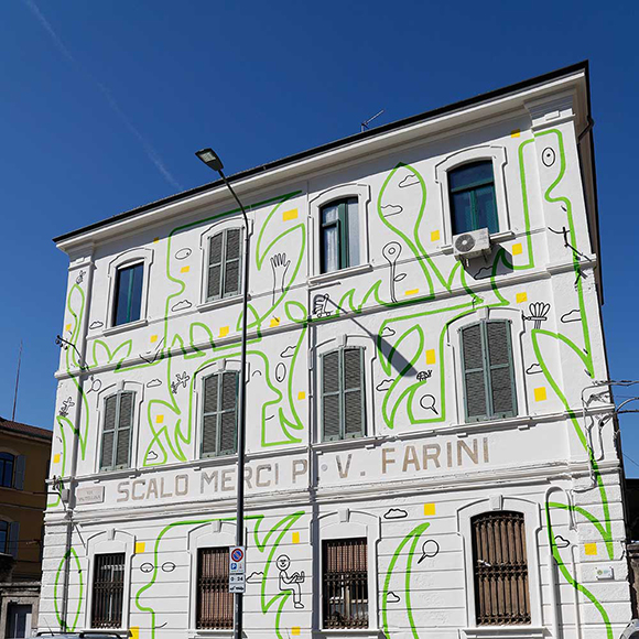
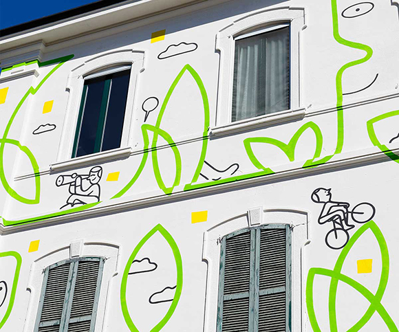
Una Casetta Piccola Così: Jonathan Calugi’s new four-wall mural inaugurated in Milan
After his Los Angeles tribute mural created for SQLA a few years ago, Jonathan Calugi unveils his largest public art project in Milan!
As part of “Take Your Time”, the Italian state railway company FS Group’s urban regeneration project curated by Renato Fontana, Jonathan was tasked with injecting the landscape of the Scalo Farini in Milan with joyous art.
Taking over an entire building with his minimal yet playful line art, Jonathan imagined a lovely artwork to uplift the facades with natural elements, cheerful characters, and playful details, creating an adorned artwork that transforms and revitalizes the building through meaningful art.
“My work is about connections”, explains Jonathan, “and for Scalo Farini, I wanted to create an artwork that engages with the public, making room for the viewer’s interpretation. The artwork’s main element is the continuous green line that connects all elements, and this intertwined forest of human faces and emotions becomes an invitation to take your time”.
See more of Jonathan Calugi’s work here!
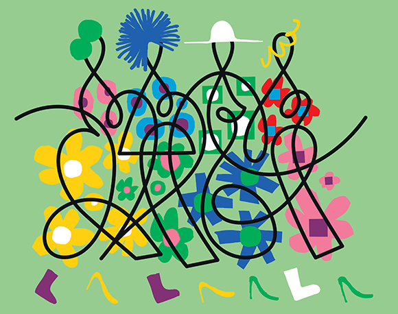
Hello Spring! Jonathan Calugi x Sole24
We continue our collaboration with the economic newspaper Il Sole24 on the latest issue of Moda24, featuring a stunning and graphic artwork of our very own Jonathan Calugi.
Tasked with capturing the positive energy of the Italian fashion sector as well as the zeitgeist of the latest trends, Jonathan created a vibrant, colourful artwork that blends his minimal, one-line style with the cheerful maximalism of cut-out patterns and colours.
Taking inspiration from his latest personal works that see his line artworks heading towards a bolder yet iconic stylistic direction, Jonathan created a joyful celebration of the impending springtime and the optimistic attitude of the fashion industry.
See more of Jonathan Calugi’s work here.
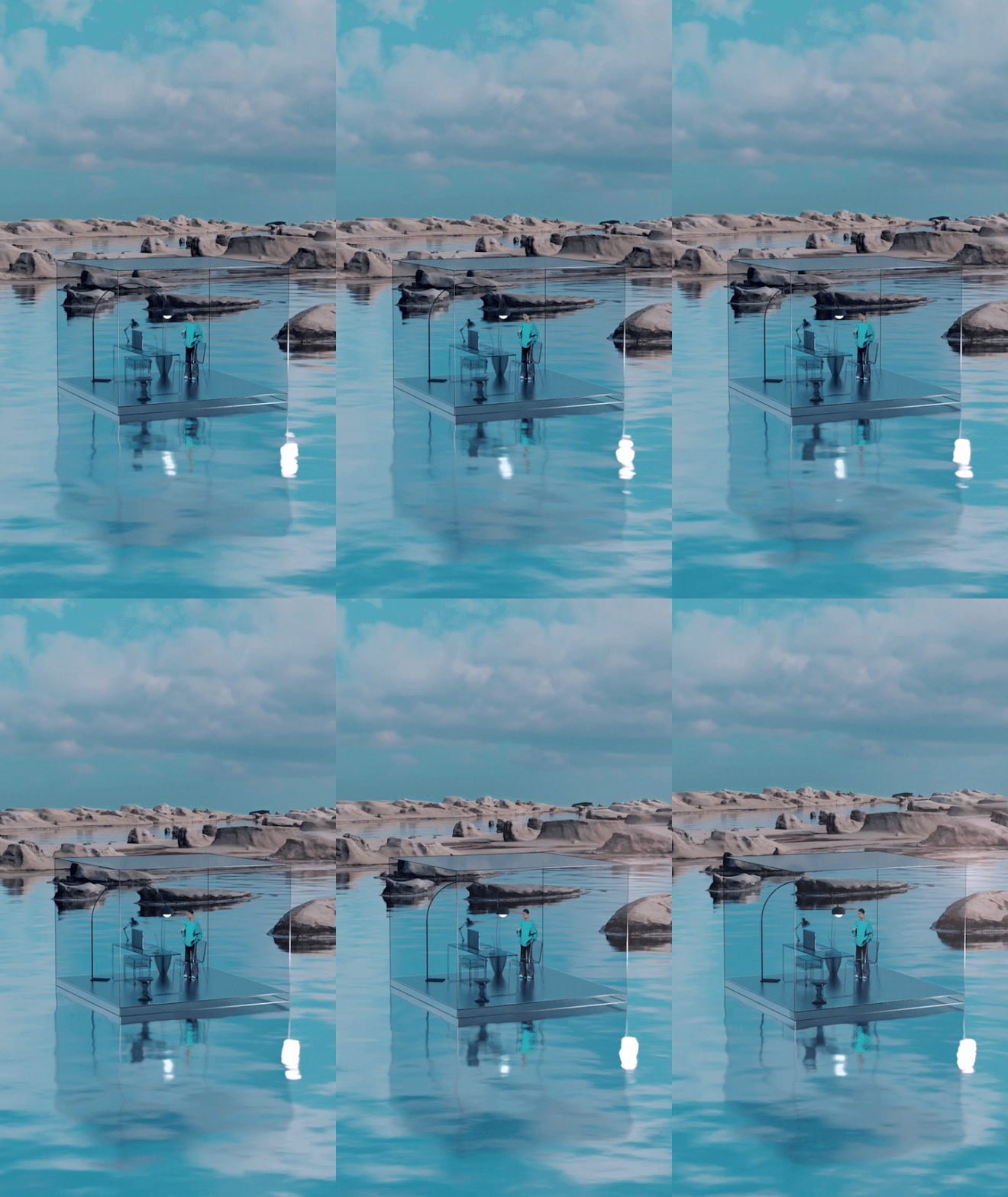
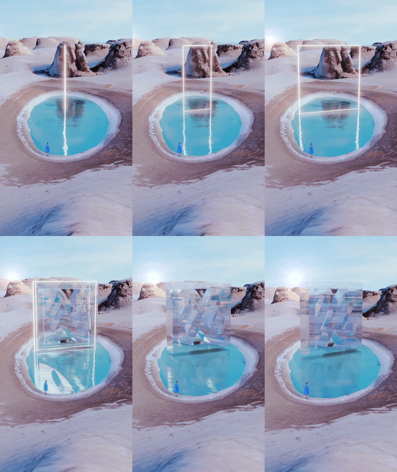
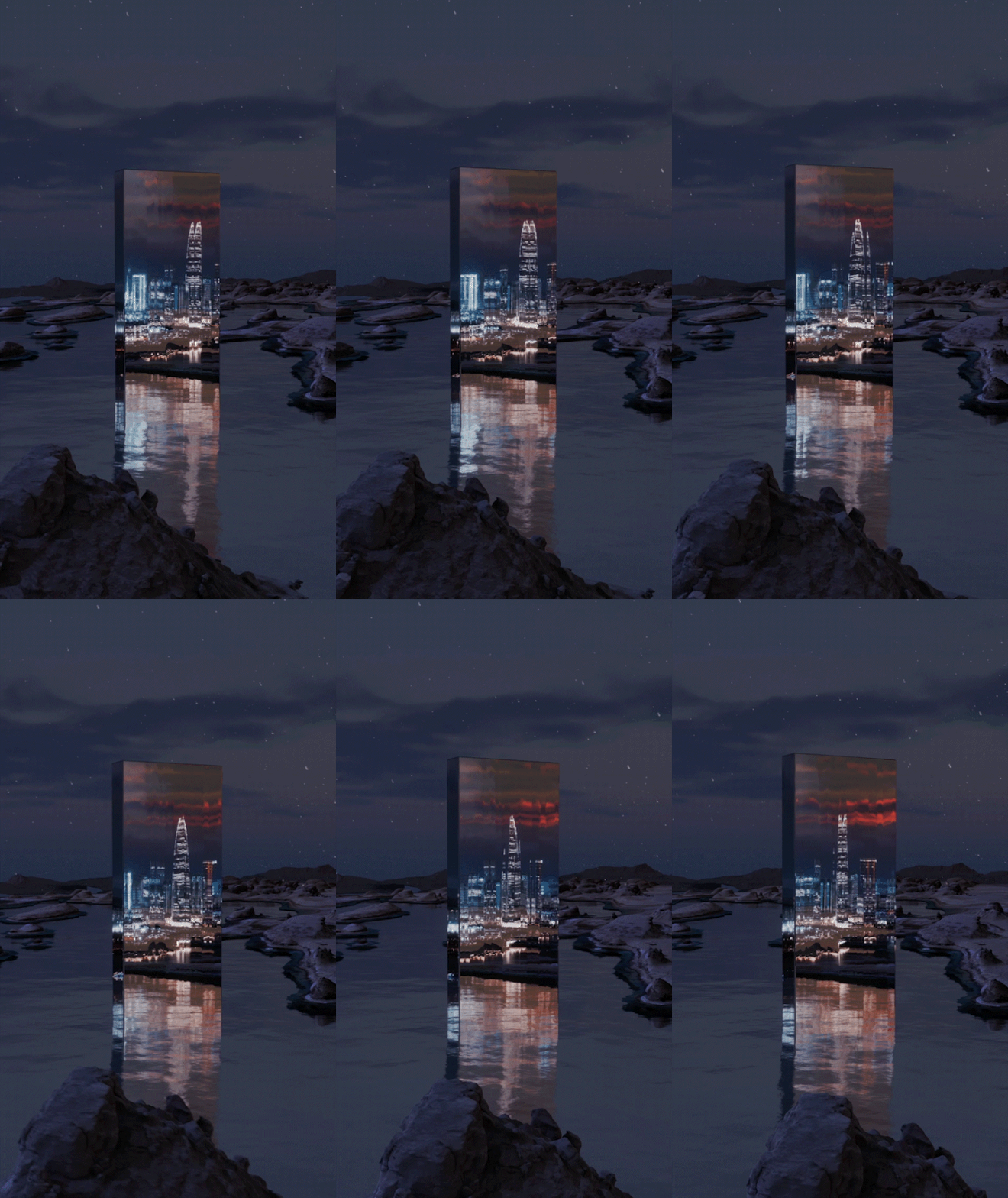
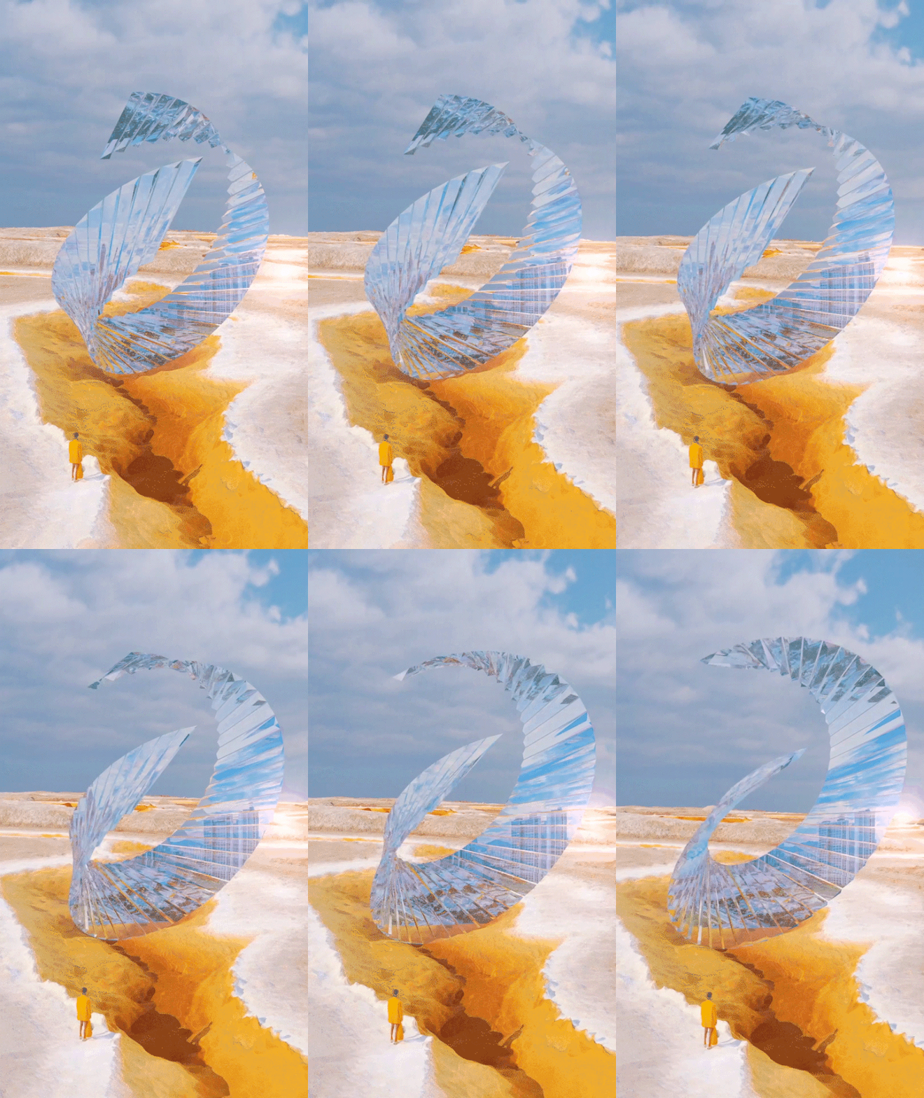
Blooming in Light: Cao Yuxi x Marisfrolg
Cao Yuxi’s art moves away from abstraction with a series of evocative visuals created for the AW 2022 collection of the Chinese fashion brand Marisfrolg.
Taking inspiration from multiple disciplines, including fashion, art, technology and design, the collection was conceived as a “light-seeking journey” from the city to nature.
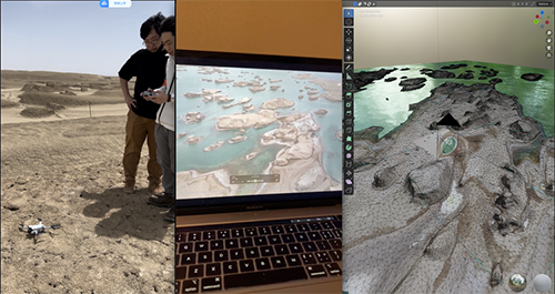
Using scanning technology, Cao Yuxi captured three-dimensional aerial images of the landscapes featured in the collection - the Qinghai lakes - before reproducing and customizing them to build a new virtual natural world.
Yuxi produced a stunning series of artworks, using light to create a portal connecting the city with nature by exploring physical changes such as refraction, reflection and scattering of light.
In the post-epidemic era, Yuxi’s imaginary portal generates a new dimensional space between the real and virtual worlds.
The series was exhibited during Marisfrolg AW 2022 fashion show.
See more of Yuxi’s work here!
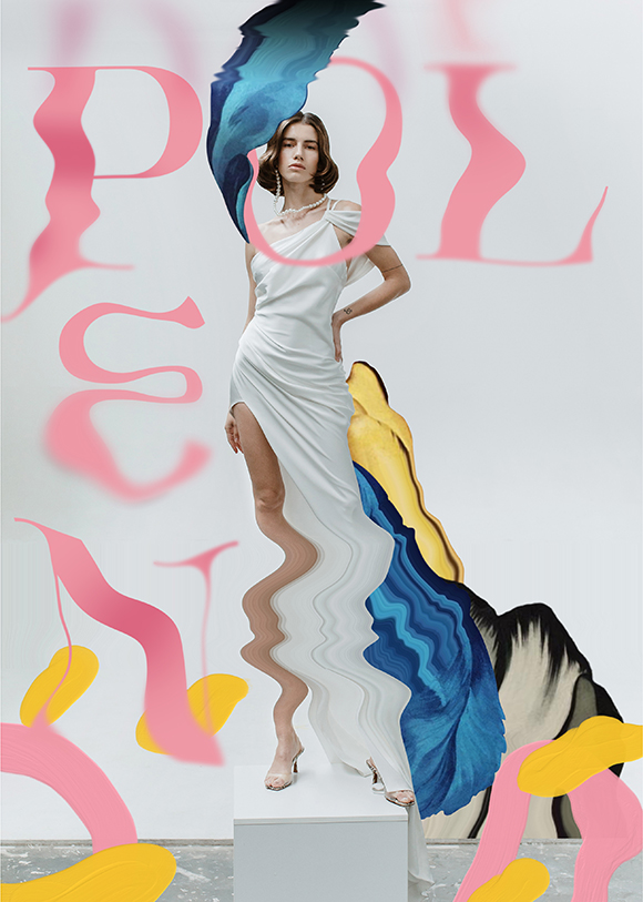
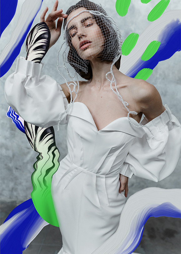
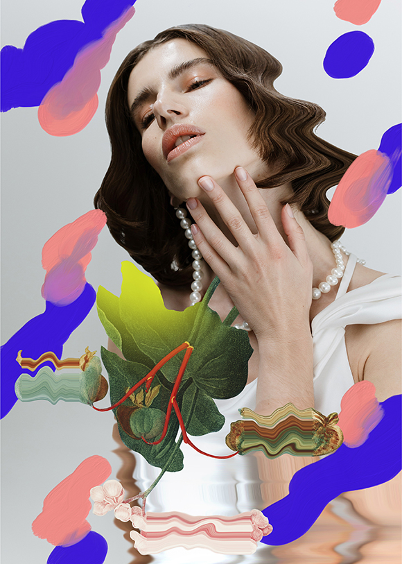
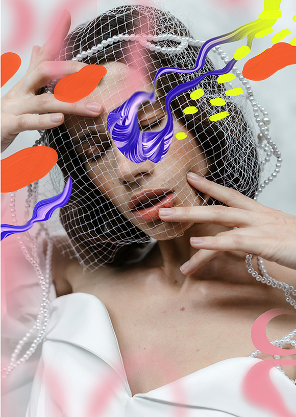
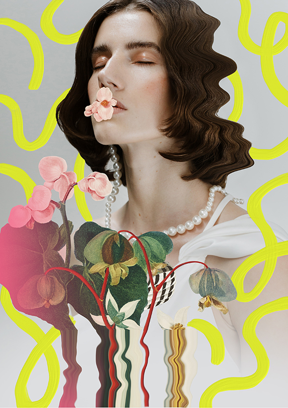
POLEN: Captivating, ethereal artworks by Becha
Becha creates captivating, ethereal compositions that strike with grace and beauty, and her latest editorial collaboration with photographers Danilo and Sharon is no exception.
Using a skilful combination of hand-painted brush strokes and digital collage techniques, Becha beautifully explores our dissonant perceptions of pollen: a healing, fruitful natural treasure, yet a dreaded allergen.
“I wanted to present this vivid dance with the gentle feminine portraits, with eyes closed, feeling joy and struggle at the same time”, she explains.
Full credits:
Photography: Danilo & Sharon
Hair: Dalibor Vrtina
Makeup: Ena Jović
Styling: Tijana Žunić
Model: Maja Petrović
See more of Becha’s work here.
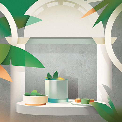
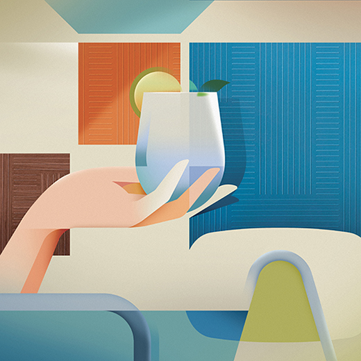
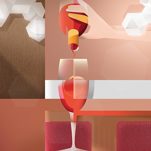
The Art of the Aperitivo: Ray Oranges x Cleaf
Needless to say, the aperitivo is a quintessential component of the Italian lifestyle - and Milan is considered by many the place where this ritual has reached new heights and given birth to iconic drinks such as the Negroni Sbagliato. Cleaf, a leading company in surfaces for interior design with their headquarters in Lombardy, wanted to pay tribute to this tradition in their 2023 calendar.
With his minimal, sleek and elegant approach, Machas artist Ray Oranges was the perfect fit to illustrate the art of aperitivo in style - this time expanding his creative process to adopt a mixed media technique.
“Creating the Cleaf 2023 calendar was an intriguing experience - I haven’t used a mixed media technique since my university days!” says Ray Oranges. “The images I made back then were completely different from my artistic work, and I had to find a trait d’union between two very different styles.”
Ray was inspired by twelve iconic Milanese bars, expertly mixing architectural features and drinks while seamlessly integrating Cleaf’s textures into each artwork. “I used the colours of the Cleaf materials selected for each artwork on the illustrative parts and then added a bit of noise to harmonise the composition”, recalls Ray. “The photographs of Cleaf’s materials obviously had a very high resolution, and I could scale them accordingly, and I used a gradient effect to enhance each specific texture. I also made juxtaposing the different elements smoother with a very subtle shading that added depth to the composition.”
The result is a stunning and sophisticated series of illustrations that each convey the special aperitivo atmosphere to accompany every calendar month.
We will reveal new artworks throughout the year, so keep your eyes peeled for more!
See more of Ray Oranges’ work here.
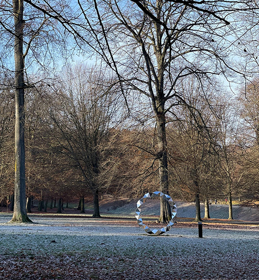
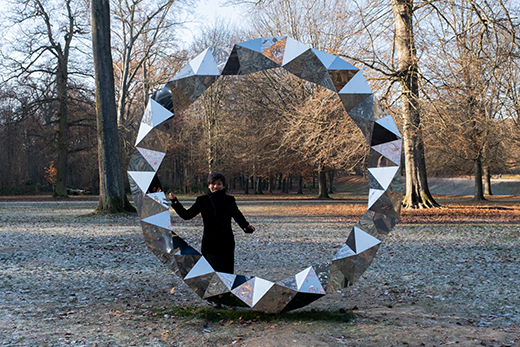
A Call to Travel: Ensō by Kaz Shirane unveiled in Brussels
Following the successful exhibition of Prism Wall at Villa Empain for The Light House group show, Kaz Shirane was invited to participate in A Call To Travel, a sculpture trail initiated and curated by the Boghossian Foundation.
Located in the Bois de la Cambre, a few steps away from the Villa Empain, the journey invites the public to walk, contemplate and interact with six contemporary artworks.
Kaz Shirane imagined a stunning artwork intended to dialogue with the surrounding nature. The spectacular circular shape, featuring his distinctive use of multifaceted mirrors that delicately reflect the park’s foliage, bark and light, appears in a perfect dynamic balance with its surroundings, fascinating and peaceful at once.
“In this sculpture, three stripes are folded into triangles and twisted to form a large circle”, explains Shirane. “Made of heavy stainless steel with a mirror finish, the structure creates an impression of transparency as it reflects the surrounding scenery of Bois de la Cambre”.
With this artwork, Kaz Shirane aimed at creating an eternal symbol inspired by two oriental thoughts - the Zen ensō symbol and the concept of Yin and Yang. “In Zen, “ensō” is a circle drawn with a single stroke, with no starting or ending point”, explains the artist. “The circle is said to represent the infinite, while Yin and Yang complement each other to form a whole, beyond which a dynamic new world can be created.”
In the aftermath of the global Covid-19 pandemic, the artwork appears as a symbolic gateway to a new world and an invitation to move forward, according to Shirane.
Becoming one with its environment, Ensō is an ever-evolving artwork that changes from sunrise to sunset and throughout the seasons. It will be on display until December 2023.
See more of Kaz’s work here.
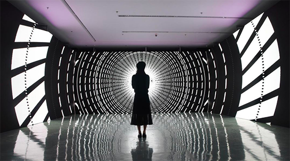
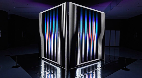
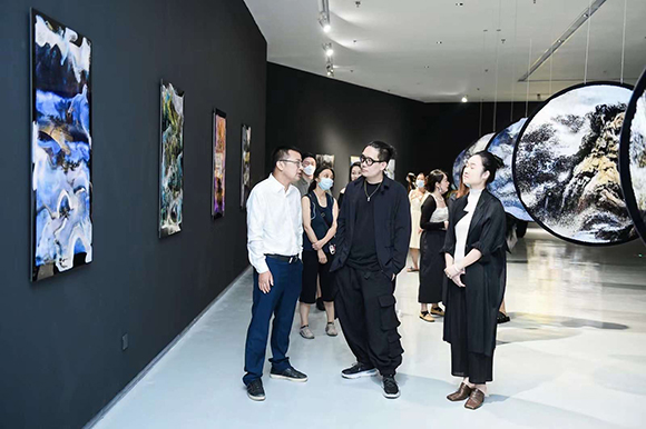
Solidified Dimension: Cao Yuxi’s impressive first solo museum exhibition opens in China
Following his role as Visual Effects Director for the opening ceremony of the 2022 Beijing Winter Olympics, Machas Artist Cao Yuxi opened his first art museum exhibition, Solidified Dimension, on the occasion of the second anniversary of the Guangming Culture and Art Center.
This exhibition showcases more than 100 artworks created by Yuxi in recent years and includes large-scale displays and unique sound installations.
“The artist disrupts and reassembles the pixels to become a new artistic language and constantly challenges and impacts the audience’s visual experience”, stated the Guangming Culture and Art Center.
Cao Yuxi’s work is on show at the Guangming Culture and Art Center, China, until 19th November 2022.
See more of Cao Yuxi’s work here!
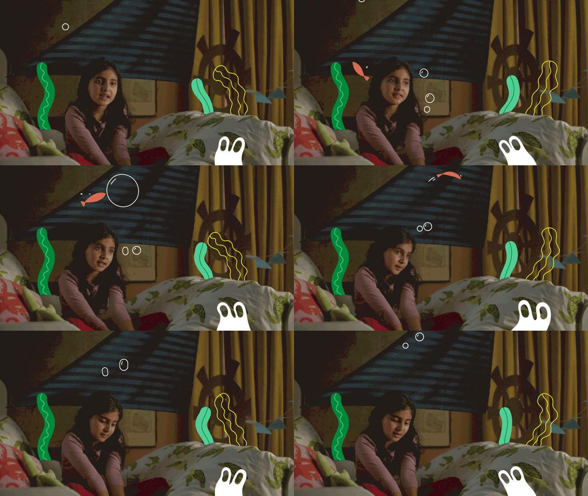
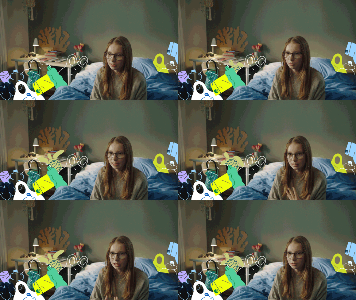
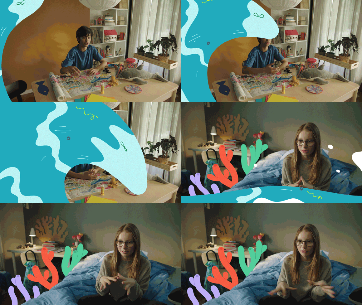
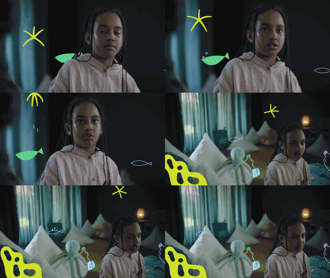
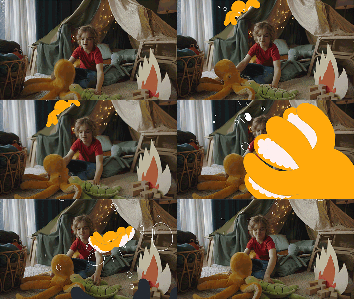
Miguel Angel Camprubi x IKEA BLÅVINGAD Kids Collection
Miguel Angel Camprubi’s light-hearted animated world takes over the new IKEA Denmark film campaign!
Collaborating with Scandinavian agency Blonde Inc, Miguel created two eye-catchy films for BLÅVINGAD, a new IKEA collection designed to spark play and curiosity about the ocean for children and young teens.
With his friendly, playful, imaginative style, who else better than Miguel could illustrate and animate life in the ocean and its adorable creatures?
See more of Miguel’s work here.
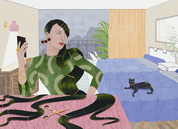
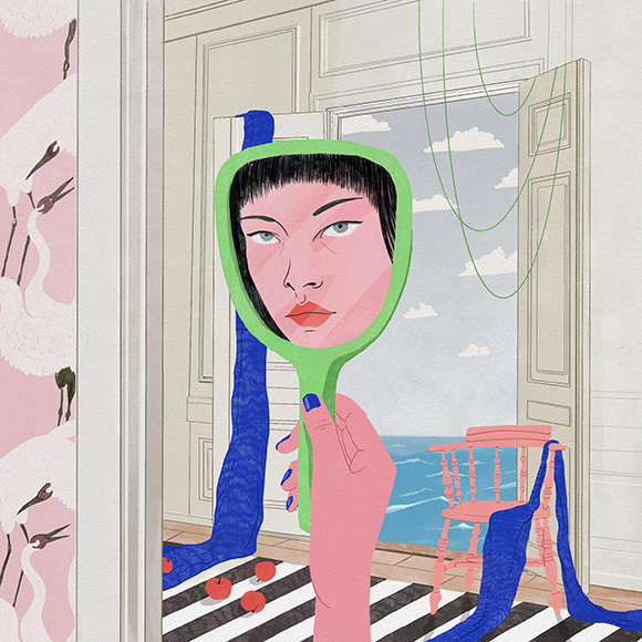
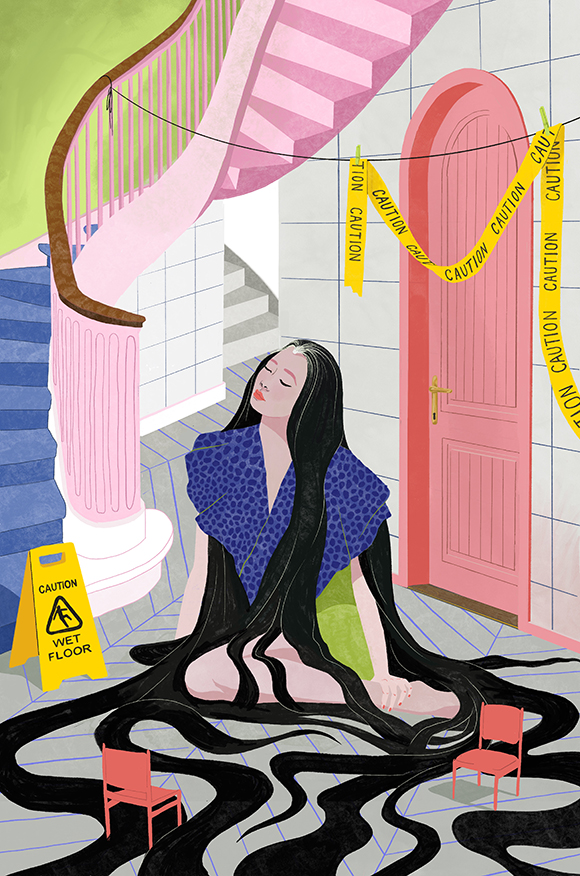
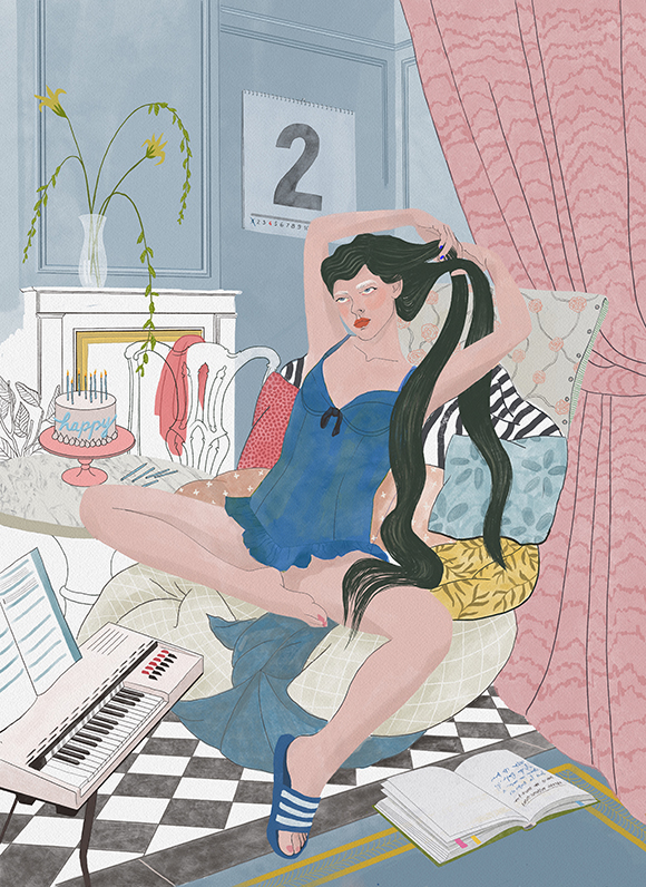
BECHA illustrates millennial women’s social anxiety in a new series of artworks
Mixed-media artist BECHA expands her illustration practice with this new series of digital artworks made with ProCreate.
In this series, BECHA captures millennial women and their relationship to anguishing and taboo themes such as social anxiety and hair loss. Normally the cheeky and cheerful gal, BECHA continues exploring the darker side of her artistic view whilst broadening her visual language.
Keep your eyes peeled for more to come soon, and see BECHA’s portfolio here!
Kaz Shirane x Noor Riyadh 2022
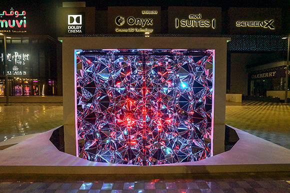
After exhibiting twice at the Sharjah Islamic Arts Festival in UAE, Kaz Shirane returns to the Middle East with a stunning artwork unveiled on the occasion of the Noor Riyadh Festival 2022.
The renowned citywide festival of light welcomed Shirane and a group of selected international and local artists to reflect on the theme “We Dream of New Horizons”.
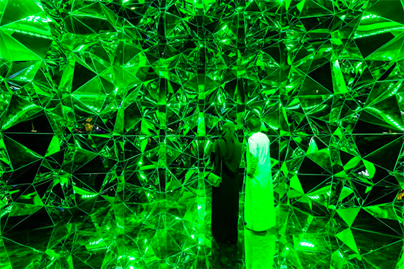
The Machas Japanese artist presented “Mirage”, an immersive piece exploring our relationship to space and reality. With this installation, made of polished stainless steel, Shirane uses mirrored surfaces’ mysterious and fascinating nature to reveal what is beyond the viewer’s perception. Objects and people are projected and transformed while enchanting lighting effects immerse the audience into a new dimension like any they’ve seen before.
“With this installation, I aim to reveal the unknown, invisible world using the power of mirrors. This artwork is similar to a mirage that appears on the desert’s horizon - a mysterious natural phenomenon caused by the refraction of light.”
Manifesting the mystery of perception, Shirane’s artwork becomes a mirage on the desert’s horizon, confirming Riyadh as the perfect home for his installation.
“Mirage” will be on view until 19th November 2022.
See more of Kaz Shirane’s work here.

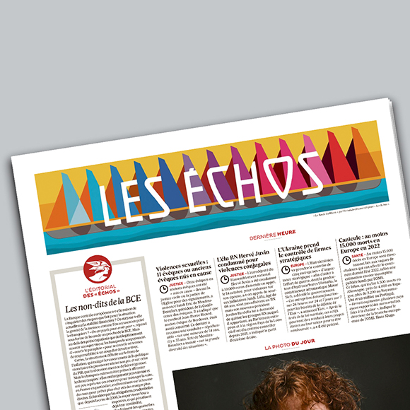
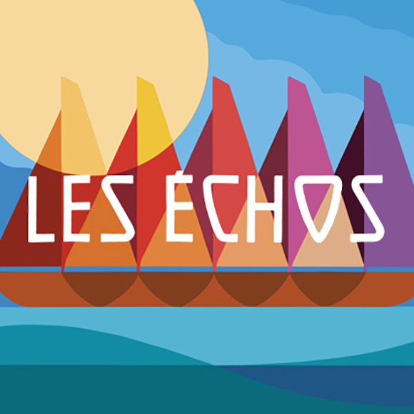
Fernando Chamarelli’s new illustrated logo for Les Échos
Machas Brazilian illustrator Fernando Chamarelli collaborates once again with French newspaper Les Echos on a new beautiful, brightly illustrated logo. The artwork was accompanied by a short interview where Fernando talked about his work and current inspirations.
“My universe is 2D and full of vibrant colours. I split my work between canvas painting, mural painting and digital arts. I love to paint with acrylic paint, but I’m currently in a digital phase, drawing on Procreate every day” explains Fernando to Les Echos.
This time, the Machas Artist was challenged to capture the iconic boat race La Route Du Rhum 2022. “My art style is unique, geometric and contemporary,” says Fernando. “I’m currently very inspired by the ideas of the Solarpunk movement, and I’m planning to create a series of paintings around this theme.”
See more of Fernando Chamarelli’s work here!

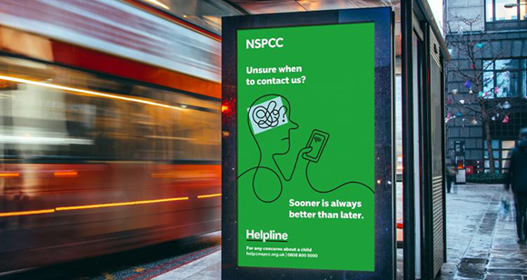
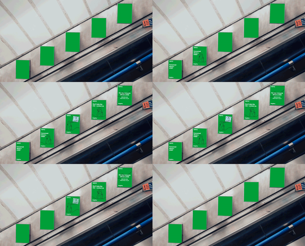
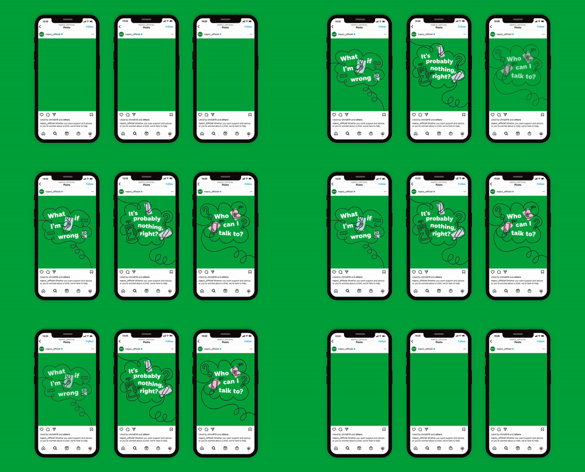





Graphic Lifeline: Jonathan Calugi x NSPCC
The National Society for the Prevention of Cruelty to Children (NSPCC) Helpline is a UK-based service where adults can report concerns about a child’s safety or well-being. The service, not to be confused with Childline, which is for children to access, tasked London design agency Baxter & Bailey to help clarify the Helpline’s purpose and to encourage people to report their concerns and feel “more comfortable” doing so.
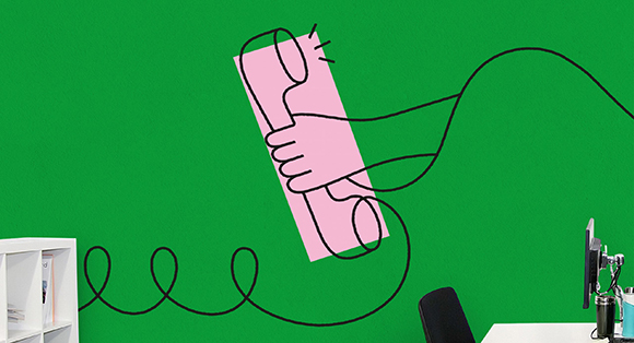
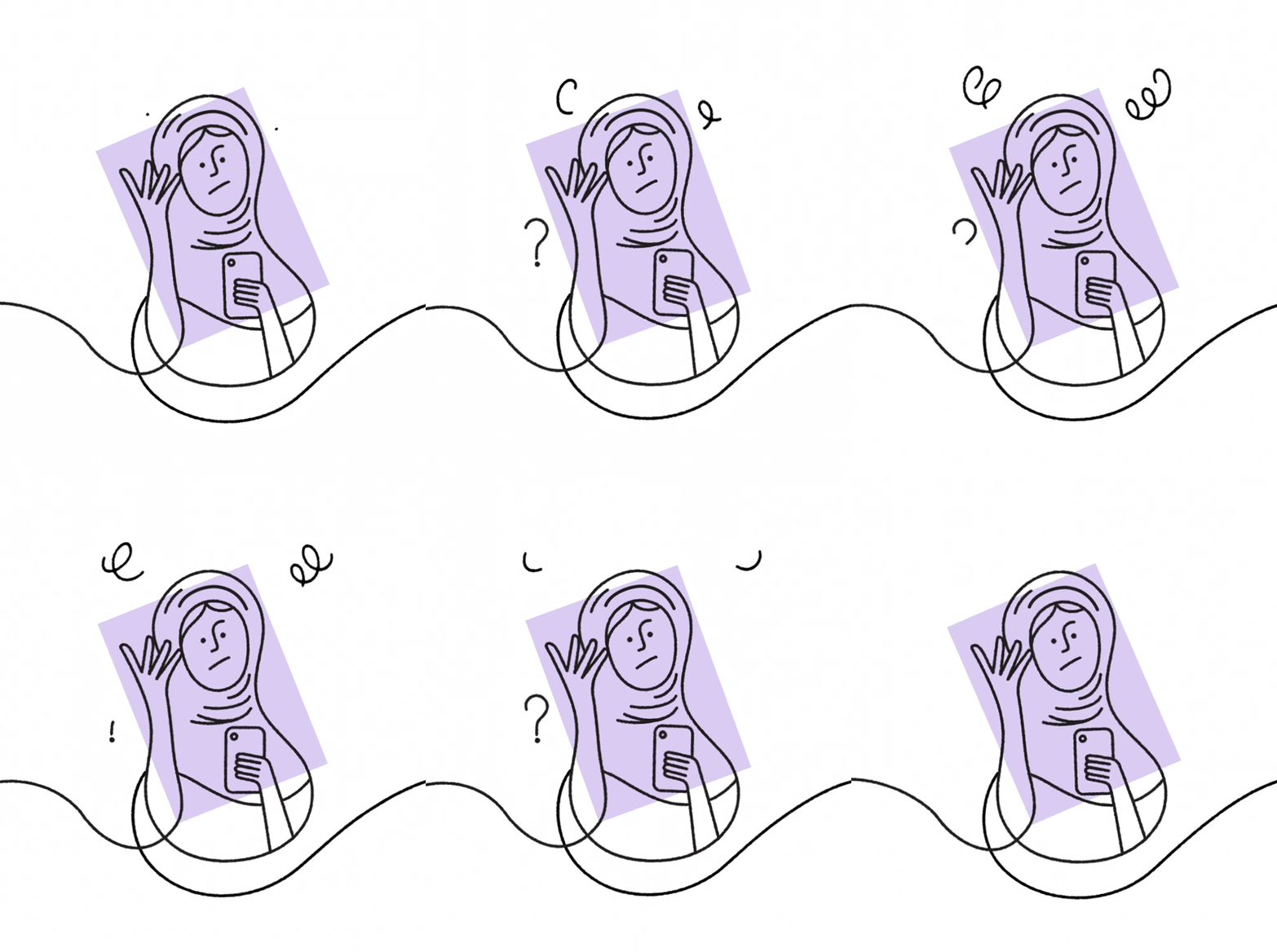
Devising a “graphic lifeline” running throughout the new identity as the key element to provide reassurance for those looking to access the service, Baxter & Bailey brought in Machas Artist Jonathan Calugi to bring to life their creative concept.
According to Baxter & Bailey Designer Lydia Fisher, Calugi’s iconic and “flexible style” was applied to both “simple and graphic” depictions and “more complex scenes.” The hand-drawn line highlights different points of contact and represents “a constant, ever-present source of help and support.”
The NSPCC Helpline’s new campaign has launched digitally and will be followed by a wider roll-out across physical assets.
See more of Jonathan Calugi’s work here!
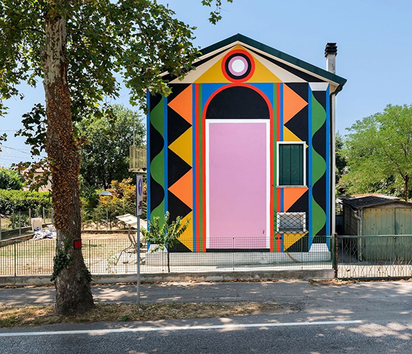
A Doorway: Agostino Iacurci signs a new striking mural in Italy
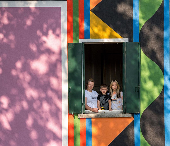
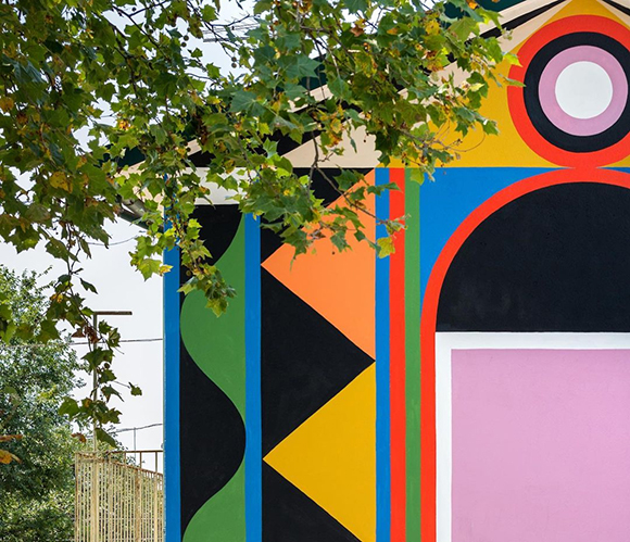
When entering the city of Vallà in the province of Treviso, Italy, it is impossible to miss Agostino Iacurci’s new mural, “A Doorway”.
Inspired by the area’s notable history, Agostino transformed the 60s building into a larger-than-life, multicoloured gateway - a symbolic doorway to the town.
“The portal or the monumental door is a recurrent theme in the architecture of the area,” says Agostino, “with exquisite examples such as the magnificent facade of Villa Emo and Villa Maser by Palladio to the neoclassical Temple of Canova and the propylaea of the Brion Cemetery by Carlo Scarpa, to name a few. But the whole area of Treviso boasts a rich decorative wall tradition dating back to the 13th century.”
The collective Bocaverta invited Agostino to participate in THE WALLÁ, a local urban regeneration project, and “A Doorway” is a new local landmark in Vallà, contributing to energising the town damaged by a tornado in 2009 through engaging, colourful art.
See more of Agostino Iacurci’s work here.

Jonathan Calugi x Wyth
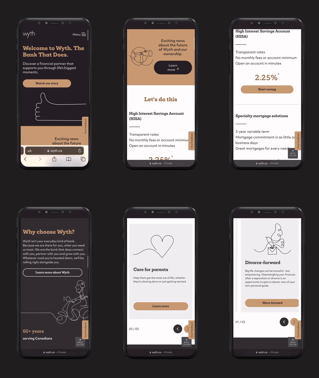
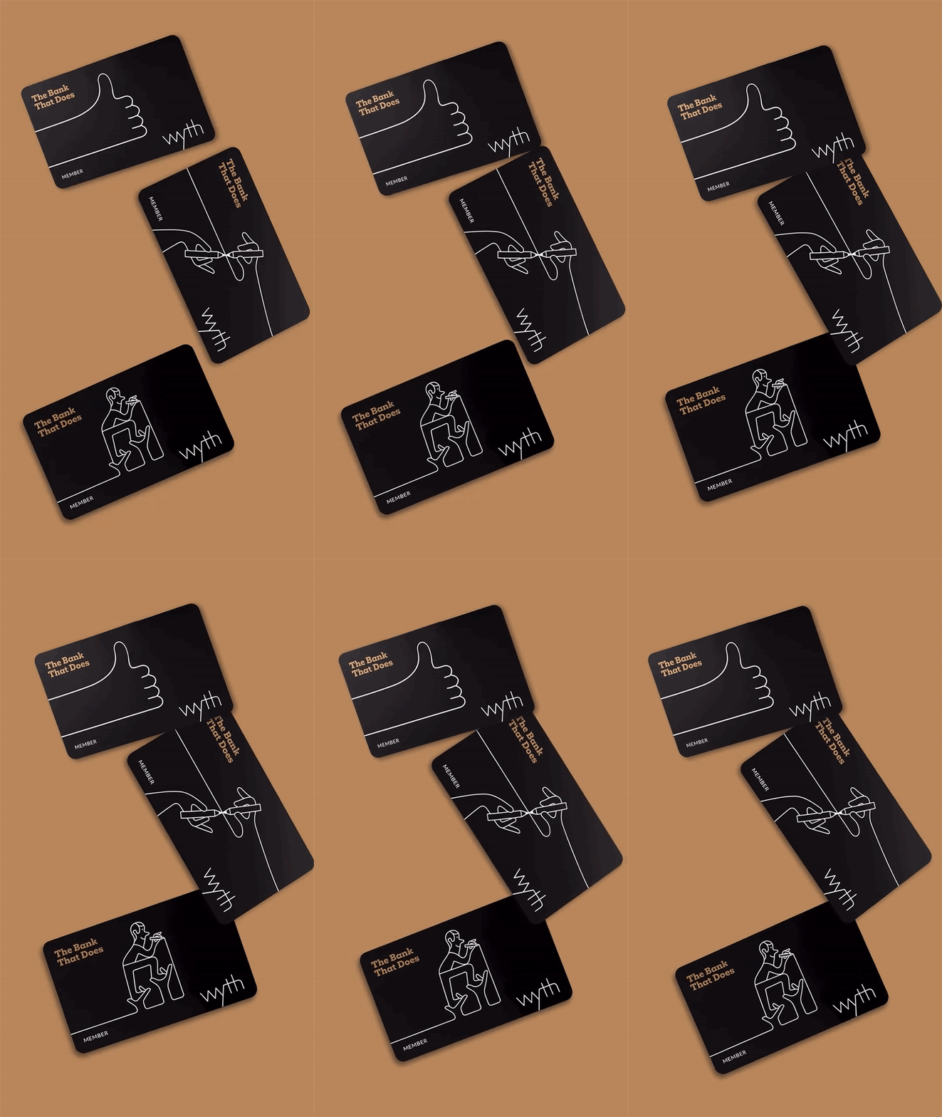
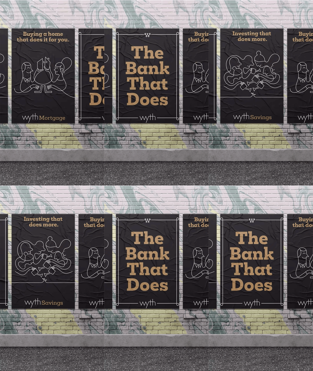
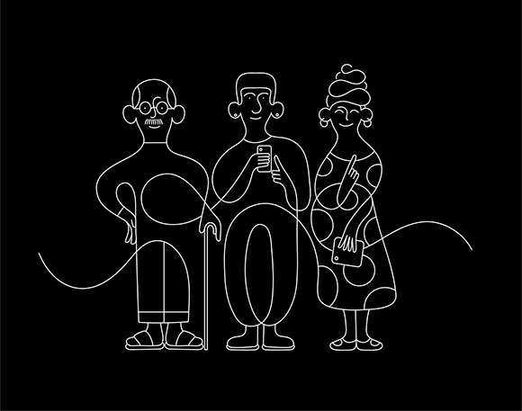
The newly launched digital-only Canadian bank Wyth is “The Bank That Does”, and PS&Co Brand Studio found in Jonathan Calugi’s bold yet approachable illustrative style the talent to bring such a positive and can-do attitude to life.
“Together with PS&Co, we created a series of different imaginative words for people to connect with and create their own story,” explains Calugi. “In the rebranding journey for Wyth, we searched for the most effective solutions to visualise the most important moments in people’s lives and the path leading to those milestones, whilst ensuring that the illustrations reflected the bank’s inclusive and diverse customer base.”
“I think people will love the simplicity of the illustrations, the idea of I could draw this, and the resulting feeling of immediate connection”, concludes Jonathan.
The result is a bold, striking series of illustrations for the brand to use across all their touch points. The illustrations were brought to life through animations by Blatant Studio.
See more of Jonathan Calugi’s work here!
Dance Of Light: Kaz Shirane unveils a new art installation in Venice
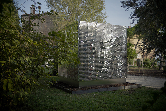
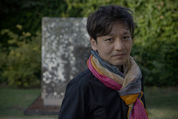
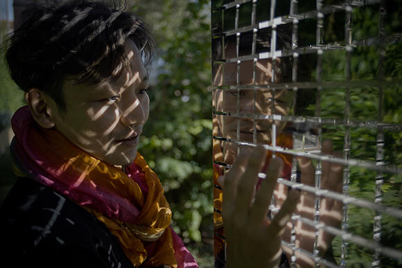
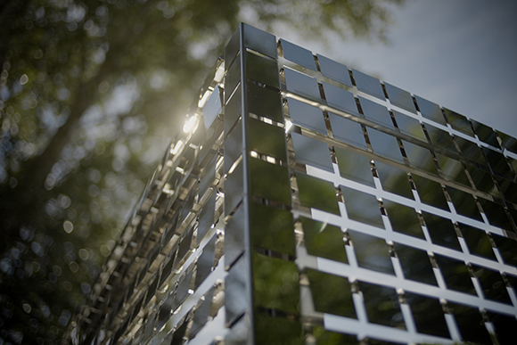
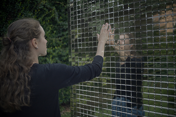
With “Dance of Light”, Shirane continues exploring two of his preferred materials, mirrors and light, while experimenting with new forms and interactions.
“This artwork is a light sculpture based on a collaboration between invisible forces », explains the artist. The installation enables a multi-sensorial interaction with its surrounding environment as an ever-evolving piece. Thin mirror plates sway in the wind and produce a soft, music-like sound, while the reflection of the sun rays and the surrounding landscape creates distortions, light and shadow around the metallic cube. « It is as if the light is dancing », suggests Shirane.
Through this project, Kaz Shirane presents a piece in which the artist doesn’t fully control the output of the artwork, but it is completed in dialogue with nature and the viewer.
The site-specific artwork is displayed in the Marinaressa Gardens, a scenic park along the Riva did Sette Martiri and will be on view until 27th November 2022.
The project was supported by the Pola Art Foundation, the Arts Council Tokyo, the Nomura Foundation, the Yoshino Gypsum Art Foundation, the Union Foundation for Ergodesign Culture and Yoshizumi Press.
See more of Kaz Shirane’s work here.
Photographs by Antonio Messana
Ray Oranges x Brera Design District
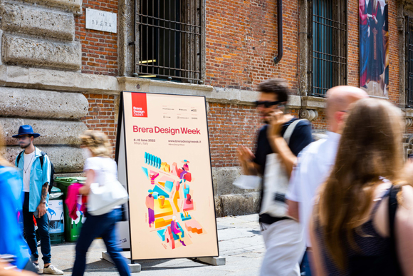
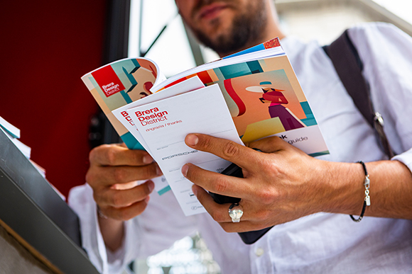
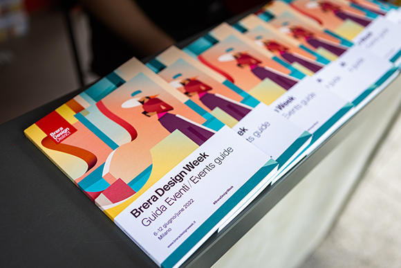
On the occasion of the Salone Del Mobile, Machas Artist Ray Oranges was selected by Brera Design District to capture the essence of the Milanese design-led district.
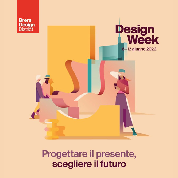
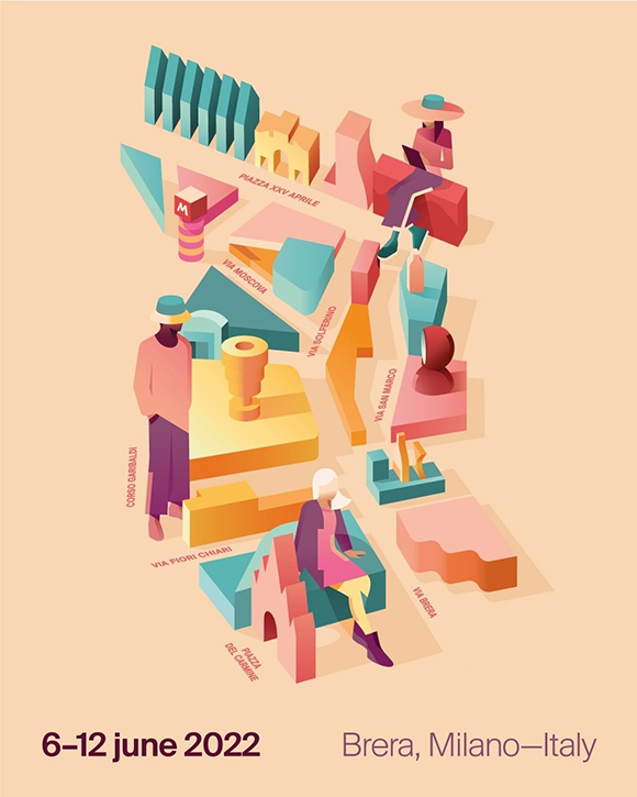
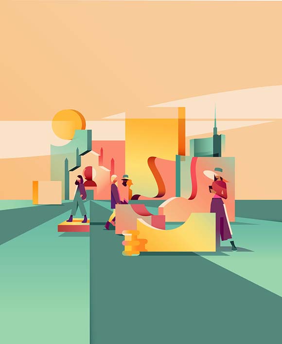
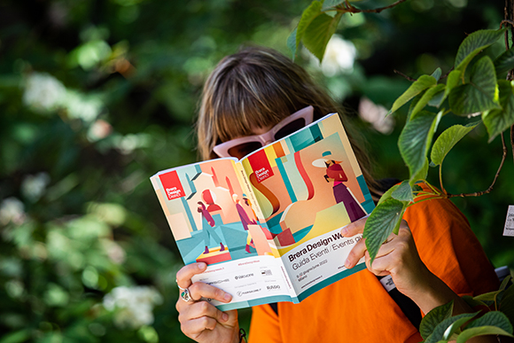
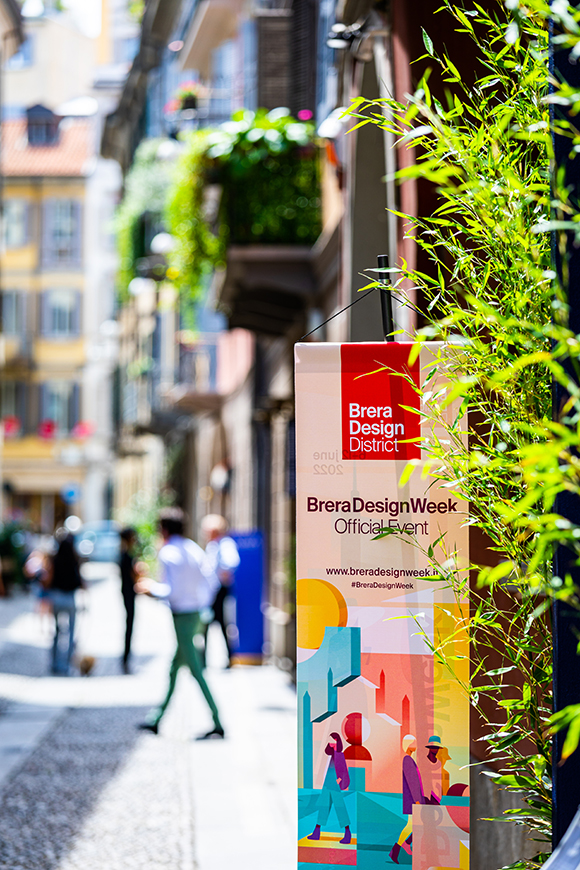
Illustrating this year’s theme, “Designing the present, choosing the future”, Ray created a stunning mix of architectural elements, design classics, contemporary characters and abstract geometrical shapes.
“For Brera Design District, I allowed myself to be inspired by the emotions and sensations that Brera evokes in me”, he explains. “I defined a series of geometric blocks that combined together created the impression of a window on the horizon and, at the same time, referenced iconic shapes of the design, like the Arne Jacobsen armchair.”
True to his precise, sleek approach, the collaboration resulted in two striking and contemporary illustrations, including an illustrated map of the area.
“I like to use this highly structural architectural approach because I believe cities have an identity, and their characteristics are defined precisely by the buildings and everything that man has built”, develops Ray.
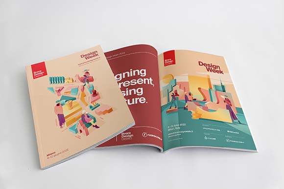
From posters to printed brochures to website and social media, the artworks were used across various Brera Design District’s collaterals, making for an outstanding collaboration between art and design.
See more of Ray Oranges’ work here.
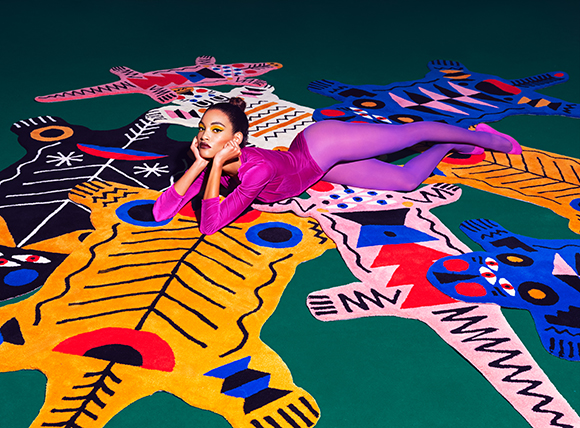
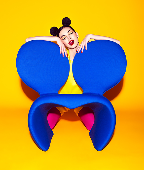
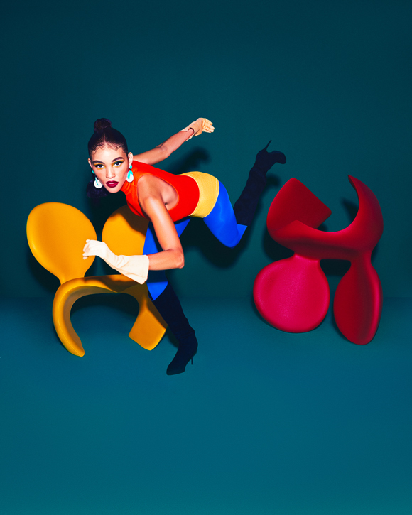
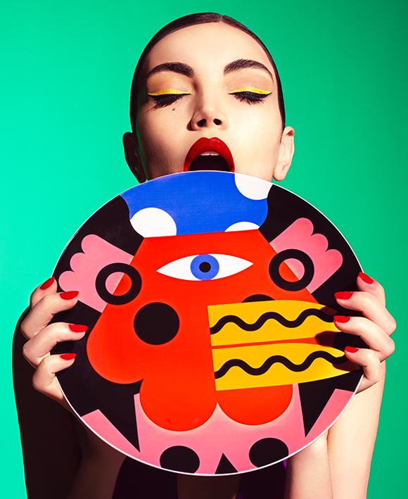
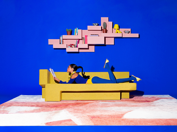
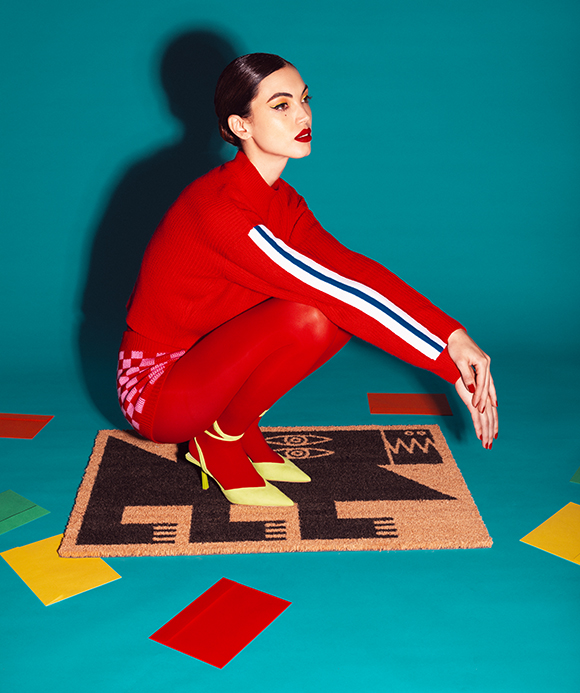
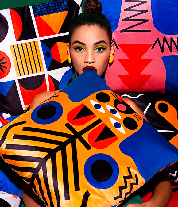
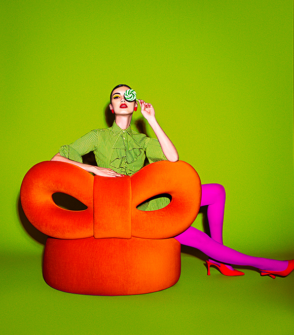
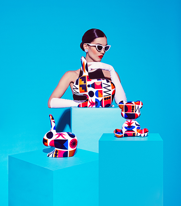
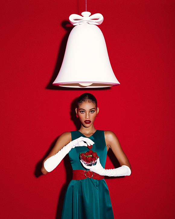
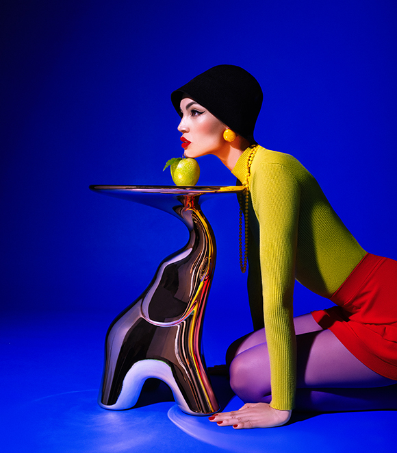
Elena Iv-Skaya signs a new series for Qeeboo
Machas photographer Elena Iv-Skaya keeps blurring the lines between fashion and design, teaming up again with Italian design brand Qeeboo on their 2022 catalogue.
Following up on the 2020 collaboration, the Geneva-based photographer signs a new, irresistibly eye-catching series with an even bolder, more playful and daring approach.
With bright-colored backgrounds and color-blocking styling, the images bring together Elena’s graphic and highly contrasted signature style with Qeeboo’s iconic creations in a playful celebration of design and joie de vivre.
Released for Milan’s Salone del Mobile, Elena’s series has captured Qeeboo’s luxurious yet tongue-in-cheek essence with irreverence and style.
Credits:
Client: Qeeboo
Agent & Producer: Céline Vignes at Machas
Photographer: Elena Iv-Skaya
Models: Daphnée Kbidi, Graziella Araujo
Stylist: Chiara Tarantino
Stylist assistant: Antonella Maiorino
Hair & Make-up: Daniella Isabella Valenzi
Set designer: Alessandro Mensi
Set designer assistant: Gina Pulcini
Digi tech assistant: Filippo Ragone
Light assistant: Umberto Corsico
See more of Elena Iv-Skaya’s work here!

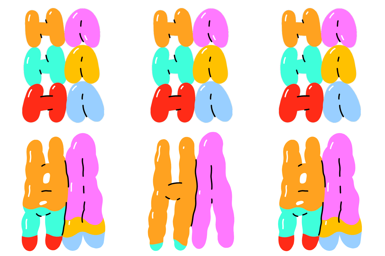
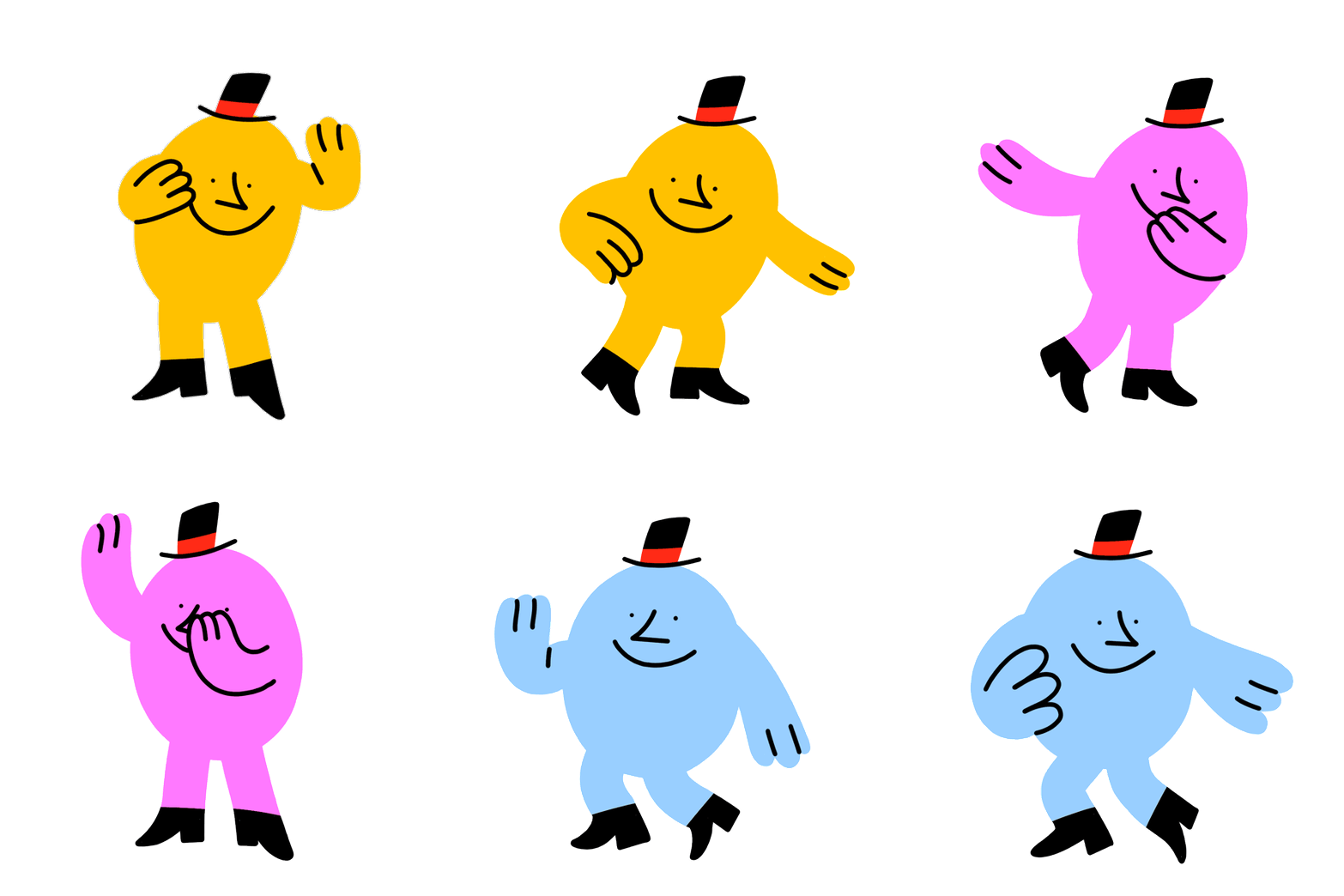
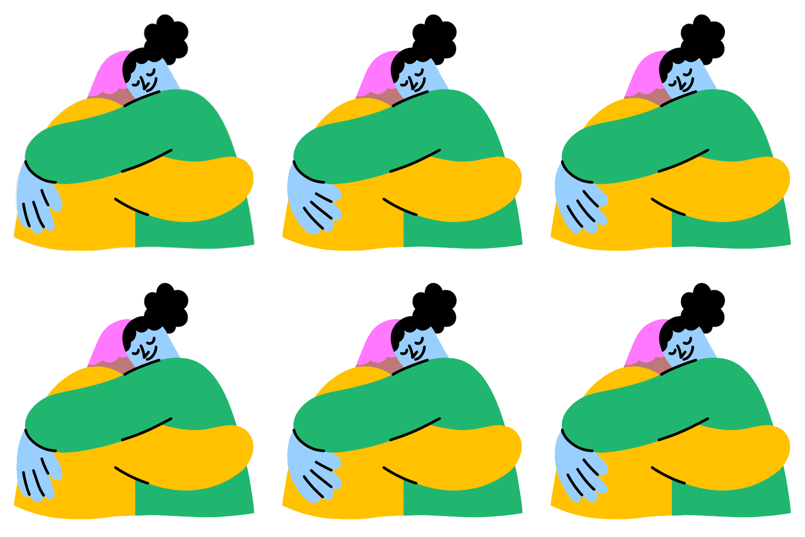
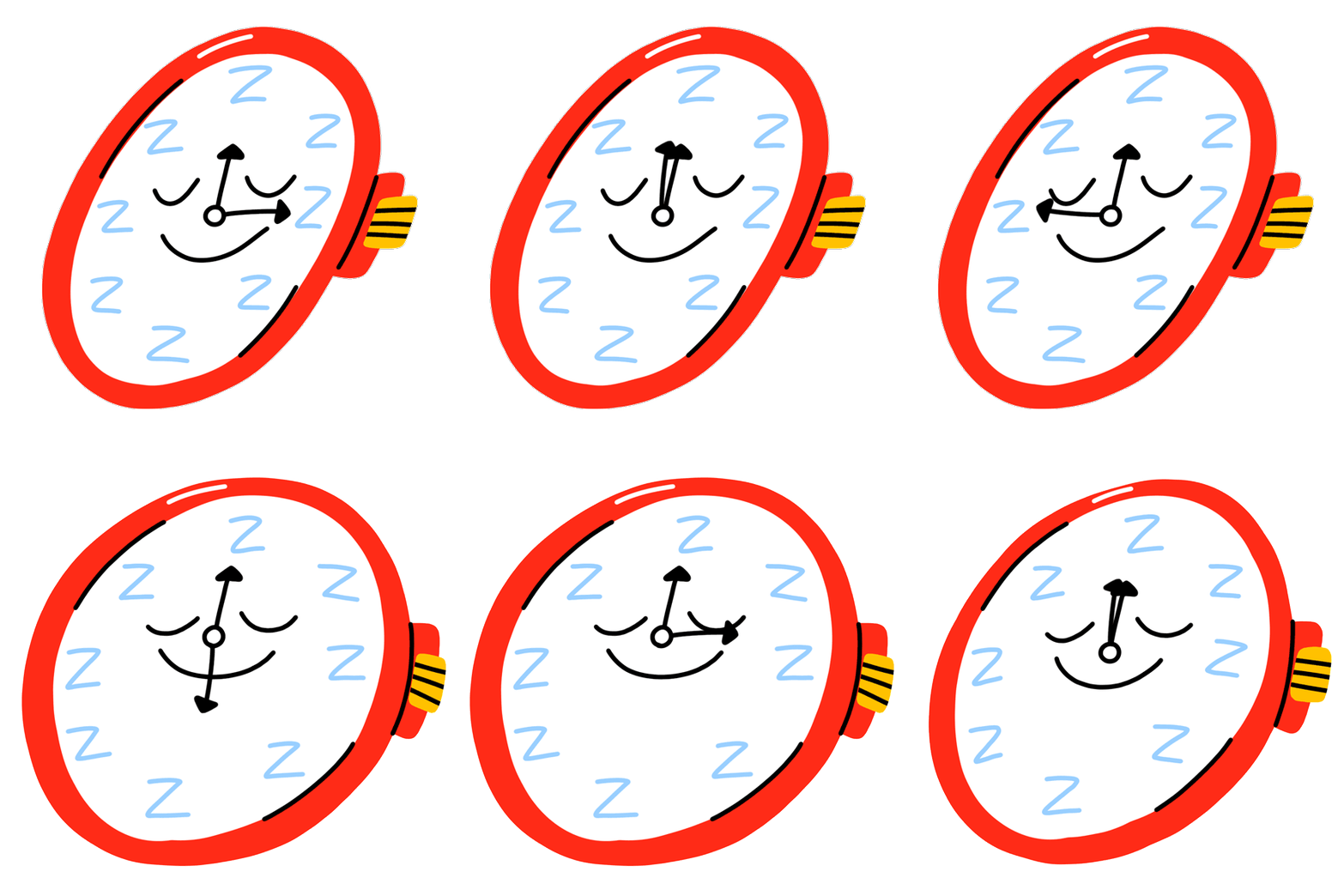

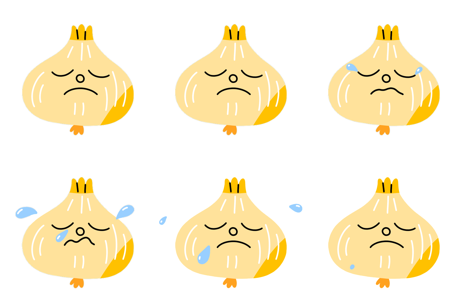
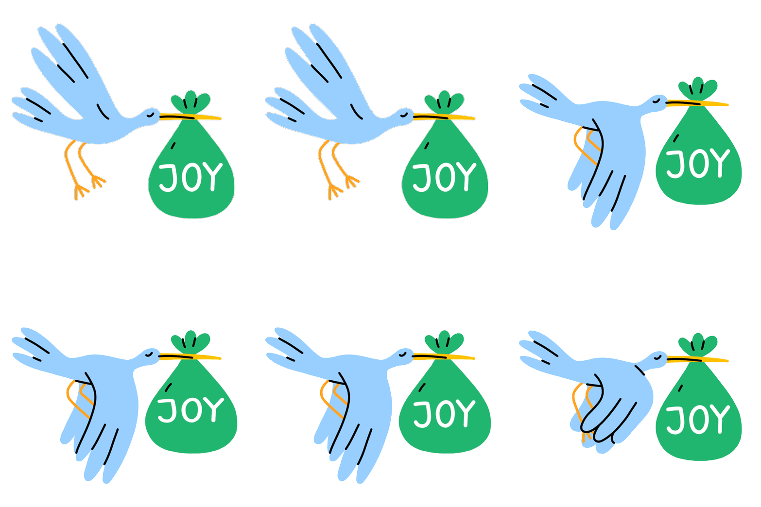
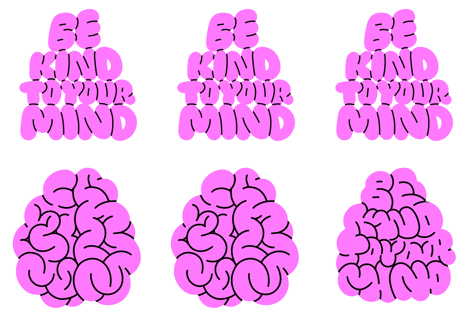
Cool stickers alert! Miguel Angel Camprubi for Pinterest
Miguel Angel Camprubi did it again! After releasing stickers on Facebook, WhatsApp, Snapchat, Signal, and Boing TV, Miguel has created a new set of relatable animations, this time for Pinterest.
The wildly popular app was looking to create simple animated stickers with a human, creative and fun feel - who’s best than Miguel to take on this brief?
From birthdays to earth day celebrations or to your mood of the day, Miguel designed a sticker for every occasion, each one with his approachable and light-hearted style. Find them on the app within the Idea Pins!
See more of Miguel Angel Camprubi’s work here!
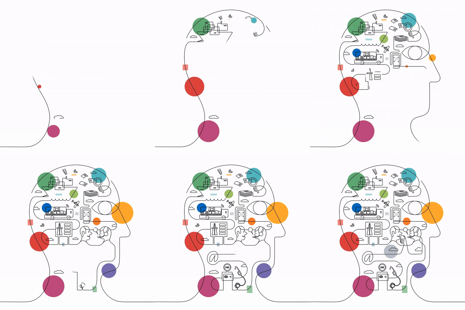
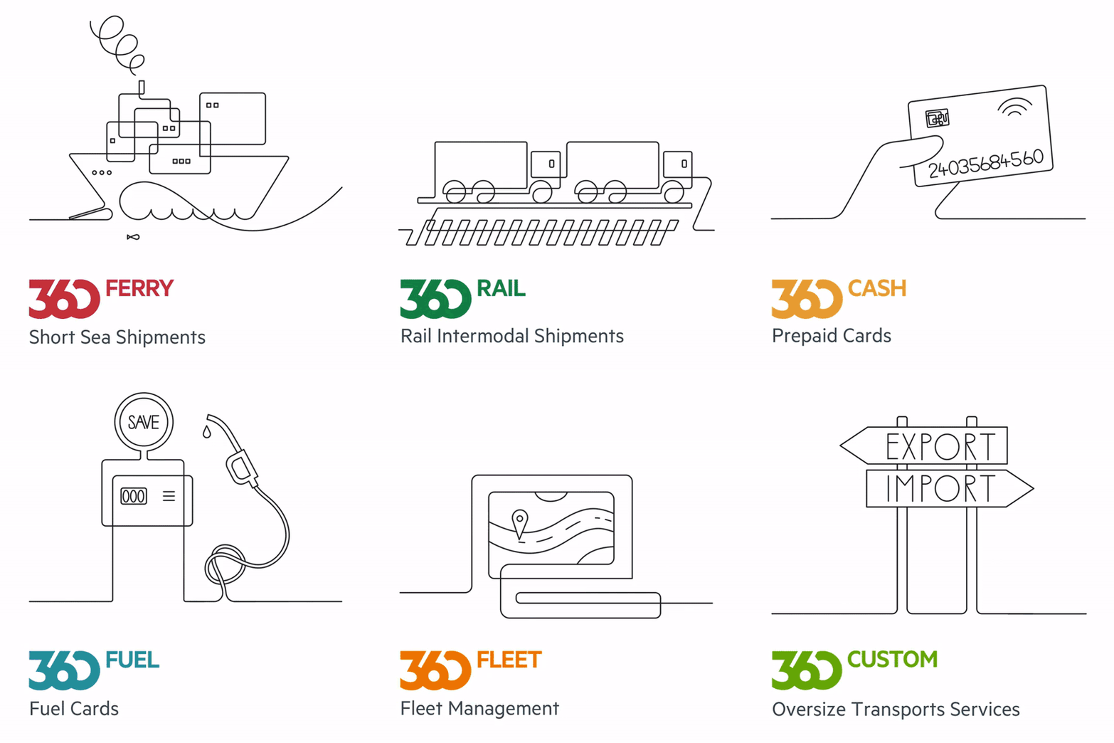
Jonathan Calugi x 360 PAY
With his fluid, effortless one-line drawing, who best than Jonathan Calugi could illustrate 360 PAY’s services?
Offering payment and supply solutions to support transport across Europe, 360 PAY needed artworks that would depict their wide range of services while conveying the ideas of dynamic collaboration and efficiency.
As part of their rebranding, Jonathan created a series of illustrations, all seamlessly weaved together in simple and striking compositions.
The smooth flow of Jonathan’s designs was emphasized through a series of animations produced by design agency Bunker.
See more of Jonathan Calugi’s work here!
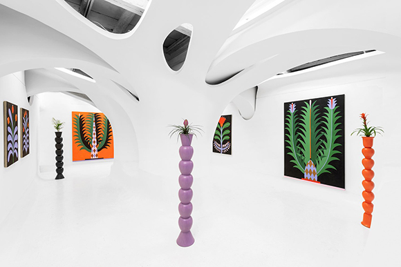
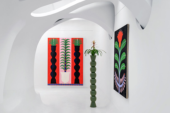
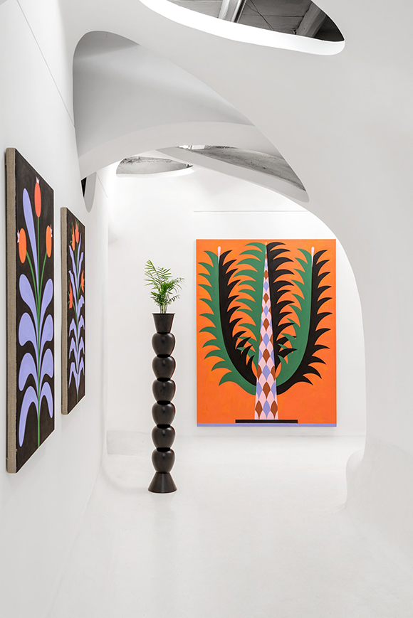
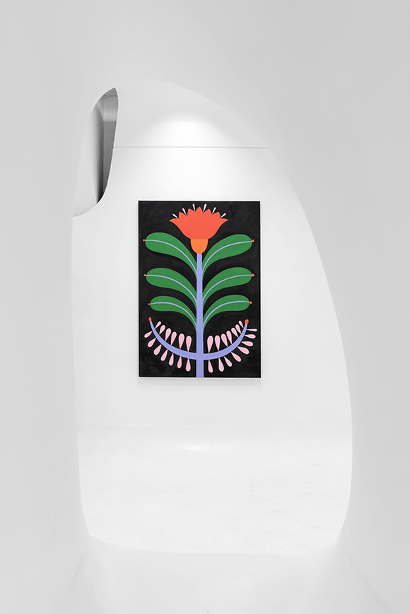
Of my abstract gardening: Agostino Iacurci’s solo show in Rome
Agostino Iacurci showcases a stunning series of paintings and glazed terracotta sculptures in an impressive solo exhibition entitled “Of My Abstract Gardening” at the Ex Elettrofonica gallery in Rome.
For this new body of works, exhibited along with living plants, Iacurci explored the subject of “Horti Picti”, or garden painting. The paintings, a recurring theme in Roman interiors’ wall decorations, presented an elegant harmony between natural and architectural elements, such as columns, fountains and statues, often favouring an ideal composition rather than a realistic representation of seasonality.
And it is this abstract approach that inspired Agostino to deconstruct and reinterpret the classical elements into a contemporary, three-dimensional art experience. This object of study, which has become a “personal obsession” for the artist in recent times, ties Agostino’s gallery works with his practice as a muralist.
Iacurci’s exhibition title was inspired by Goethe’s botanical study Metamorphosis of Plants and the paintings of the House of the Orchard in Pompei.
See more of Iacurci’s work here!
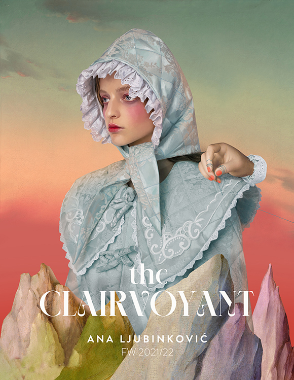
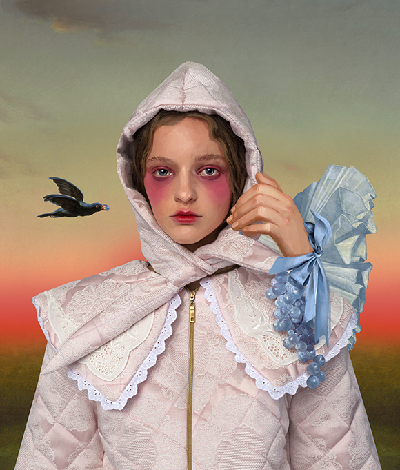
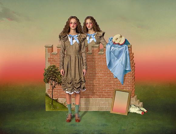
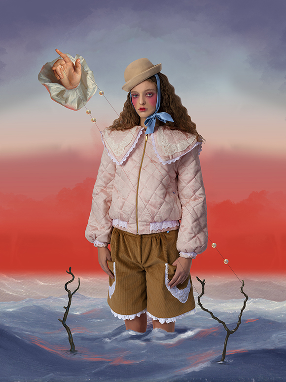
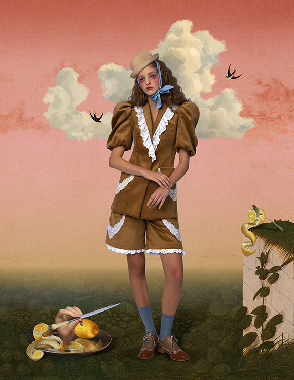
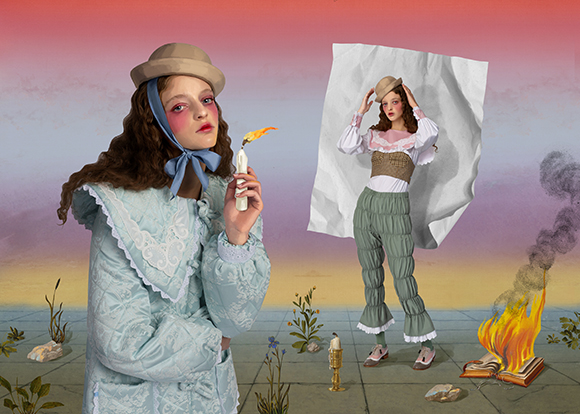
The Clairvoyant: Becha x Ana Ljubinkovic
Machas Artist Becha and Serbian womenswear designer Ana Ljubinkovic have a long history of concocting stunning creative collaborations, and their work on the FW 21/22 collection is yet another stepping point in their artistically charged alliance.
From SS 2012’s Silent Spring to SS 2013’s Never Forever, Ljubinkovic’s pop couture has resonated with Becha’s surreal vision, generating a highly distinctive and unique universe.
“Ana gave me a lot of freedom”, explains Becha. “And it is always a pleasure to work without strict conditions. Her clothes are a huge inspiration for me, and it is easy to put her vision into my world.”
Using her mixed-media magic and Ilija Milosavljević‘s photographs, Becha created a series of enchanting artworks with a surreal and mysterious twist.
“The collection’s name, The Clairvoyant, has a mystical meaning, and I wanted to capture a sense of uncertainty, of magical yet strange calmness. I wanted to take the viewer into an eerie dream, where something will happen, yet nothing is happening.”
See more of Becha’s work here.
Full credits:
Digital artwork: Becha
Photographer/casting director: Ilija Milosavljevic
Stylist: Zejak
Model: Mina Stankovic
Hair & make-up: Marko Nikolic
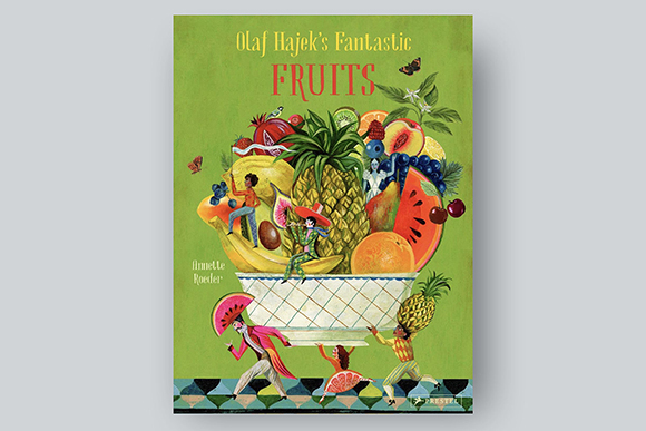
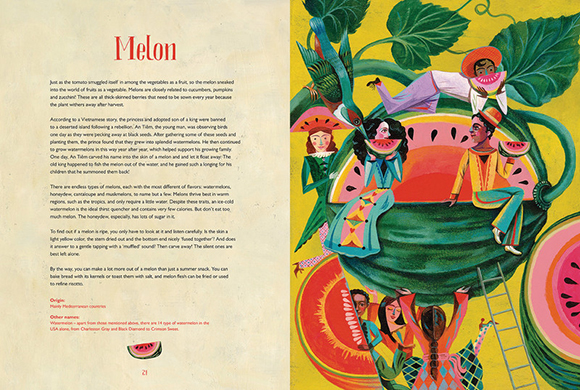
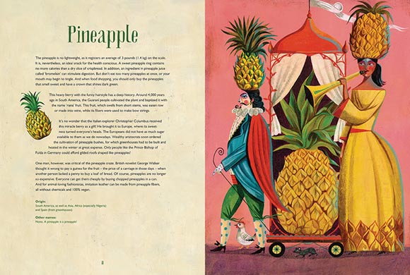
Fantastic Fruits: Olaf Hajek’s new book is out!
Following the success of “Flower Power” and “Veggie Power”, Olaf Hajek continues his beautiful exploration of flora and signs a new gorgeous title, “Fantastic Fruits”, this time exploring the fascinating world of fruits!
Published by Prestel, the new art book features Olaf Hajek’s colourful and fascinating illustrations accompanied by the words of Annette Roeder.
Rich in details and full of delicious surprises, Olaf’s delightful fruit “portraits” make for a stunning book to add to everyone’s bookshelves.
Find out more of Olaf Hajek’s work here.
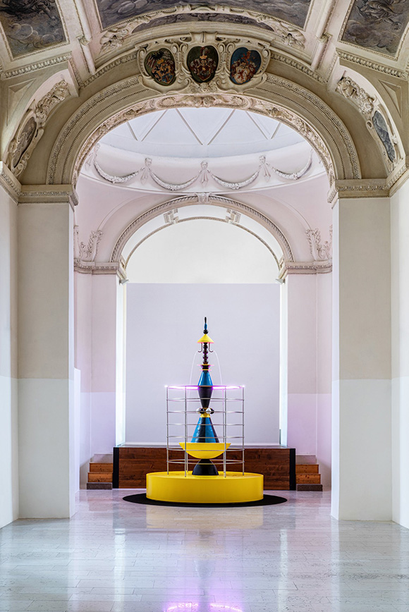
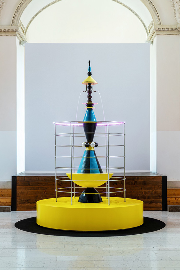
Hortus: Agostino Iacurci’s first terracotta sculpture
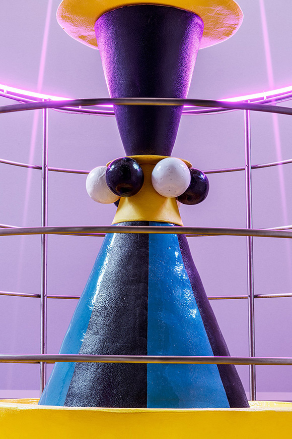
Pushing his artistic practice further by exploring new materials and techniques, Machas Artist Agostino Iacurci signs a new sculpture entitled Hortus - an impressive, contemporary and geometric fountain drawing inspiration from the myth of Paradise.
The sculpture, now showing at the baroque chapel of the Italian Cultural Institute in Prague, is composed of a glazed Impruneta terracotta fountain, circled by a structure of seven steel and neon rings reminiscent of Dante’s seven circles of heaven.
The artwork project echoes of the mythological fountain of youth, represented in the Renaissance miniature “The Garden of Love or Hortus with Fountain of Youth” from the codex De Sphaera.
Selected as part of the Italian Cultural Institutes’ Cantica21 project in Prague, the artwork has been acquired by the Luigi Pecci Center for Contemporary Art in Prato.
See more of Agostino Iacurci’s work here.
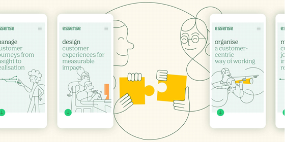
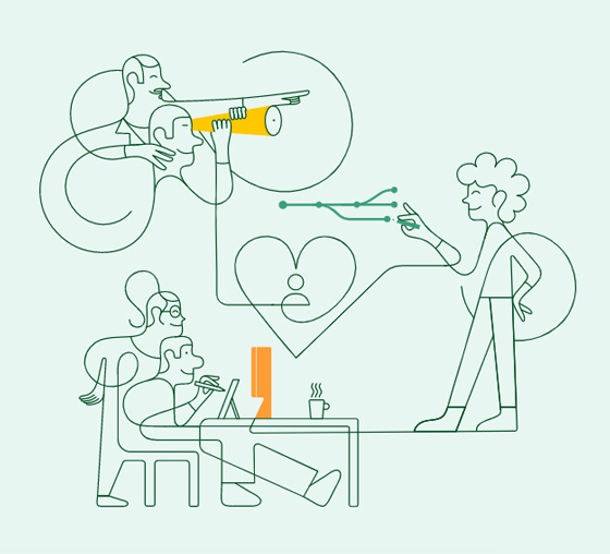
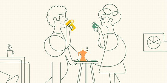
Illustrating customer-centricity: Jonathan Calugi for Essense
Jonathan Calugi helped Nok Nok Studio rebrand Essense, a dutch agency specialising in service and customer experience design, with a series of fluid, minimal line artworks.
Challenged to express Essense’s approach in a few carefully crafted and well-balanced lines, Jonathan used his unmistakable, effortless style to show a joyful, collaborative professional crowd actively designing every single aspect of the service experience.
The artworks evoke the interconnectedness of all initiatives leading to customer-centricity whilst being seamlessly integrated into the agency’s new branding materials.
See more of Jonathan Calugi’s work here.
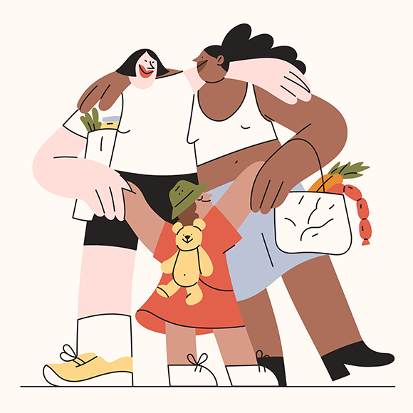
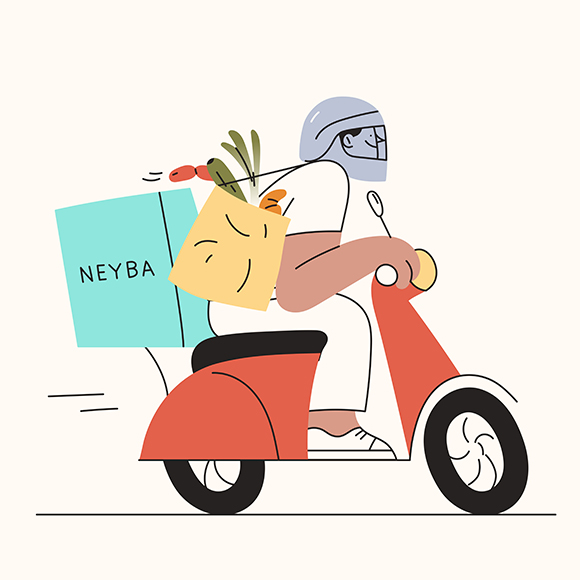
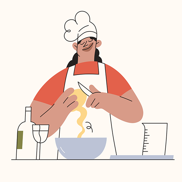
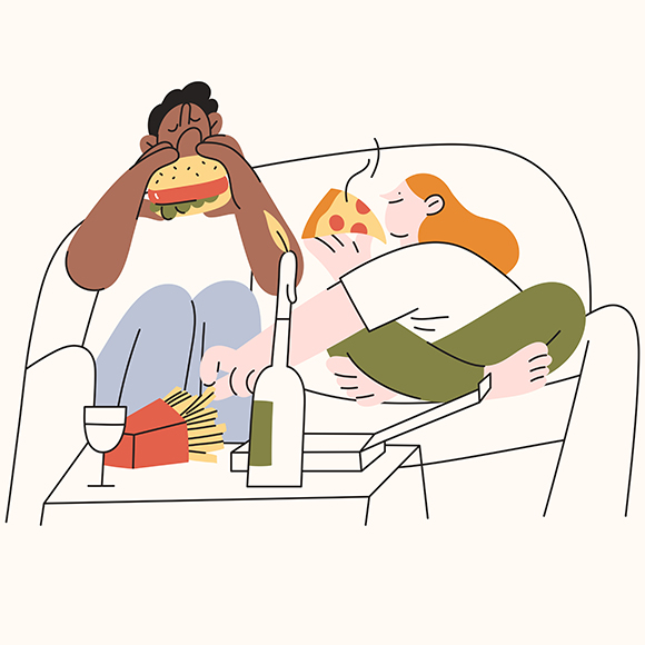


Great food close to home: Miguel Angel Camprubi for Neyba
Neyba, a multi-cuisine kitchen available for delivery & pick-up, commissioned Machas Artist Miguel Angel Camprubi to create a set of warm and neighborly illustrations to accompany their London launches.
From the veggies producer, the chef, the delivery guy, and the hungry couple, Miguel created a series of small scenarios which brilliantly captured Neyba’s ethos - approachable, fun, and energetic.
See more of Miguel Angel Camprubi’s work here!
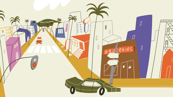
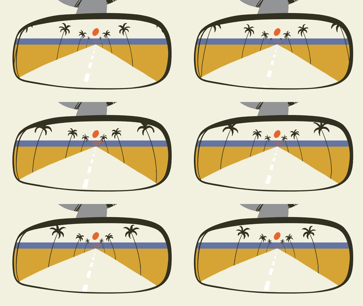
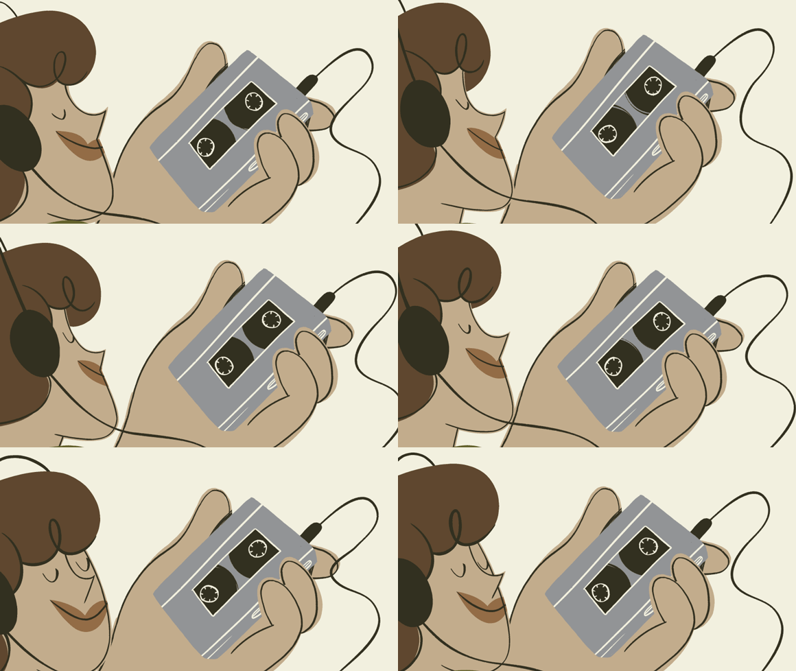
The surprisingly long history of electric cars: Miguel Angel Camprubi x TED-Ed
After “The Science of Surfing”, the highly educational and fun first collaboration with TED-Ed, Miguel Angel Camprubi strikes again, this time lending his upbeat style to illustrate the surprising history of electric cars.
Our history begins in the late 1800s - Miguel added a delightful vintage twist to his trait as a nod to this surprising yet little-known fact while still maintaining his fun and light-hearted approach.
Miguel’s jolly characters and bustling cityscapes were animated by animation studio Lobster.
See more of Miguel Angel Camprubi’s work here!
—
Credits:
Client: Ted-Ed
Production: Lobster
Direction : Fausto Montanari
Illustration: Miguel Ángel Camprubí
Animation: Ralitsa Aleksieva, Teodor Hristov, Nikolay Ivanov
Coloring: Tanya Bozhinova, Nicole Pavlov
Educator: Daniel Sperling , Gil Tal
Narrator: Addison Anderson
Producer: Bethany Cutmore-Scott
Music & SFX: Fabrizio Martini @rocketaudiostudio
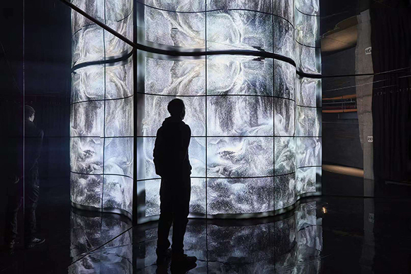
UK Premiere: Cao Yuxi’s New Media installation exhibited at 180 The Strand, London
For his first exhibition in London, Machas Artist Cao Yuxi takes part in “LUX: New Wave of Contemporary Art”, a group exhibition aiming at expanding the boundaries of immersive art.
At 180 The Strand, Cao showcases his artwork “Shan Shui Paintings By AI” on an impressive set of large-scale, curved LED screens.
Cao’s mesmerizing piece uses an artificial intelligence algorithm to generate ever-changing traditional Chinese ink style paintings, blurring the lines between the physical and virtual worlds.⠀
On show at 180 The Strand until 6th February 2022.
See more of Cao Yuxi’s work here!
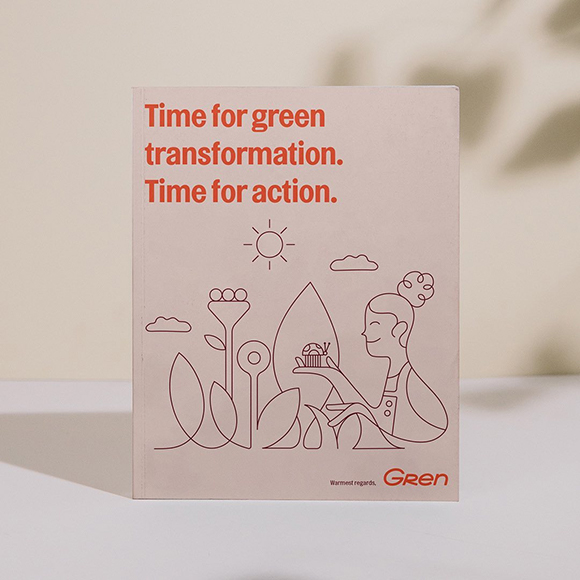

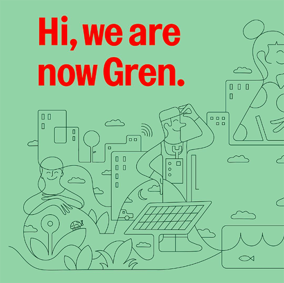
Jonathan Calugi’s warm illustrations for sustainable energy provider Gren
Over the past few months, Machas Artist Jonathan Calugi has been working on many inspiring, striking branding projects. The latest one is Gren, a new sustainable energy provider in Lithuania.
Working with design agency Bond, Jonathan developed a series of cheerful and warm illustrations to match perfectly the smooth, sustainable service Gren delivers.
Jonathan created for Gren a universe in which the energy supplier, people and nature are seamlessly weaved into each other.
See more of Jonathan Calugi’s work
here!
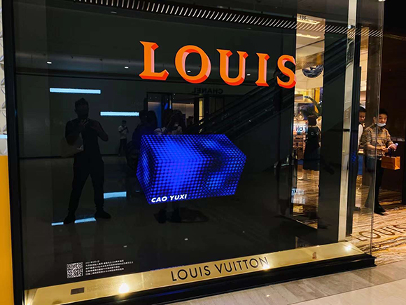
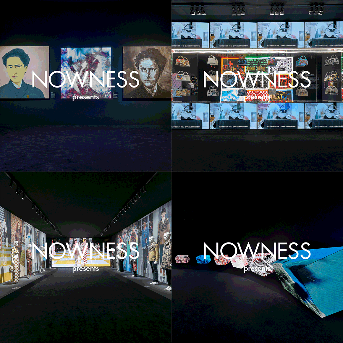
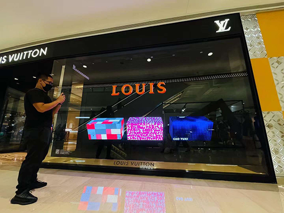
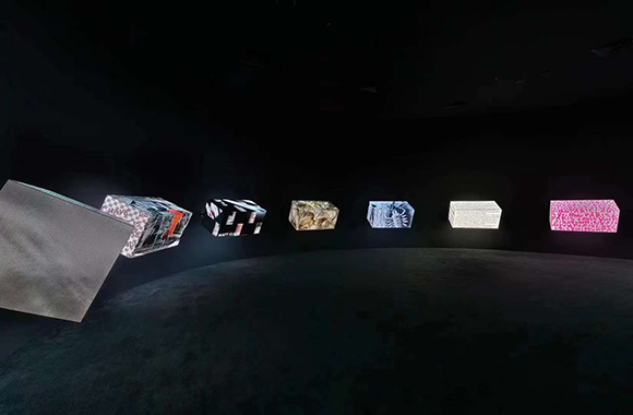
200 TRUNKS, 200 VISIONARIES: Cao Yuxi for Louis Vuitton’s exhibition
To celebrate Louis Vuitton’s bicentennial birthday, Machas Artist Cao Yuxi was invited along with a group of talent to participate in the group exhibition LOUIS: 200 TRUNKS, 200 VISIONARIES.
Using the original flat-top hard case conceived by the brand’s founder in the 1850s as a metaphorical blank canvas, Cao created “Gradual Pattern”, a dynamic, generative artwork inspired by the brand’s aesthetic and patterns.
“As an artist, I am deeply and constantly inspired and obsessed by the classic square tile Damier and Louis Vuitton monogram. I am also fascinated with the variation in colour and the pattern’s graphic elements: the Circle, the Diamond and the Cross,” explains Cao.
“Since all those elements are also fundamental, I re-used them to create generative art in the past. So for this, I pitched three questions: What if the shapes of elements can dynamically morph between each other? What if the pattern can evolve? What does the pattern look like for the Louis Vuitton vessel in the future? In order to answer this, I created this Gradual Pattern’.”
Cao Yuxi artwork and the LOUIS exhibition is now on display the founder’s historic home in Asnières, west of Paris, France, and on the dedicated website
See more of Cao’s work
here.


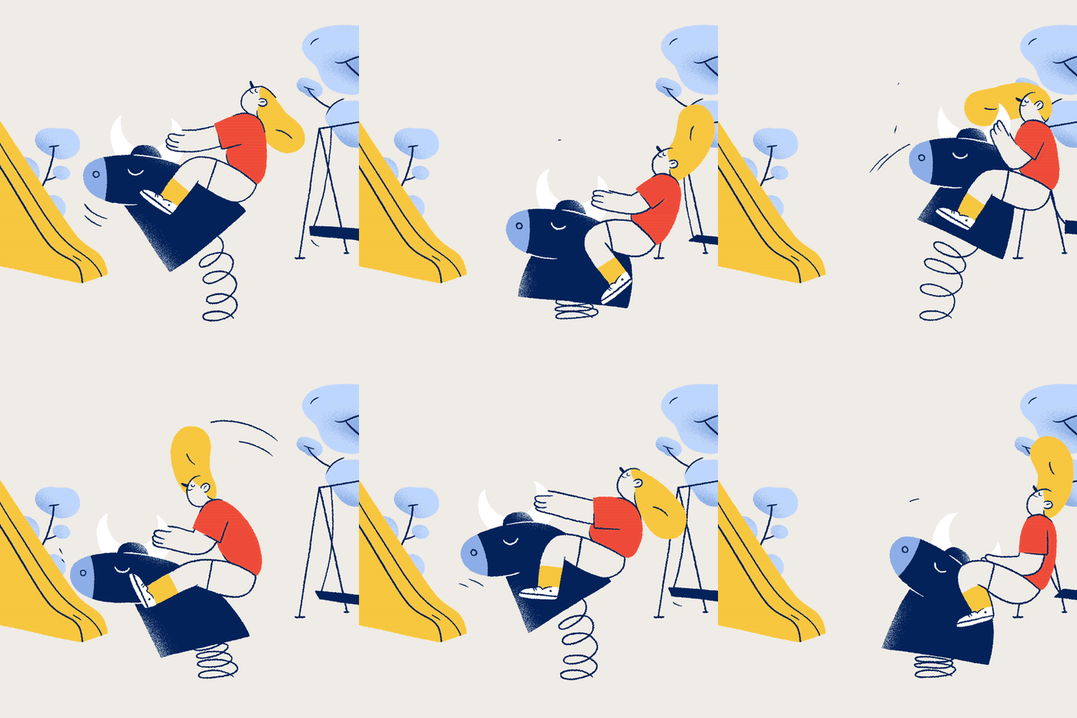
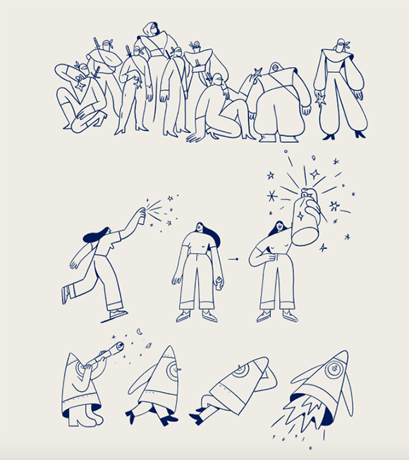
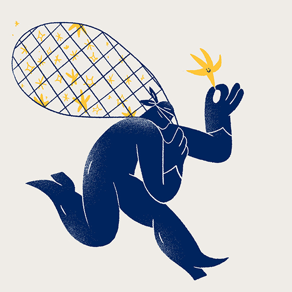
The Magic of the Night: Miguel Angel Camprubi’s animated horoscope
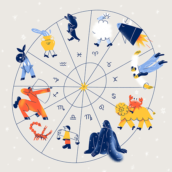
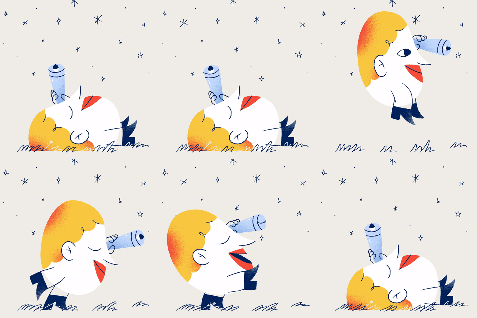
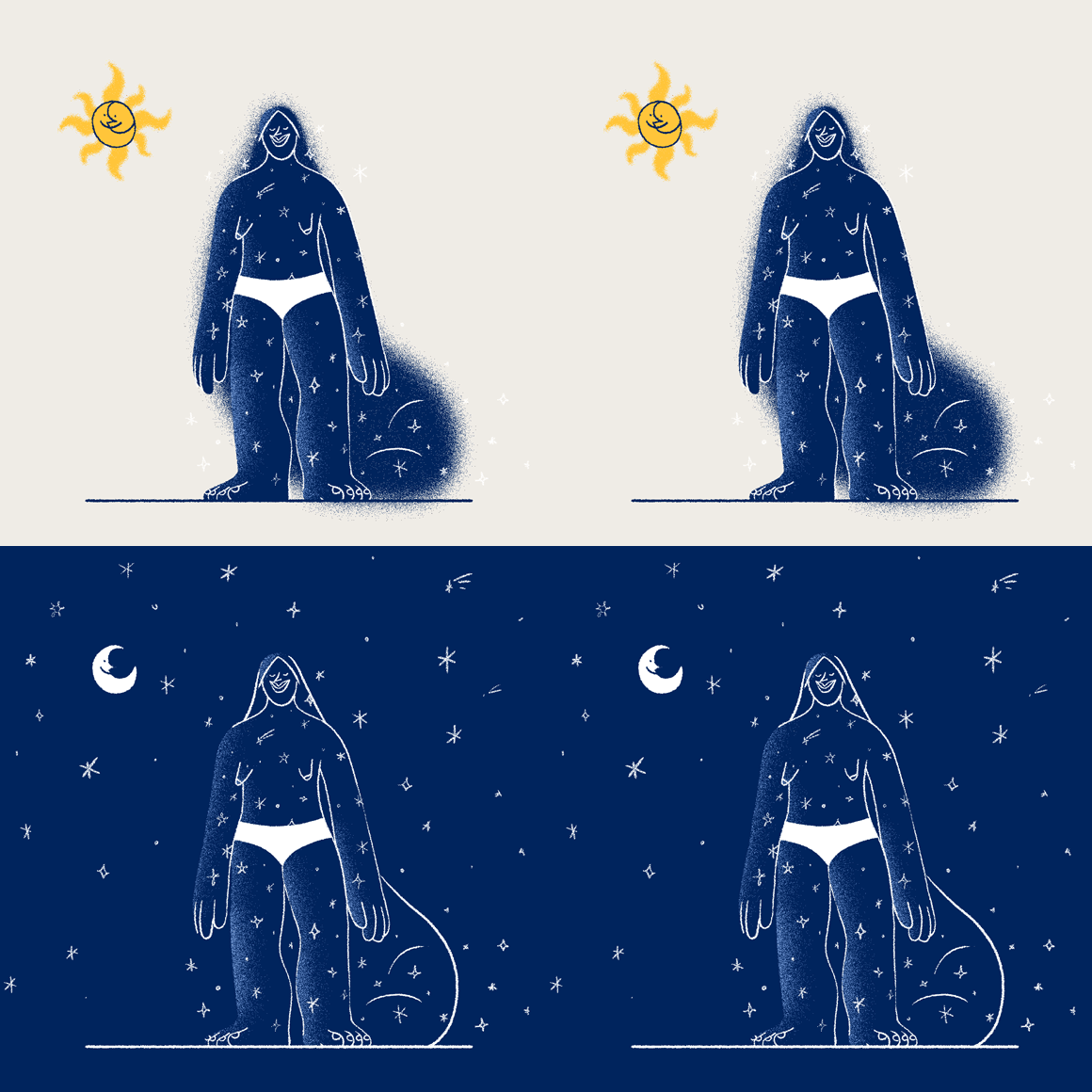
In a new brilliant series of illustrations and animations, Machas Artist Miguel Angel Camprubi reinterpreted the horoscope and the personalities of each zodiac sign in his own light-hearted, witty way.
In Miguel’s lovely world, a bunch of friendly characters embarks on a fantastic adventure to explore the sky and observe its mysterious constellations. Each zodiac sign is illustrated with the Machas Artist’s funky signature style and an extra dose of texturized colors to enhance the cosmic nature of its subjects. The designs were brought to life by animation studio Lobster.
See more of Miguel Angel Camprubi’s work here.
Full credits:
Production: Lobster
Creative Direction: Fausto Montanari
Art Direction and Illustration: Miguel Ángel Camprubí
Animation: Teodor Hristov, Nikolay Ivanov, Ralitsa Aleksieva
Music & SFX: Fabrizio Martini Rocket Audio
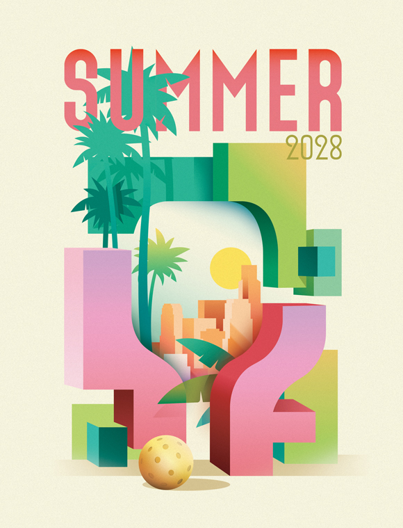
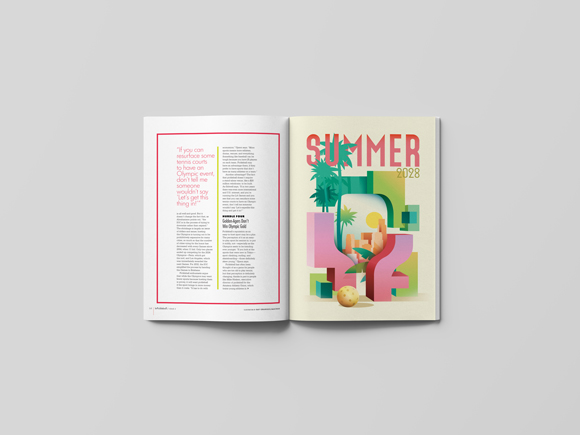
Ray Oranges’ Olympic poster for InPickleball Magazine
Pickleball is a new original sport that combines tennis, badminton and ping-pong, played by two to four players using paddles and a plastic ball with holes.
The sport has become increasingly popular recently, and Ray Oranges was commissioned by InPickleball Magazine, a new magazine dedicated to the discipline, to create an imaginary poster for the upcoming Los Angeles 2028 Olympic Games.
The sun-drenched poster features Ray’s artistic take on occasion, which might see Pickleball’s debut as an Olympic sport.
See more of Ray Oranges’ work here.
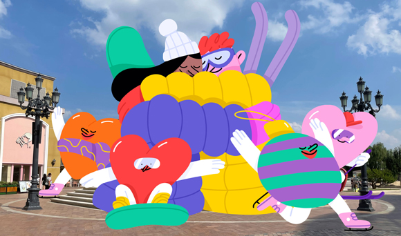

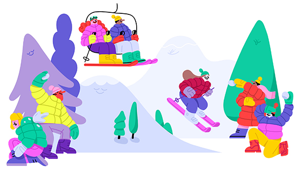
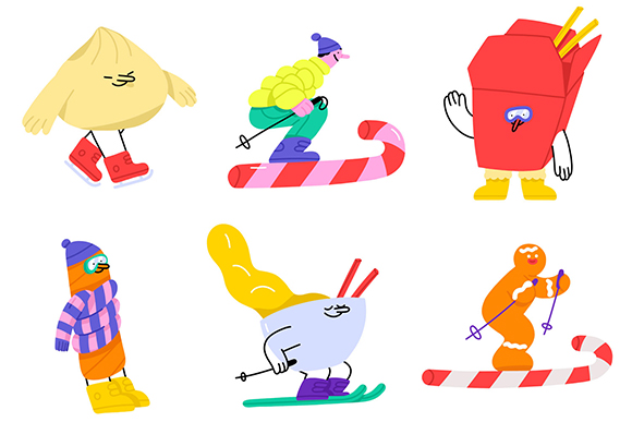
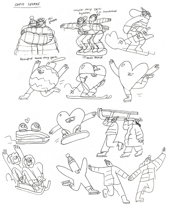
Miguel Angel Camprubi’s characters light up the night for SOLANA Light Festival!
What could be more exciting than seeing Miguel Angel Camprubi’s characters coming to life as massive, colourful installations? This is precisely what is happening at Beijing’s Solana, where his lively world takes over the mall’s festival in a series of playful site-specific art installations!
“I’ve always wanted to see my designs come to life, out of the screen or paper”, confesses Miguel, “and SOLANA was the perfect playground to do so”. Miguel collaborated with the Beijing shopping mall on the 14th edition of their yearly festival - one of China’s most celebrated light festivals, known for its spectacular light shows.
“I was inspired by the Beijing Winter Olympics, and I thought it would be fun to turn SOLANA’s squares into ski tracks and skating rinks,” says Miguel. Spread across 8 different locations of the mall, both outdoor and indoor, the installations make for a fun and festive experience, celebrating the joy of winter and the thrill of outdoor sports.
“My creative process always starts with paper. I sketch pages and pages, trying to find good ideas and concepts. Sometimes I write, sometimes I draw,” explains Miguel. From pencil sketches to 2D designs and 3D artworks, Miguel’s lovely bunch of characters became a series of stunning physical installations developed and executed with Machas’ long-time client Brand Head.
Miguel confesses: “I couldn’t be happier because this is my very first exhibition in China and my first 3D installation as well!”
The result is a charming series of artworks appreciated by young and old alike, who simply cannot resist photographing the installations and playing around them. Launched on 3rd December, the festival will run until March 2022.
See more of Miguel Angel Camprubi‘s work here!


Jonathan Calugi illustrates Avast’s new brand identity
Jonathan Calugi’s ongoing collaboration with Avast is yet another brilliant example of his art being used to build a strong, cohesive and striking visual identity. After working with Basque telecommunications company Guuk on building their memorable branding visual assets, Jonathan teamed up with cybersecurity software giant Avast to help them craft their new global identity.
With his dynamic yet clean and minimal illustrations, Jonathan’s style contrasts with the generic visual language commonly used by tech companies, making Avast’s new brand with a distinctive aesthetic to set them apart from its competitors and appeal to a global audience.
Jonathan was challenged to create a large number of artworks to illustrate all aspects of the company’s services and its customers worldwide. To reflect Avast’s goal to make the digital landscape “a fairer, freer, more equitable place for all”, Jonathan channeled the idea of inclusivity, togetherness, digital freedom, and safety in his illustrations.
“Working for Avast was a cool and unexpected opportunity! I studied informatics, and I remember that the Avast software was installed on all the computers at school and on my personal computer as well. So when I received this inquiry, it sounded like something really cool and fun to work on” explains Jonathan.
He continues: “I have developed an entire visual language for Avast. The creative director and the whole client team had a very smart and intuitive approach to the project. Together we have created something that connects everything in a way that resonates immediately with people. It was an amazing process - and still is, as we are working on more illustrations! I think it’s great because this continuous line that is at the heart of the project not only connects a part of my past with my future, but it also speaks to the entire world and helps millions of users.”
A portion of Jonathan’s illustrations were also brought to life in a short animation to present Avast and what the company is about.
As the new brand identity and flagship product “Avast One” is progressively unveiled, the illustrations are released on all the company’s digital platforms. Keep your eyes peeled for more artwork to be shown soon!
Credits:
Client: Avast
Creative Direction: William Bloor at Avast
Agent and Producer: Valentina Guarneri at Machas
Illustration: Jonathan Calugi
Animation: Motionhouse
See more of Jonathan Calugi’s work here.
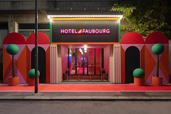
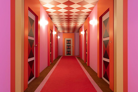
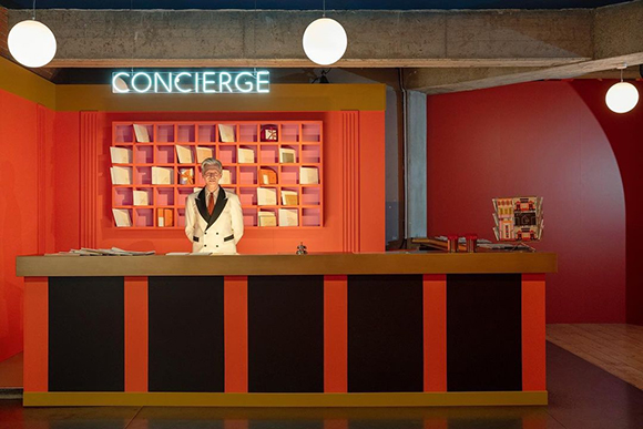
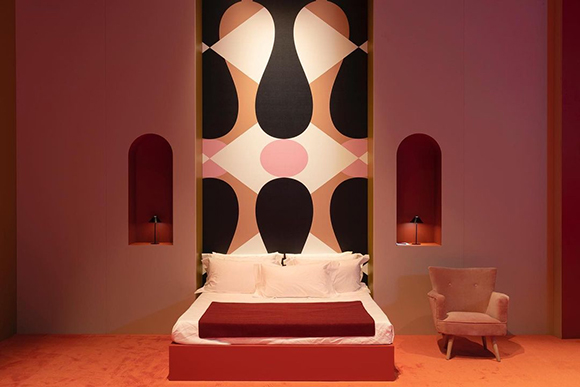
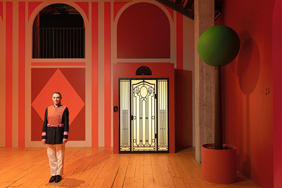
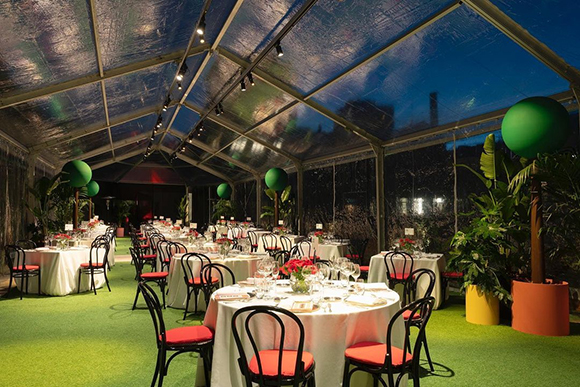
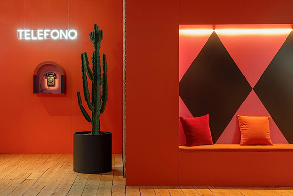
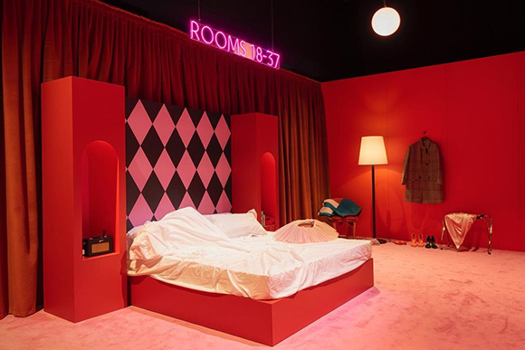
Hotel il Faubourg: Agostino Iacurci for Hermès
Machas Artist Agostino Iacurci was invited by Hermès to work on an ambitious, spectacular project: recreating a huge, fully-functioning hotel within Milan’s Teatro Franco Parenti.
Agostino designed and decorated the space with scenographer Gaspard Pinta, infusing his signature bright, geometric aesthetic and playful touch from floor to ceiling.
Bold checkered patterns, large stripes, captivating red hues and flashy neons combine to create a unique, elegant and dashing atmosphere, where delightful potted rounded trees stand alongside eye-catchy painted walls.
The ephemeral yet unforgettable hotel hosted a 5 hours-event of performances featuring actors, dancers and musicians.
See more of Agostino’s work here.
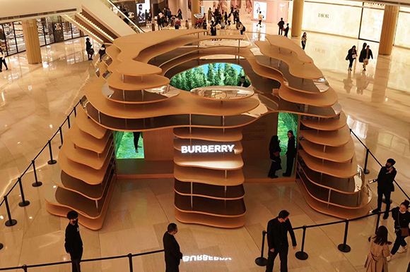
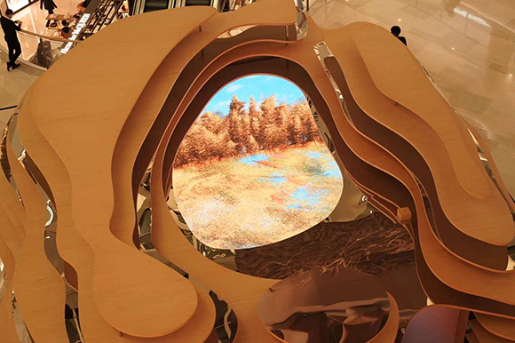
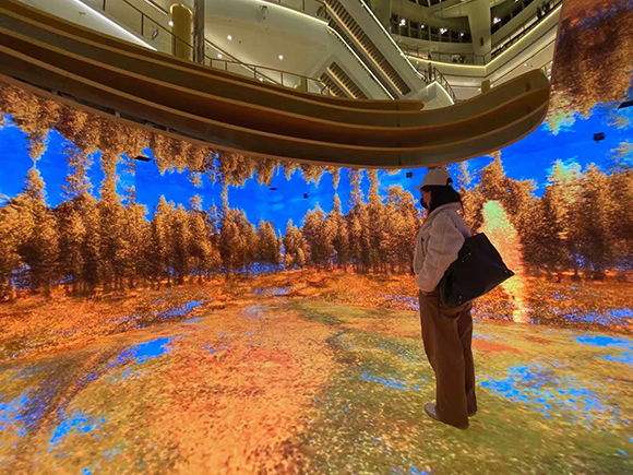
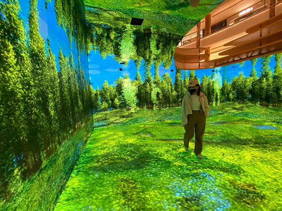
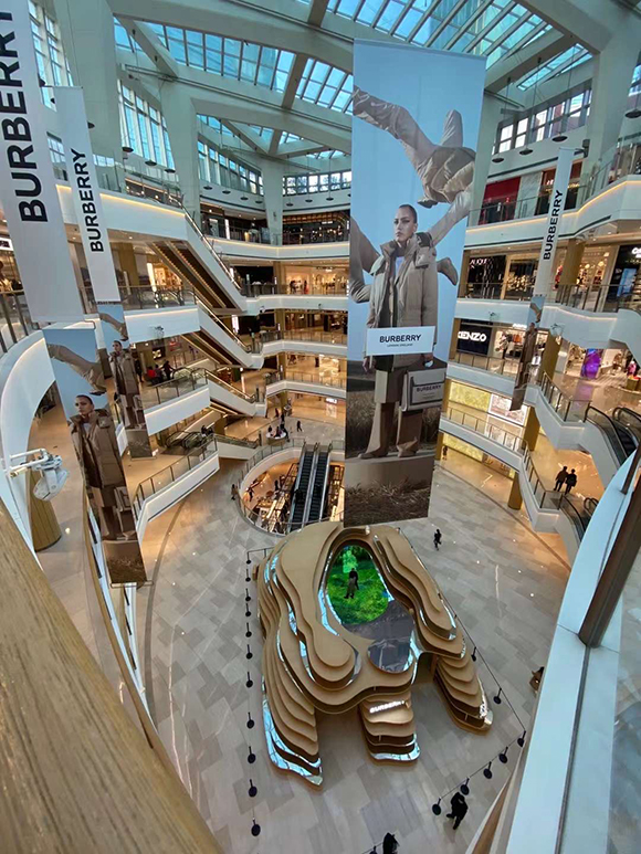
Seasonal Proximities: Cao Yuxi for Burberry
Setting out to blur the lines between nature and technology, Cao Yuxi was invited by Burberry to create an immersive, interactive experience to be showcased alongside two other artists.
Entitled Seasonal Proximities, Cao’s New Media artwork explores one of his subjects of choice: the influence of technology and the digital age on our perception of reality.
Through interactive screens and moving images projections, Cao’s fascinating artwork depicts vivid natural landscapes in an immersive 360 degrees cinematic experience, transporting visitors into the great outdoors.
The collective, carbon-neutral art installation touches on themes related to the natural world while previewing the British brand’s latest collections.
Seasonal Proximities is being featured within the brand’s ephemeral structure “Imagined Landscape” across Asia.
See more of Cao Yuxi’s work heren.
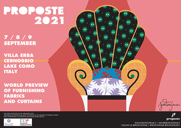
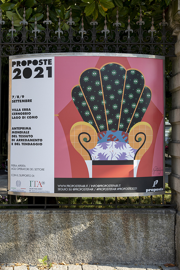
When Art meets Design: Agostino Iacurci x Proposte
Agostino Iacurci blends Art and Design with a bold, striking artwork for Proposte Fair, the leading trade show in luxury furnishing fabrics.
Taking place in the iconic Villa Erba on the shores of Lake Como, Proposte focuses on showcasing the quality and professionalism of the Made in Europe manufacturers and commissioned Iacurci to create an artwork that captured the essence and values of the trade show.
Iacurci took the occasion to explore furnishing fabrics as visual patterns in a bold, pop artwork featuring colorful curtains, funky patterns and a revisited Mendini armchair as the main subject.
Agostino explains: “I thought about using fabrics as a storytelling tool, thanks to their ability to transform spaces and objects - and Poltrona di Proust (1978) by Alessandro Mendini and its re-design concept came immediately into my mind. Therefore I placed it at the centre of the scene, theatrically crossed by two curtains held open with tie-back braids. Each element – the armrests, back and seat — of this classic armchair had a different fabric and decoration that helped connect the artwork with the international, multicultural and open identity of the object and the event.”
“In Agostino Iacurci we found the ideal artist to synthesize, in an exemplary way, what Proposte 2020 represents”, says Piercarlo Viganò, president of Proposte.
Find out more of Agostino Iacurci’s work here.
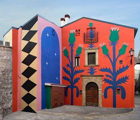
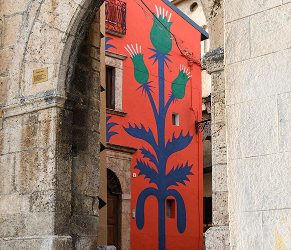
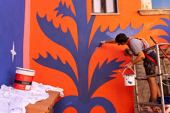
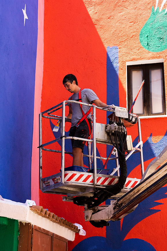
Agostino Iacurci signs a new colourful mural in Italy for Borgo Universo Festival
After his interventions in Pomezia, Santarcangelo di Romagna and Ludwigshafen-am-Rhein earlier this year, Agostino Iacurci signs a new, large-scale artwork in Italy.
Borgo Universo, the renewed Italian festival in Aielli mixing street art, music, performance and astronomy, asked Agostino to transform a building strategically located near the town’s old medieval door.
Ever faithful to his minimal approach, Agostino imagined a mural made of colorful cardoons and graphic patterns that seem to be cut out into the huge walls.
See more of Agostino Iacurci’s work here.
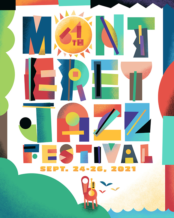


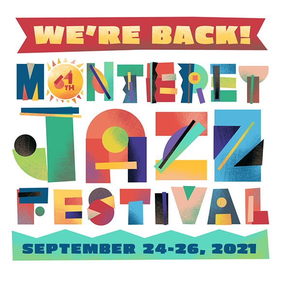
Jeff Rogers for Monterey Jazz Festival 2021
Machas Artist Jeff Rogers has a long history in collaborating with the team of the Monterey Jazz Festival, creating posters and developing visual identities for the renown Californian music festival.
In 2020, he designed some playful illustrations and lettering before the edition was cancelled due to the Covid pandemic. For the 2021 festival, Jeff got the chance to take his initial design further and develop a fresh, new identity for the upcoming edition.
“This year’s art is based on the work I developed for the 2020 festival that got cancelled” explains Jeff. “We didn’t want to throw that work completely out but wanted a fresh take on it.”
“Last year’s art was based on cut paper shapes so I took that idea and created more refined digital cutouts using imperfect angles and circles for curves” says Jeff. “There is also an updated color palette, and I turned the O in Monterey into a sun shape that contains the number 64, expressing hope, joy and the idea of a new day.”
We can already reveal that the main stage design will feature Jeff’s eye-catchy sun illustration. As for the rest, he is currently working on more designs including merchandise, stage design, wayfinding, digital ads and souvenir programme. Keep your eyes peeled for more artwork to be revealed as the festival approaches!
See more Jeff’s work here.
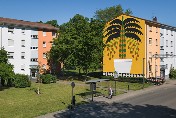
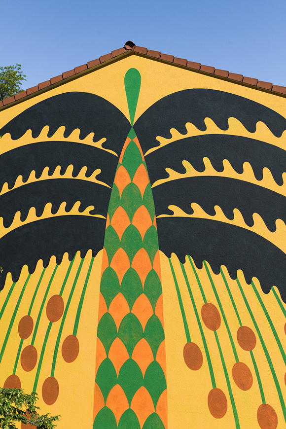
“Palmen Am Rhein”: Agostino Iacurci’s larger than life palm tree in Ludwigshafen.
Machas Artist Agostino Iacurci adds a new striking chapter to his ongoing series of artworks featuring palm trees, this time commissioned by Wilhelm-Hack-Museum’s MURALU initiative, curated by Astrid Ihle.
Entitled “Palmen am Rhein”, the mural blends the real with the improbable by depicting a larger than life date palm growing in a flower pot.
“When I start a new project, I usually do some research about the context I will be working in”, explains Agostino. “For this piece, I was inspired by various articles on how climate change is affecting the Rhine and its region - and, in the near future, the city of Ludwigshafen could have a Mediterranean climate where new plant species could grow.”
The colourful and vivid design features Agostino’s poetic, bold, yet essential style. “I am interested in reducing the number of elements, as it gives strength to the work and somehow creates an interesting dialogue with the buildings. The architecture [in Ludwigshafen] is quite linear, and the city is full of geometric information, and the mural creates an interesting visual play in terms of shapes.”
“I have a very intuitive use of colours”, Agostino further develops. “Somehow, my choice is always defined by the landscape itself. I try to find a minimal palette that somehow matches or contrasts with the surrounding environment”.
See more of Agostino Iacurci’s work here.
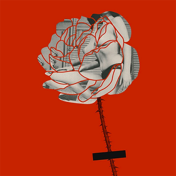
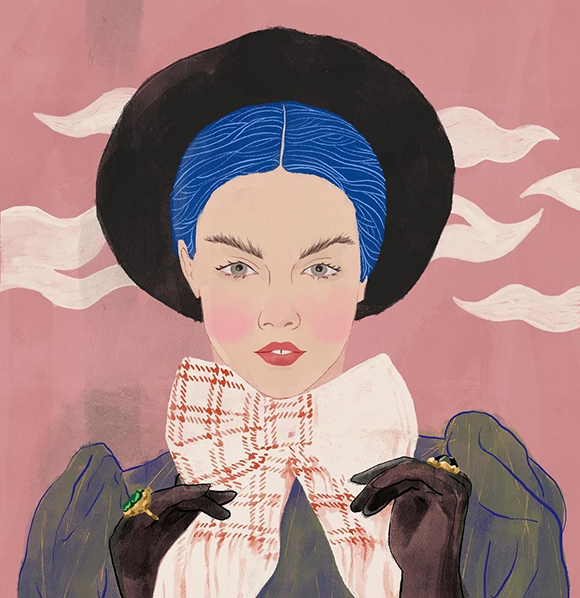
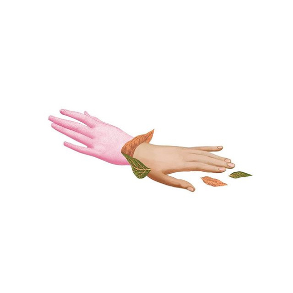
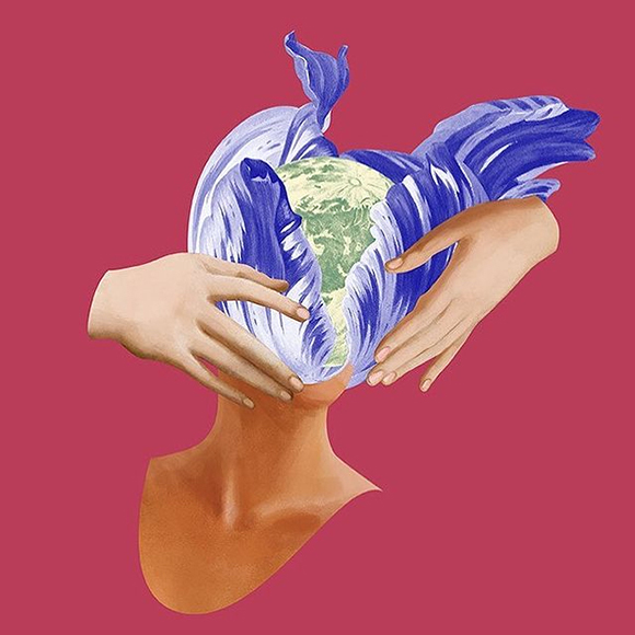
Becha x ELLE Serbia: a long-standing creative collaboration
As one of ELLE Serbia favourite illustrators, mixed-media artist Becha has been collaborating with the magazine for more than ten years. To mark the publication’s new website, she was invited to create a special sticker and share in a candid interview what inspires her every day and why it is essential to follow one’s passions.
Recalling her first memories of ELLE, Becha remembers: “When I started my art studies, ELLE magazine was among the stack of magazines I chopped up to create my first collages. I have never been a passionate buyer of new magazines, rather an archivist of old editions that exuded an aura of past times. Browsing through such material not only inspires me, but it gives me an insight into the spirit of a period.”
Becha’s career in the creative industry started as an Art Director in a studio for animation, production and post-production. At the time, she was developing her distinctive collage style in her spare time, but thanks to commissions like ELLE’s, she decided to quit the agency and pursue her career as an artist. The change could be daunting, especially in difficult times, but when asked about freelancing vs working for a company, she affirms that “freelancing is the best option for me. I am aware this might not be the case for everyone, but it is for me. The pandemic has revealed how flexible and yet successful working from home can be. Also, it is easier than ever to showcase art and find customers online, so I believe that entrepreneurship and freelancing are a good combination - that is, if you do what you love. I believe it is important to follow one’s passions and, to turn that into a job, understanding the market and creating a healthy environment is vital.”
As an artist, Becha expresses her creativity with all her soul. Especially in authorial works, creating an artwork is to develop a path to an idea. “To create a vision, I need to understand what I want to say and, if I’m working on a commission, understand what the client wants to say. Because while I am creating, I think about that topic and shape it accordingly. It’s like a visual introspection.”
Becha believes that creativity requires nurturing, but the reward for such effort has helped her overcome many difficult times. “It might sound like a cliché,” she admits, “but after the artwork is finished, there is always a great sense of happiness.” When asked about a piece of advice for young artists, she has no doubts: “inspiration, strength, and willpower are all around you, and you can use them as a motivation to explore and learn so that you can capture that moment of happiness again - it’s a wonderful feeling!”
Over the years, colour has been key to Becha’s oeuvre. When asked which colours represent happiness, nostalgia and freedom, she replies: “happiness would be a warm ray of sunshine; nostalgia is always a muted tone. Freedom is white and pure.”
See more of Becha’s work here!
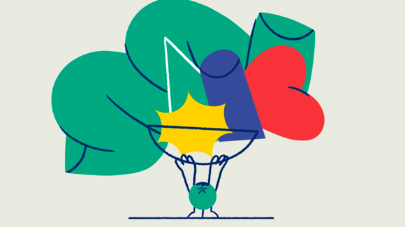
Headstrong: Miguel Angel Camprubi for the Mental Health Commission of Canada
Miguel Angel Camprubi was commissioned by the Mental Health Commission of Canada to create an animation for Headstrong, a recently launched initiative to reduce stigma and inspire young people to reach out and speak up about mental health.
Miguel created a friendly bunch of personified shapes using plain colours and a few outlines, animated with a simple, approachable style.
The resulting animation is a positive, light-hearted yet informative piece that invites young people to join the Headstrong Summit event and become mental health champions in their schools.
See more of Miguel’s work here!
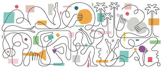
Capturing the LA Downtown Scene: Jonathan Calugi’s mural at The Crosby’s rooftop
Pre-Covid time, Jonathan Calugi flew all the way over to California for a mural project in Los Angeles. Commissioned by landscape developer group SQLA Inc, the murals are nested on The Crosby’s, a brand new luxury building on Wilshire Blvd, sunny rooftop deck.
Having immersed in the buzzing Koreatown area, Jonathan created a 21-metre long, LA-inspired artwork that marks an exciting evolution in his style. A mix of black lines and bold, graphic shapes in which the fluidity of the drawing finds an unexpected balance between abstract and figurative.
Jonathan says that the “inspiration for the artwork was quite organic. My interest was in how people can write stories with shapes and colours. This type of work starts with free-flowing doodling, where I just translate an idea into form. It’s a creative game, where those who can visualise the artwork complete it.”
“The spirit of LA absolutely influenced my artworks,” Jonathan adds. “The fluid movement of the city — palms, music, playfulness, and love! I’m starting to believe that maybe ‘LA’ means Love Always.”
When creating the piece, the building was still under construction, and there was even a rare spot of LA rain, making Jonathan’s painting experience far from low-key. Dodging construction materials and raindrops, however, Jonathan completed the mural within a week.
“The LA experience was crazy!” Jonathan explained. “I’m from a small town in Italy, and I move around by bike - you can imagine how bizarre it was for me to take a Lyft to go everywhere. My understanding of LA is that everything is around the corner - you just need to use a car. But I love Los Angeles.”
The pool deck is now open and makes a strong case for the chilled-out lifestyle of the Angelenos!
See more of Jonathan’s work here.
Summer rush: Olaf Hajek x Ritzenhoff
Olaf Hajek collaborates once again with German glassmaker Ritzenhoff on a new summer-inspired collection of gorgeous crystal glasses.
The collection of aperitif glassware comprises two sets, aptly entitled “Summer rush” and “Summer dew”, each including two new designs.
The collection graces the signature vibrant colours, floral freshness and fine details of Olaf’s art: “Summer dew” emphasis is on lush flowers, flamboyant birds and exotic fruits in a kaleidoscope of botanical treasures, while “Summer rush” captures fascinating characters of Olaf’s iconography, including a striking Frida Khalo and an underwater mermaid.
Created as a celebration of summer, the new collection awakens the senses and makes an artful vessel for festive ice-cold cocktails.
See more of Olaf’s work here!
UFC x James Braithwaite: amplifying sport’s storytelling through animation
Over the past few years, James Braithwaite and his Picnic Dinner team - Darren Pasemko and Fred Casia - have collaborated with the UFC to tell the story of the world’s most successful MMA promotion through short animated films.
Moving away from the usually hyper-masculine UFC visual universe, the animations adopt a stripped-down visual approach with a touch of humour. James develops: “We’ve worked with the live-action director, Dan Marks, many times over the years. He has a lot of trust in us and lets us explore new approaches with each new project. So for each episode for the UFC project, we are using a slightly different style. Some look like ink, some are drawn with real pencil, some have more collage elements. We want each episode to have a unique style approach, and I think the varied art styles help spice up the episodes.”
James held different roles within the project: “I did a bunch of drawing, alongside the wonderful Noam Sussman and Bijan Shahir. But I also art directed and helped write the animation scripts.”
The project didn’t come without any creative challenges. “At the beginning, none of us were really fans of MMA. A little too visceral for us wimpy artists”, recalls James. “We needed to find a way to get excited about the content and find a fun way in. The first episode was about a guy named Forrest Griffin. He was surprisingly hilarious and empathetic. His funny vibe gave us permission to get a little weirder with these episodes. We didn’t need to focus on only the blood and the violence, but let us shine a light on the stranger, funnier aspects that happen around the fights.”
The UFC animations follow the path set by Picnic Dinner and Dan’s work done on the 30 for 30 ESPN series, which set a new benchmark for sports documentaries. James and the creative team’s animation added another exciting layer of storytelling to the customary sit-down interviews plus archive footage combo usually seen in sports documentaries. “The 30 for 30 series really changed the world of sports documentaries for the better”, explains James. “It was great to be part of such an iconic series”
The UFC collaboration is far from being concluded, and it is going to add a new chapter soon. “We are currently working on an episode about Marc Ratner,” says James. “Ratner was the boxing commissioner who joined the UFC to help solidify the rules and turn it from seemingly random street fights into the sport juggernaut it is today”.
So stay tuned for the next episode coming soon!
See more of James Braithwaite’ work here.
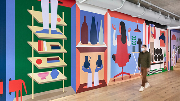
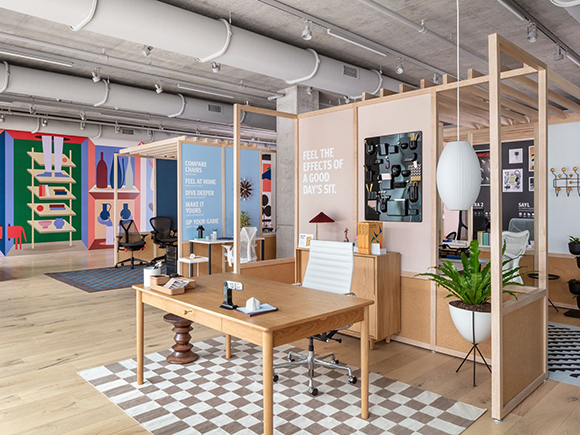
Agostino Iacurci for Herman Miller
US furniture group Herman Miller commissioned Agostino Iacurci to create a bespoke wall artwork for their Chicago showroom.
Agostino enhanced the wall’s long horizontal format with a multi-scene composition, each presenting a smart take on iconic pieces of the Herman Miller collection.
The distinctive use of bright colours and bold shapes, one of Agostino’s most distinctive traits, injects the space with joyous playfulness and contributes to the showroom’s inspiring atmosphere.
An ode to furniture design and art, the large-scale artwork brings uniqueness to Herman Miller’s space, a real-life embodiment of the company’s motto to inspire people to do great things.
See more of Agostino’s work here.
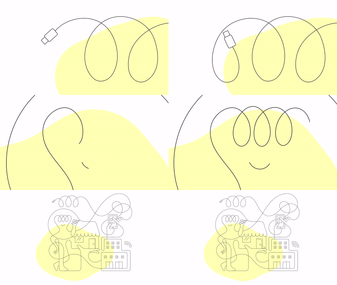
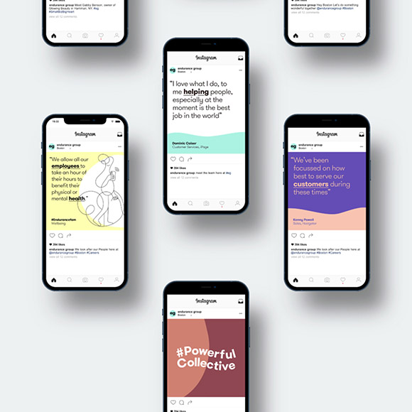
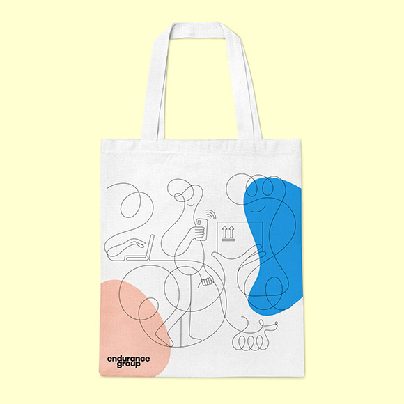
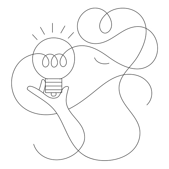
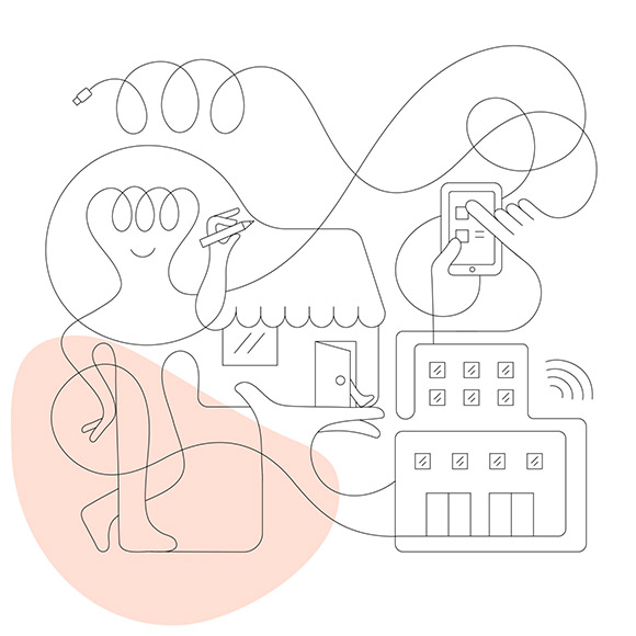

Jonathan Calugi x Endurance Group
Machas Artist Jonathan Calugi brought a warm, friendly touch to tech company Endurance Group, a collective of brands helping small businesses to succeed online.
To go along with their new brand identity, the Boston-based company asked Jonathan to create a series of artworks that would reflect the ‘Genuinely Helpful Companions’ spirit of their business while highlighting the humanity of their customers and employees.
In collaboration with London-based agencies Styles & Partners and People-Made, Jonathan designed a series of unique and fresh artworks where his approachable yet distinctive artistic style shone.
The result is a set of six memorable illustrations, placing people at the heart of the tech company.
See more of Jonathan’s work here.
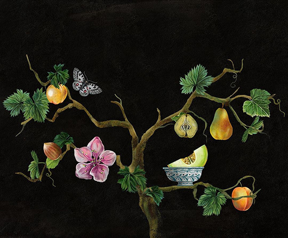
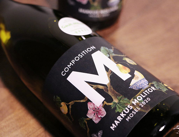
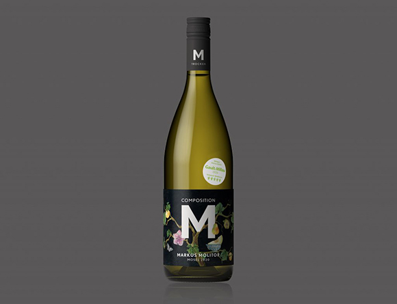
Composition M: Olaf Hajek x Markus Molitor
German illustrator and painter Olaf Hajek collaborated with winemaker Markus Molitor to distil his superb, nature-inspired universe on an exclusive label.
For “Composition M”, Olaf Hajek illustrated the notes of the Gault & Millau awarded wine with skilful delicacy.
The label, created as an exclusive edition for one of the largest German food retailers, presents grape leaves, flowers and fruits artfully intertwined in a sophisticated and contrasted painting.
See more of Olaf Hajek’s work here.
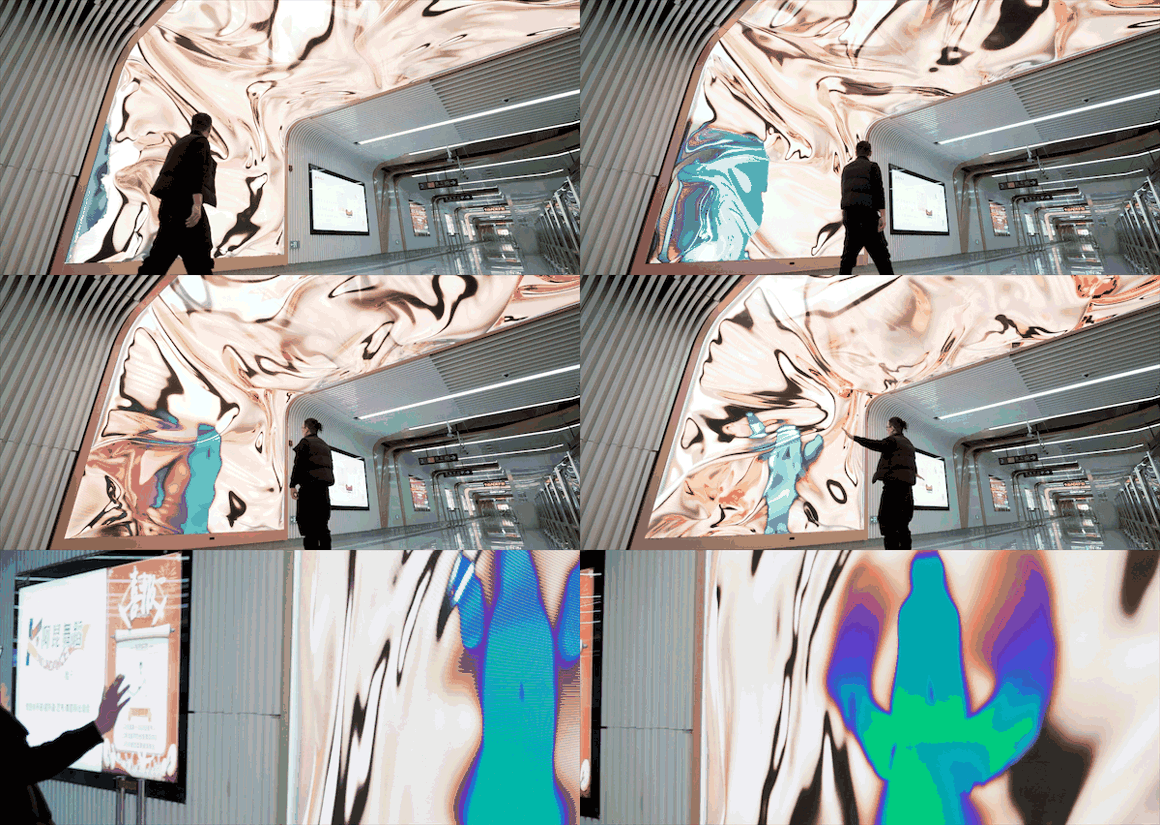
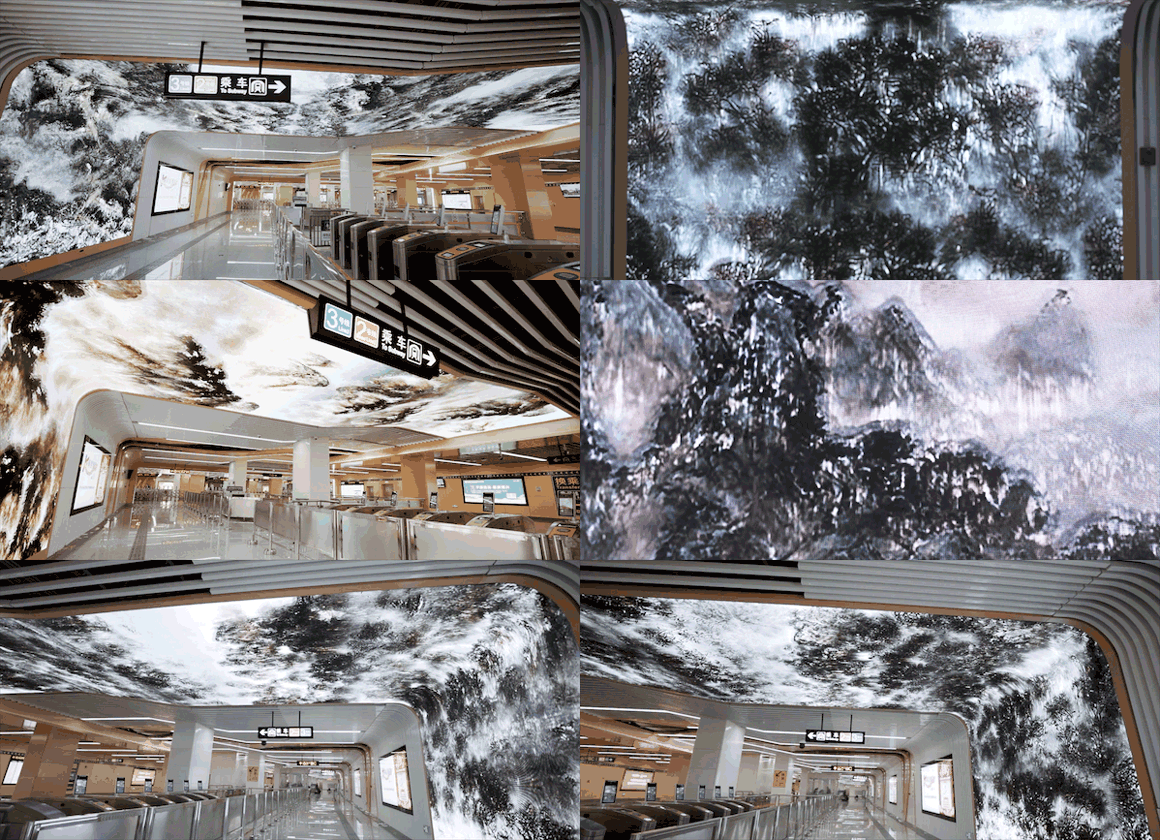
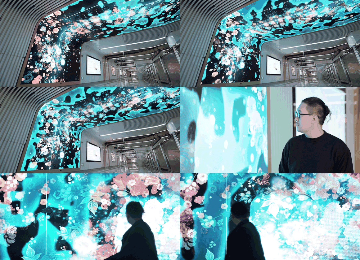
Cao Yuxi designs a futuristic interactive installation at Jinan’s Bajianbao tube station, China
Machas Artist Cao Yuxi collaborated with Jinan Rail Transit, the city’s transit system, to design new media installations at the Bajianbao tube station.
Jinan, the capital of China’s Shandong province, is known for its many natural springs and is often called the “City of Springs”.
Blending tradition with modernity, Cao’s installations tell the heritage and identity of the Spring City while enabling commuters to immerse themselves in the art while crossing the station. Waterfalls, landscapes and ancient Chinese inscriptions blend to create beautiful, evolutive pieces.
The artworks, displayed on large LED screens, create an impressive waterfall effect that envelops from the station’s wall to its ceiling. Thanks to a camera system, they capture people’s position and depict their silhouette within the changing visuals.
With this impressive interactive installation, Cao brings a modern yet playful art experience to Jinan’s commuters on their daily tube journey.
See more of Cao’s work here!
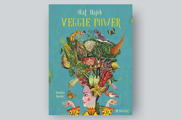
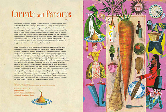
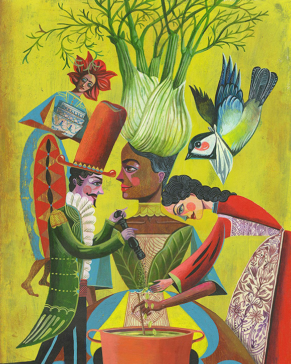
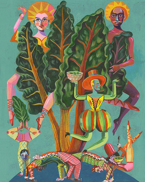
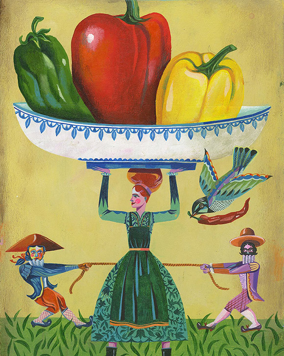
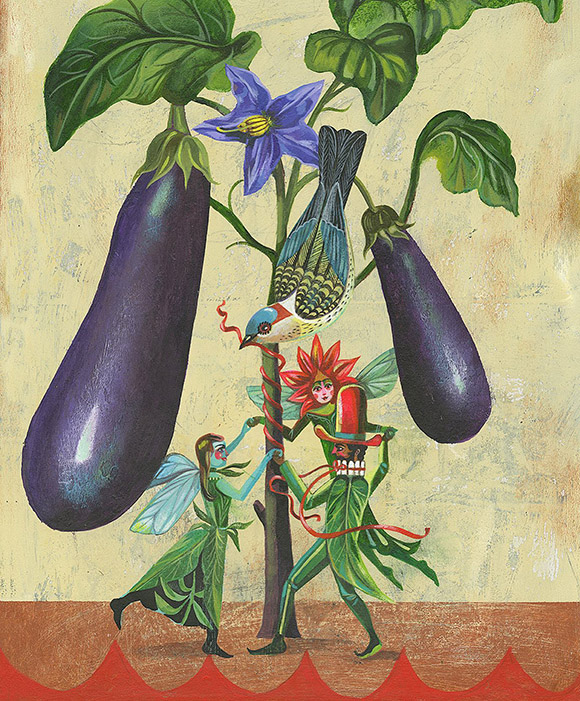
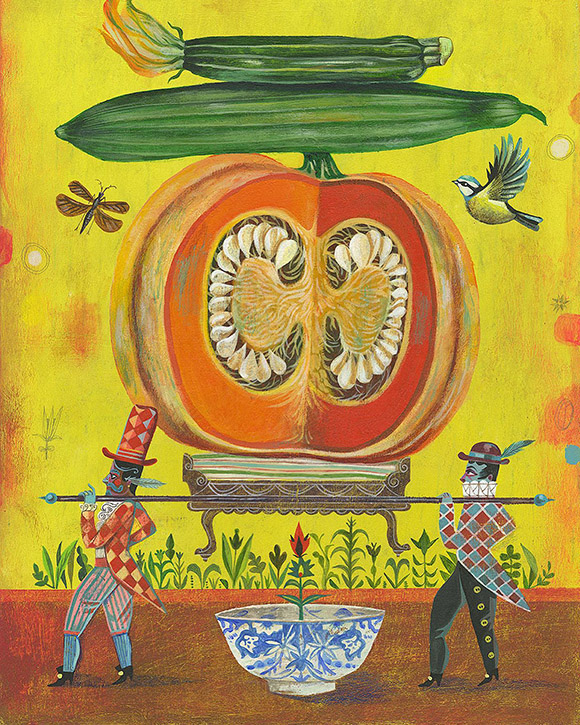
Veggie Power: A new enchanting book by Olaf Hajek!
Calling all veggies fans! Following his previous publication “Flower Power: The Magic of Nature’s Healers”, Olaf Hajek signs a new wonderfully illustrated book, “Veggie Power”.
Published by prestigious publishing house Prestel in Germany and Rizzoli in Italy, the book features Olaf’s beautiful and imaginative illustrations, accompanied by the words of author Annette Roeder.
The colourful, vibrant, and often surprising artworks celebrate the artistic, historical, and culinary generosity of all common vegetables. Presented by season, the book is a delectable illustrated garden aimed to be enjoyed by readers of all ages, from 8 to 99 years old.
See more of Olaf’s work here!
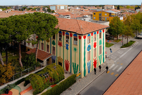
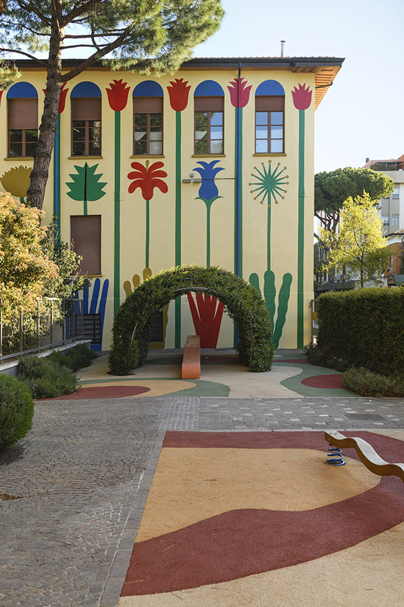
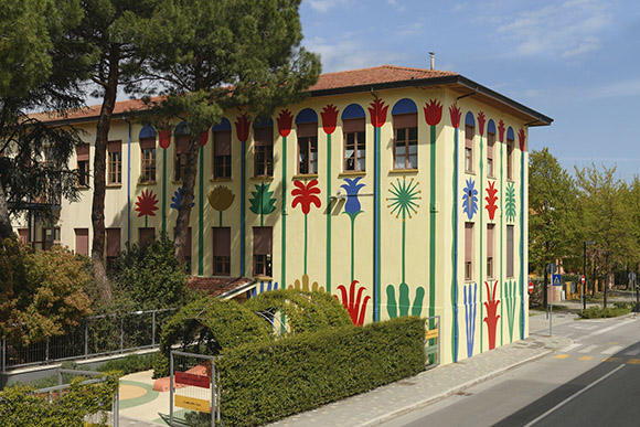
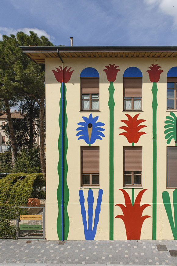
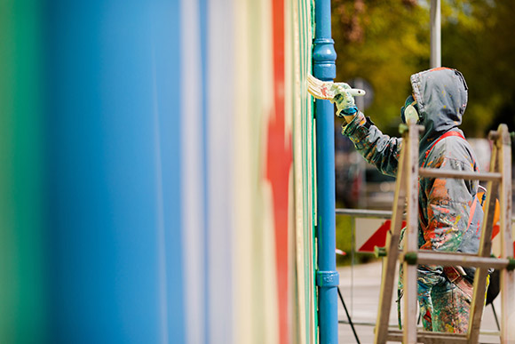
“Disegno d’esame”: Agostino Iacurci’s elementary school mural in Romagna, Italy
Following his large-scale mural painting in Pomezia, Italy, Agostino Iacurci signs a new stunning mural, gracing this time the facade of the Pascucci Elementary School building in Santarcangelo di Romagna.
Entitled “Disegno d’Esame” (Exam Drawing), the colourful artwork depicts a series of large-scale plants, poetically encircling the whole building.
The mural is a tribute to Federico Moroni, a Maestro (elementary teacher) in Sant’Arcangelo who experimented with a new pedagogical approach. Linking education and creativity, Moroni encouraged and nurtured his pupils’ freedom of expression, the practice of drawing, and observation of nature.
“The painting takes its name from a drawing made by a 9-year-old boy Piero Morandi, who was a pupil in a class held by Moroni”, explains Agostino. “Piero’s drawing was included in the book Arte per Gioco, which Moroni edited and published in 1964, and that I discovered in Santarcangelo”.
Unveiled to the city just before the pupils started to attend class again after the lockdown restrictions, the mural, as Agostino explained, “is a symbol of a new beginning and a breath of fresh air.”
See more of Agostino’s work here!
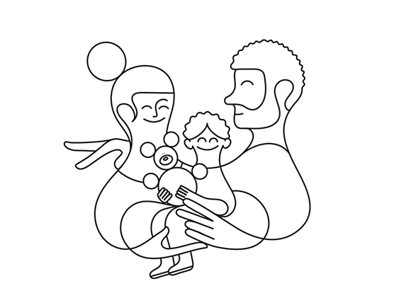
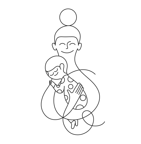
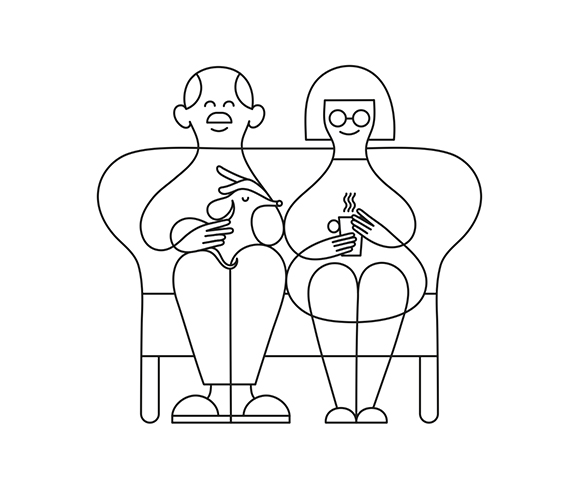
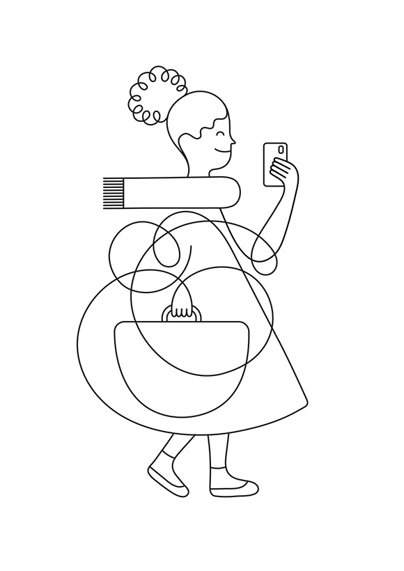
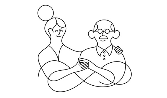
Jonathan Calugi for health app Milo
Simplicity is key when launching a new service to the market. Milo is a new US pharmaceutical app that helps people fill in their medical prescriptions.
With his approachable style, the Milo team was seduced by Jonathan’s one-line illustrations and their ability to convey visually multi-layered storytelling with warmth and simplicity.
Using his minimal one-line style, Jonathan illustrated various scenes - from a couple of seniors sitting together to a mum holding a baby.
The result is a series of five simple artworks populating Milo’s app and website, bringing a human, warm touch to the innovative service.
See more of Jonathan’s work here!
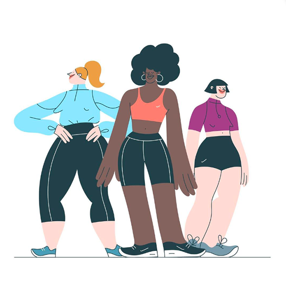
Running in a New Light: Miguel Angel Camprubi for Sports Direct
Filled with joy, energy and fun, Miguel Angel Camprubi’s new animated characters for Sports Direct invite us to go out and get running!
The UK’s number 1 sports retailer commissioned Miguel to illustrate and animate a friendly and active urban tribe for their ‘Running in a New Light’ commercial, calling people to make the most of brighter days in this Spring season.
Miguel’s relatable joggers run and jump happily, in a series of dynamic, energising animations condensed in a short and punchy commercial along with filmed sequences.
Full credits:
Clients: Barney Jones, Sam C
Directors: Toby Jones, Jamie Sivers
Producer: @fresh.base
DOP: @tristan_chenais_dop
First AC: @hemex26
Second AC: @imalewska
Illustrations & animations: @miguelangelcamprubi
Sound design: @brothermusic_
Copy: @friendship.creative
See more of Miguel’s work here!
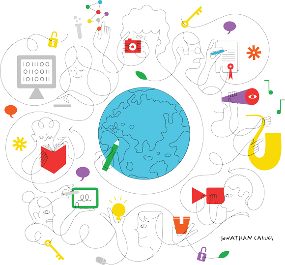

Jonathan Calugi x World Intellectual Property Organization (WIPO)
Jonathan Calugi has developed over the years a unique, distinctive visual language, with interconnectivity and fluidity at the heart of his work.
To mark the World IP Day 2021, the World Intellectual Property Organization (WIPO) needed to accompany their global campaign with a bright and engaging artwork that would speak to a wide, international audience of the different nuances and applications of Intellectual Property.
With his modern and dynamic style, Jonathan Calugi illustrated the campaign, using his signature style to bring a sense of connectivity and simplicity to WIPO’s communications.
Jonathan created a vibrant artwork punctuated with a few touches of colour, integrating the ideas of creativity and entrepreneurship while representing people in a diverse and inclusive way.
The campaign launched worldwide on World Intellectual Property Day (26th of April 2021) and is accompanied by an array of digital and downloadable tools translated into eight languages.
See more of Jonathan’s work here!


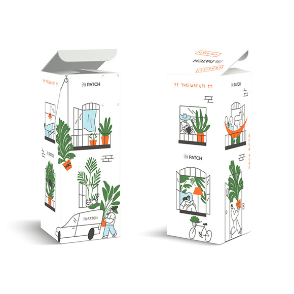
Miguel Angel Camprubi x Patch Plants
At a time when interest in gardening is growing, Miguel Angel Camprubi has collaborated with plant delivery company Patch on a series of lovely illustrations to help the brand stand out!
From friendly customers and staff to cute pets and personified house plants, Miguel created a light-hearted world to illustrate the online plant shop’s business in a fun, engaging and inclusive way.
Miguel, with the help of Lobster studio on the animations, has illustrated the Patch experience from A to Z: from buying plants online to packing and delivering them, to the necessary care instruction once at home.
Featuring Miguel’s signature style and a touch of humour, the engaging artworks are used across Patch Plants’ communications, including their social media, website and innovative packaging.
See more of Miguel’s work here!
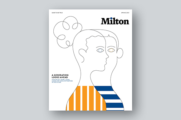
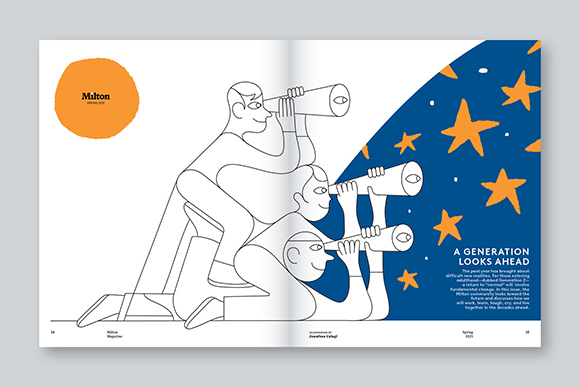
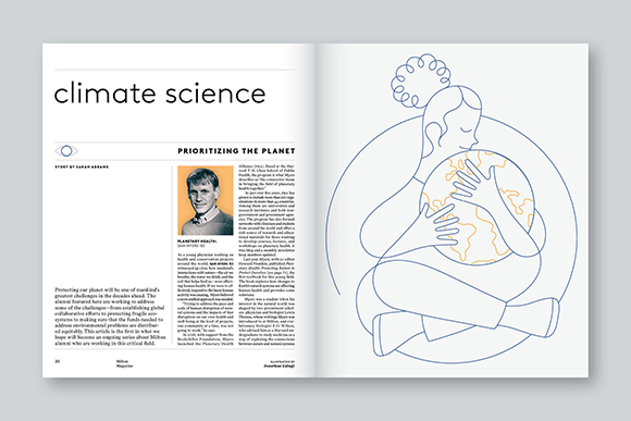
A Generation Looks Ahead: Jonathan Calugi for Milton Magazine
Despite the past year’s challenging new realities, Jonathan Calugi illustrates for Milton Magazine, the alumni magazine of Milton Academy, how the new generation is looking towards the future.
This new series of artworks includes a striking, minimal cover and two other illustrations for the Spring 2021 issue of the magazine, capturing the challenges and hopes of a generation that has seen its formative years defined by the global pandemic.
See more of Jonathan’s work here!
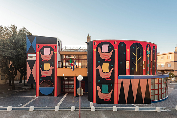
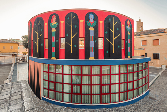
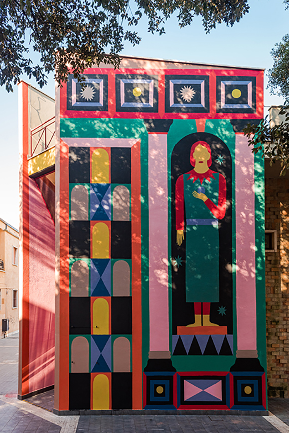
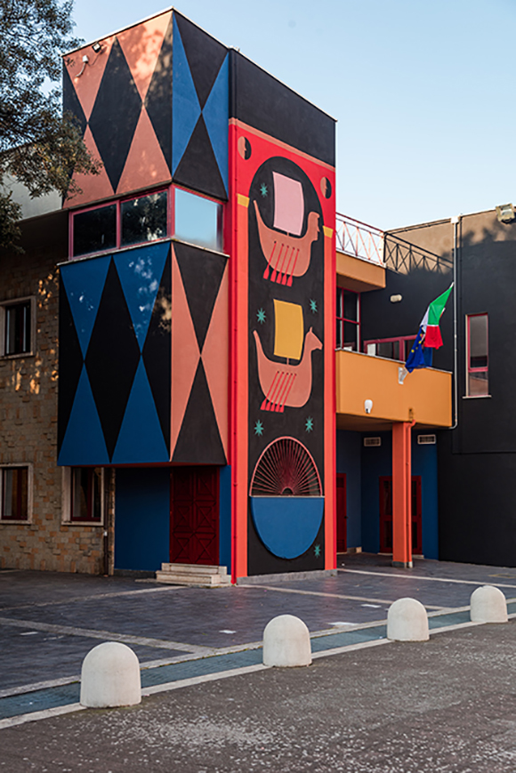
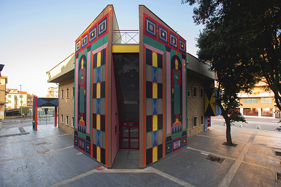
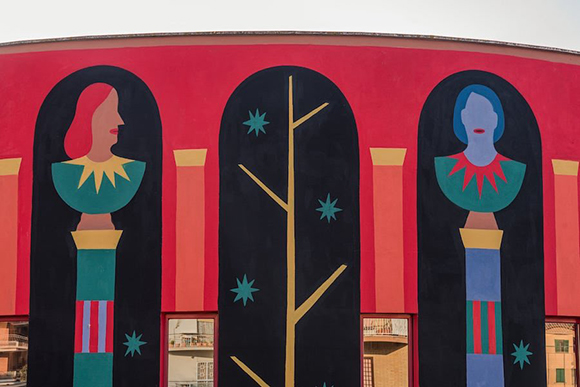
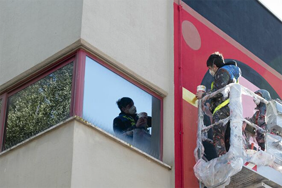
“L’Antiporta”: Agostino Iacurci’s new stunning mural
Agostino Iacurci has unveiled his latest, large-scale mural painting, “L’Antiporta”, in Pomezia, Italy. The 600 sqm mural painting embraces the public library’s architectural design, triggering new surprising narratives in the contemporary urban fabric.
“L’Antiporta is not only the architectural structure that precedes the access to a second door,” says Iacurci “, but it also indicates the page before the title page, especially in ancient books. It often depicts an allegorical portrait or illustration, which I think it’s perfectly fitting for the mural’s location. Architecture and literature are the two focal points of the piece”.
Iacurci seamlessly weaves into his art iconographic classical, architectural and historical references such as the Book VI of the Aeneid, which narrates the encounter between Aeneas and the Cumaean Sibyl, who predicts he will land on the Lazio coast. The Heroon of Aeneas’s mysterious tuff door and the statues of young women of the Lavinium Archaeological Museum in Pomezia, as well as the doors crossed by Virgil and Dante in the Divine Comedy.
The work is aimed at creating a bridge between the contemporary and the origin of history and myth. The dialogue with the Classics has guided Iacurci to design the large access portal to the library and amplify the building’s symbolic function, electing it as a temple of knowledge, a secular oracle of the city, a privileged place in which to obtain answers to one’s own questions.
L’Antiporta is part of the “Sol Indiges” project, curated by Marcello Smarrelli, which will also feature a new work by Ivan Tresoldi.
“This phenomenon that we could call New Muralism represents a powerful tool for the diffusion and promotion of contemporary art,” says Smarrelli to Artribune. “Thanks to its immediate language, it manages to communicate across the board, directly reaching different and heterogeneous audiences”.
“Sol Indiges propose an unprecedented vision of the city. Restoring the communicative power of mural painting as a manifesto, it intervenes on places that have always contributed to contrast the cultural desertification, such as the school and the library, and stimulates curiosity and critical thinking to generate new ideas.”
See more of Agostino Iacurci’s work here.


Miguel Angel Camprubi’s animated stickers for Signal Messenger
Over the last few years, Miguel Angel Camprubi has created stickers and animations for the world’s biggest tech companies and social platforms.
Signal, the fast-growing encrypted messenger, turned to Miguel to work on a series of animated stickers to bring the Machas Artist’s joyful touch to their messaging app.
Miguel developed a series of 24 expressive and funny stickers, covering various scenarios: “the brief was quite open”, explains Miguel. “I suggested including feelings that people often have to help us communicate with our friends and family - always trying to add a touch of humour.”
The stickers can be downloaded in the Signal app.
See more of Miguel’s work here!
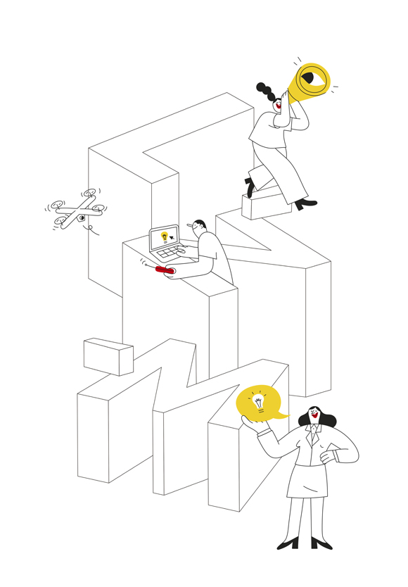
Link’N'Match: Miguel Angel Camprubi for de:hub
With his playful, approachable characters, Machas Artist Miguel Angel Camprubi’s art brings a friendly vibe to Germany’s de:hub communications.
Digital Hub Initiative, a program to connect companies with start-ups and supported by the German Ministry for Economic Affairs and Energy, commissioned Miguel to create the illustrations of their “Link’N'Match” initiative.
Adopting a stripped-back approach, Miguel illustrated the program acronym’s letters interacting playfully with three characters, using simple black outlines and few splashes of colour.
See more of Miguel’s work here!
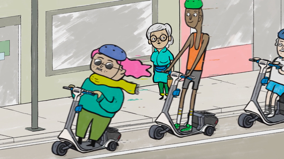
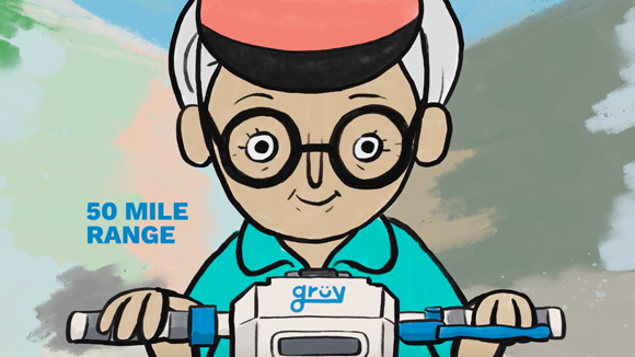
A Grüvy Vision: James Braithwaite x Grüv Scooters
The options for shared but not-too-crowded means of transportation are rapidly multiplying in every big city around the globe, and quite frequently the only difference between the plethora of services is the shiny, colourful graphics.
When James Braithwaite and his Picnic Dinner brother Darren Pasemko were approached by American start-up Grüv, they were tasked to show why the world needed yet another shared scooter company.
Grüv’s egalitarian vision of mobility as access for all, sustainability at every stage of the scooter’s lifecycle and design, and a quite humorous approach to branding were excellent starting points to develop The Perils of Modern Scooting.
James used his immediately recognisable illustrations to bring to life a witty universe of relatable characters, directed and animated by Darren.
Following Annie’s story, an endearing senior scooter user, “The Perils of Modern Scooting” shows with humour the perks of an affordable and environmentally-friendly way to get around town.
See more of James’ work here.
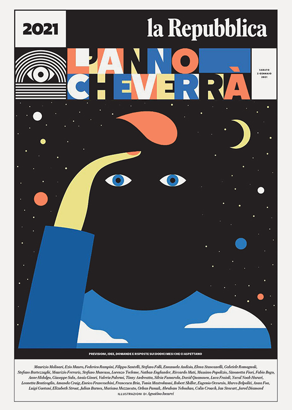

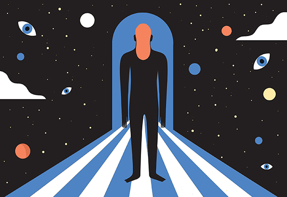
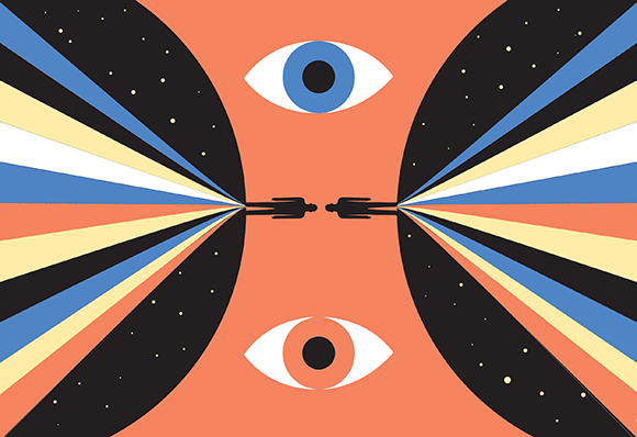
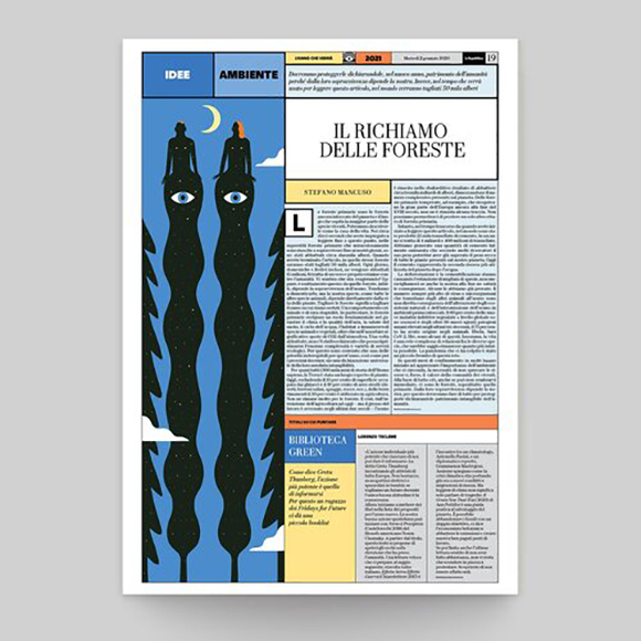
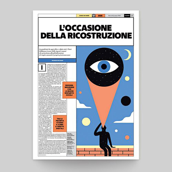
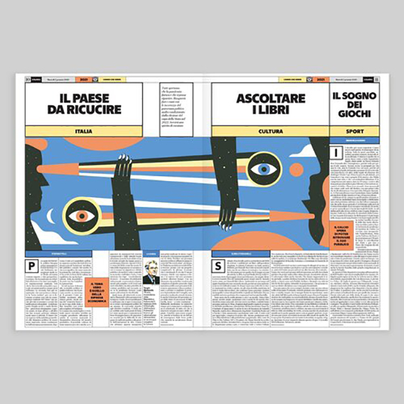
The Year To Come: Agostino Iacurci x La Repubblica
With 2020 putting our resilience to the test and possibly challenging the very notion of progress, what can we expect from 2021? Agostino Iacurci was invited by Italian newspaper La Repubblica to take a fresh and unbiased look on the 365 days laying ahead of us.
To illustrate the 48 pages of forecasts and ideas on the year to come, aptly titled L’Anno Che Verrà (The Year To Come), Agostino has created yet another striking visual story that perfectly captures what the future feels like: an unpredictable journey into the unknown.
Featuring Agostino’s surreal and poetic signature style, the artworks charge the accompanying texts with an additional layer of meaning, without being too descriptive.
“L’Anno Che Verrà is a supplement with the first newspaper of the year,” explains Agostino, “and it features articles from some of the most important writers that collaborate with La Repubblica - I am very pleased with the result.”
The ten artworks, used on the cover and throughout the issue, present a consistent visual language of shapes, colour palette and symbols. One of the most recurrent elements is the eye, and it seems to ask the viewer “how’s your year going to be?”
See more of Agostino’s work here.
A New Horizon: Ray Oranges for French bank BRED
Vibrant colours, soft gradients, surreal landscape… Ray Oranges’s dreamy set of illustrations for BRED are an invitation to embrace the new year with a positive, hopeful outlook.
The French bank was looking to create an evocative visual for their 2021 greeting card and entrusted Machas Artist Ray Oranges to bring to life their vision of a brighter future.
Ray created a beautiful, minimal illustration evoking new horizons and openness to new personal and professional opportunities.
With a skilful use of the brand’s colour palette combined with gradients and shadows, Ray represented a couple contemplating a splendid landscape, looking towards a hot-air balloon rising to the sky.
The result is an elegant, sophisticated printed and digital card that enables BRED to share with the world their best wishes for 2021. Another version of the artwork was created for BRED Banque Privee, and featuring a colour scheme with golden tones.
For the animated version of the digital cards, Ray’s illustrations were subtly brought to life by Simone Brillarelli.
We can only wish you a 2021 as beautiful as Ray’s vision. See more of his work here!
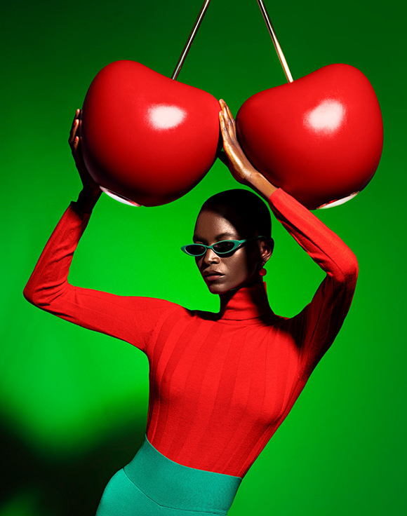
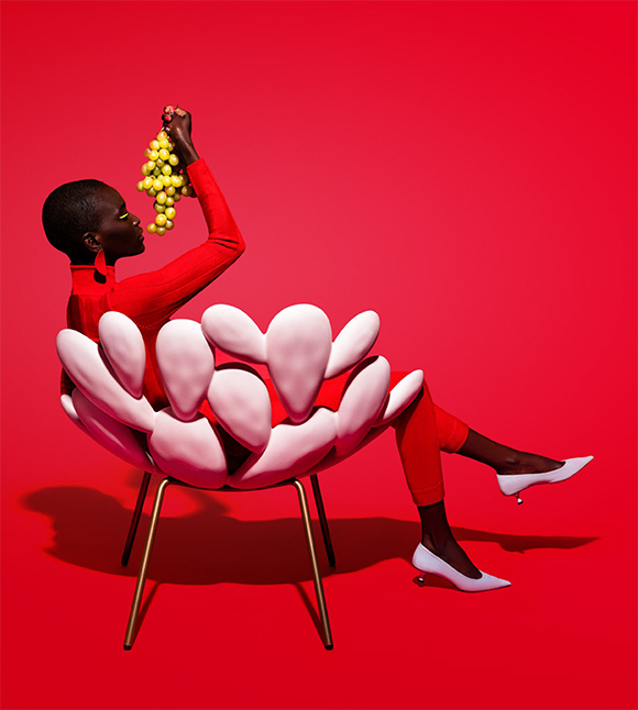
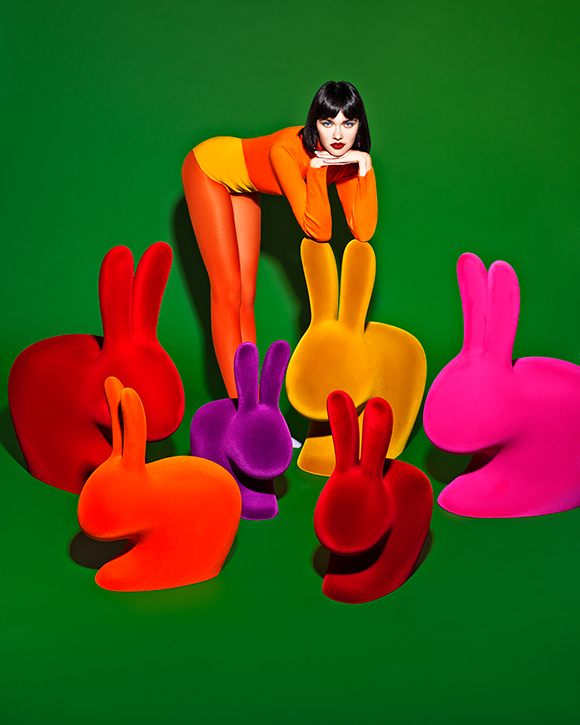
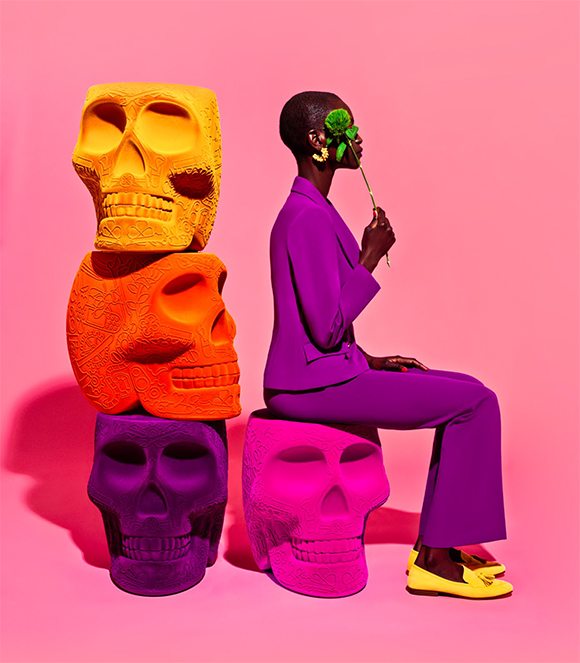
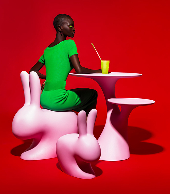
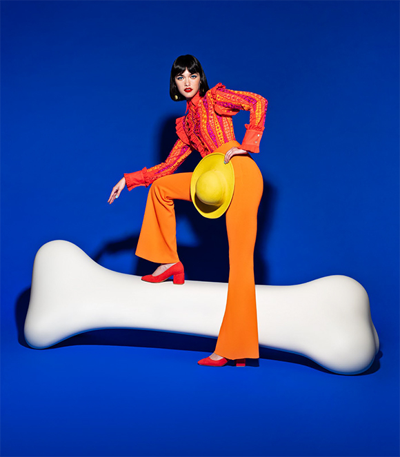
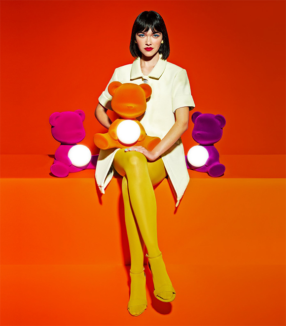
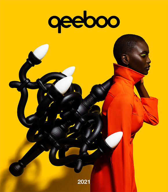
When Fashion Meets Design: Elena Iv-Skaya x Qeeboo
Fashion photographer Elena Iv-Skaya branches out into the world of design and collaborates with design brand Qeeboo on a new extraordinary series - more pop and playful than ever!
The Italian brand is renowned for extraordinary daily-use objects available to everyone, like the Rabbit chair or the Giraffe in love - which marked previous editions of the Salone del Mobile. To capture Qeeboo’s ironic and audacious designs, Elena opted for a colourful array of backgrounds and props and playful poses.
“My creative approach is a bit surreal and minimalist, so it works really well with Qeeboo, which is full of mystery but also irony” explains Elena. “The fun part was emphasizing the bold and unconventional use of colour, which is also one of my stylistic hallmarks. As for mystery, when I was preparing for this shoot, I recalled the black and white images by Man Ray, who had a very particular way of creating interactions between models and objects, giving them a surreal and poetic dimension.”
The result of two days of shooting in Milan is a series of incredibly bold and striking images that successfully narrate the brand’s essence and soul. For Giovannoni, the collaboration was a match made in heaven: “Qeeboo is energy, imagination, and colour” he explains. “Elena Iv-Skaya felt an immediate affinity with these features; she produced 20 powerful images that convey the Qeeboo products and spirit in a synergy between design, fashion, imagination, and creativity.”
See more of Elena’s work here!
Full credits:
Photographer: Elena Iv-Skaya
Creative Director: Stefano Giovannoni / Qeeboo
Agent & Executive producer: Valentina Guarneri / Machas
Producer: Giulia Castellini
Models: Oulimata Gueye Gallet and Martha Pawlowska
Stylist: Eleonora Papetti
Stylist assistant: Chiara Tarantino
Hair & make-up: Vanessa Geraci
Set designer: Michela Croci
Digi tech / assistant: Christian Valli
Retoucher: Elena Iv-Skaya and Viktoria Skopichenko

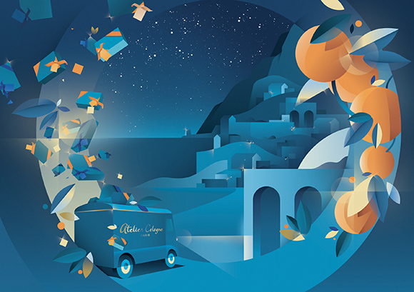
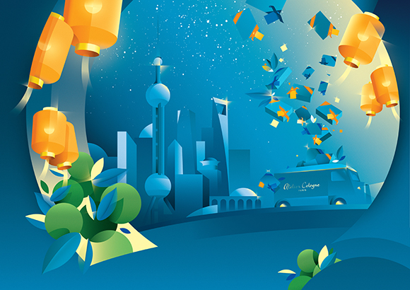
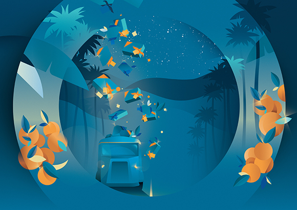
Delivering happiness all over the world: Ray Oranges x Atelier Cologne
Machas Artist Ray Oranges is renowned for his vibrant geometric art that skilfully blends sophistication and minimalism. What is lesser known is that Ray is a Calabria native and that the Southern Italian region, in particular his father’s orange orchards where he grew up, significantly defined his artistic vision.
Ray’s incomparable use of colour and composition, paired with a shared Mediterranean DNA, seduced Atelier Cologne. The Parisian perfume maison, the first fragrance house entirely dedicated to cologne, fell in love with Ray’s elegant vision and proposed an art collaboration on their most prominent collection: the Advent Calendars and Festive Season collection.
For the Atelier Cologne Luxury and Discovery Advent Calendars, Ray visually captured the essences of the fragrances with a nearly-abstract representation of their citrus core and embraced the warm and magic atmosphere of the Festive Season with Atelier Cologne blue truck driving through evocative, layered landscapes.
In addition to the Advent Calendars, Ray created five artworks to extend the Festive cheer to all the Holiday 2020 campaign and deliver happiness and scented gifts to Paris, Positano, Shanghai and Los Angeles.
From online to packaging, to in-store communications and events, the campaign includes an enchanting animation to lead everyone on a fragrant journey, full with holiday imagination.
““I’m very fond of this collaboration with Atelier Cologne,” says Ray, “because of the brand’s strong connection with Calabria, where they source the most precious citrus essences for their fragrances”.
“Even though I’ve been living in Florence since my university years and I consider myself a citizen of the world, Calabria is my homeland, it is where my roots are. We all know that Calabria is a land of contrasts, but it was wonderful to celebrate its excellencies and create a sophisticated fil rouge that connects the South of Italy with Paris and the rest of the world.”
“During the production of the artworks, I had a bike accident and had to stay a few days at the hospital. Atelier Cologne sent me a get well card with a present, their Orange Sanguine fragrance. When I smelled it, it felt like I was being teleported to another time and another place: to my family’s oranges orchards when I was a kid. The fragrance was definitely a source of inspiration, and even if I’ve maintained my minimal approach, I’ve recreated the exact shape of the citruses.”
The advent calendar is already sold out in a few countries, but it’s still available via waiting list.
See more of Ray Oranges’ work here.





Miguel Angel Camprubi’s new stickers for Boing TV
We can’t get enough of Miguel’s stickers to brighten up our message conversations! Today more than ever, with the Covid-19 lockdowns keeping us far from our friends and family, Miguel’s light-hearted and funny designs encourage us to share the joy around us, despite the difficult times we are experiencing.
After the success of his two sticker packs commissioned by Facebook, Miguel has released a new series of animated Gifs and stickers to use on WhatsApp and messaging apps, this time for Italian kids channel Boing TV.
“I made stickers for different themes: school, music, sports, groceries” explains Miguel. “It was cool making a joyful and colorful pack, trying to simplify shapes in order to make the designs suitable for a small format. I enjoyed it a lot! Boing has a really cool color palette which I loved using.”
Just like Miguel’s world of characters and personified objects, the Boing stickers are filled with humour and happiness. “There are more themes to come!” announces Miguel - and we cannot wait to reveal more of them!
You can download some of Miguel’s stickers through the free Boing Sticker App, along with other Boing designs such as their mascots Bo and Bobo.
See more of Miguel’s work here!
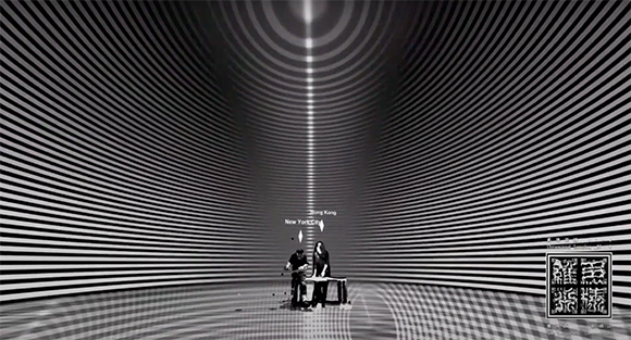
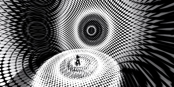
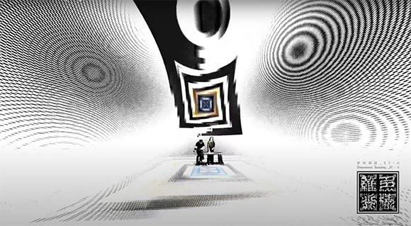
Dimensional Sampling goes VR: Cao Yuxi’s virtual audiovisual live performance for Nxt x ADE
As physical gatherings and international travels have become impossible amid the global Covid-19 pandemic, Cao Yuxi turned his ‘Dimensional Sampling’ piece - created in collaboration with Lawerence Lau - into a VR show performed live in front of an online, global audience.
In occasion of Amsterdam’s Nxt Museum opening and ADE music festival, the two artists virtually reunited on-stage through their digital avatars to perform the 40-minute long piece entitled “Dimensional Sampling #1-4. HYPERSPACE: Planet-α”, with Cao Yuxi controlling the hypnotic, pulsating visuals from his studio in New-York, and Lawrence Lau orchestrating the music and sounds from Hong Kong.
“This was the first show we performed together at literally opposite sides of the earth, Hong Kong and NYC” explains Cao. “We have been separated since the very beginning of 2020, but we have never stopped thinking of ways to continue to create and extend the possibilities of our artwork, even during this extremely different time.”
The VR performance is yet another instalment of ‘Dimensional Sampling’, now on display at Nxt Museum as part of the exhibition ‘Shifting Proximities’. Cao experimented with new technologies to take his artwork to a new visual dimension: “The performance was made possible by using Touchdesigner. Streaming softwares OBS and Yellowduck were used to stream on YouTube and Instagram live.”
“It was a wonderful afternoon for me, dawn for Lawrence Lau, and night for the audience of Nxt Museum and ADE” says Cao before announcing more content to come: “This is just the beginning of our virtual performances! More crazy things are cooking!”
See more of Cao’s work here.
Dangerously Prancy: James Braithwaite’s new drawings series
The Dangerously Prancy series first started with black and white drawings shared on James Braithwaite’s Instagram page.
The artworks showed a strong graphic approach, ranging from abstract exploration to figurative or copy-only artworks, all infused with James Braithwaite’s trademark irreverence - and a puzzling obsession with gherkin.
It was clear - even though unbeknownst to the artist himself - that these drawings weren’t just random doodlings, but that we were witnessing the dawn of a new series: Dangerously Prancy.
“Originally, I started this as a mental palette cleanser,” says James. “I was so deep in a huge documentary animation project for UFC, and I needed to draw something other than beaten up athletes. This was a way to wipe the slate with something fast and stupid. From there, it became a daily thing.”
“My mission was to work fast, frame it right away, photograph it, release it, and move on. I started posting these, and people were surprisingly eager to buy the originals. One drawing in a frame looked good. Five looked better. But when you have 50 of them, they begin to find their own horrible narrative logic. This is the million monkeys on a million typewriters, bashing away until they have a story.”
“There are over 300 of these drawings now, and Black Eye Books will be publishing a collection of them in the new year. I am hoping the world sorts its shit out so that I can do a little touring art show with it. That sounds plausible, right?”
We cannot wait for the book to be revealed!
In the meantime, see more of James’ work here.
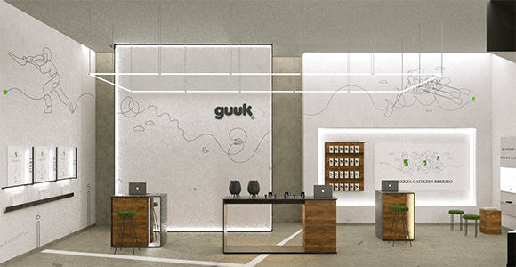
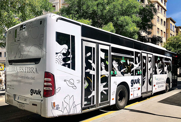
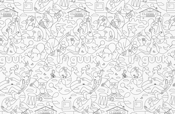


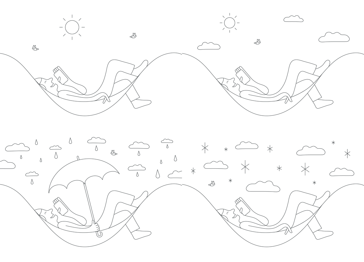
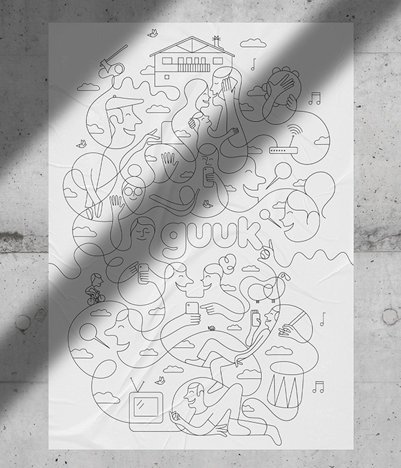
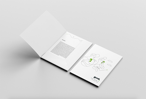
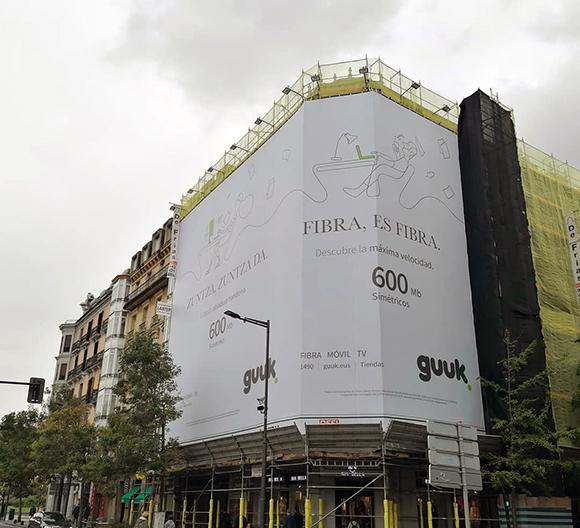
“Let’s Reconnect”: Jonathan Calugi x Guuk
Jonathan Calugi’s ongoing collaboration with the new Basque telecommunications company Guuk is all about connection - a central theme in both Jonathan’s style and Guuk’s services.
The new operator taps into its Basque roots and is bringing to the north-western Spanish region its very first regional internet and mobile network. With a “Let’s reconnect” motto, Guuk and The Summer Agency found in Jonathan Calugi the perfect artist to define their brand identity and communication, making it the very first time illustration has been used in an integrated campaign in the Basque Country.
“I knew it was going to be a good project from the very start”, says Jonathan. “When I finished reading the initial deck that presented Guuk and the agency’s idea, I thought ‘that’s going to be awesome’, because we shared the same vision: like all my works, Guuk is two points connected by a line”.
Jonathan created a series of modern and fluid illustrations focusing on people and human relations, whilst referencing technology and Basque traditions to suit Guuk’s distinctive identity.
“In my work, the challenge is to discover new, undiscovered connections between two points, while finding a good balance between storytelling and imagination”, explains Jonathan. “It’s like looking at a starry sky at night, and the mind connects the stars with endless different compositions each time. I’ve been working with a one-line style for years, I can say the line follows me, and every time I draw something, I try to find a solution that tells a new story.”
With their ability to be beautifully declined throughout multiple channels, Jonathan’s artworks are used across all of Guuk’s communications and touchpoints - from the brand’s online & offline presence including their physical stores to their region-wide advertising campaigns across print, Out Of Home and TV commercials.
It is the latter that really struck a chord with Jonathan. The three TV commercials, developed in collaboration with animation studio Device, left an impression with the Tuscan artist. “It was great to see a client so eager to fully unlock that aspect of my art. Device did a great job, I saw my line in motion like I have never seen before, and it was amazing!”
Keep your eyes peeled for more work to come!
See Jonathan’s portfolio here.
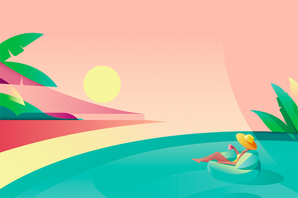
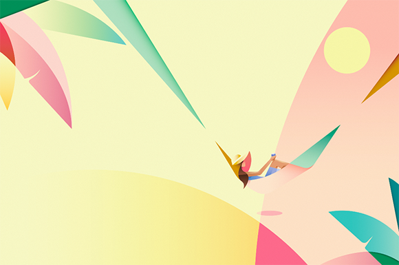


Summer is a sip away: Ray Oranges for Starbucks
Machas Artist Ray Oranges is well known for his minimal and colourful style and ability to create vibrant, evocative artworks that strike with their simplicity yet layered multiplicity of perception.
For Starbucks’ in-store campaign, he was challenged to illustrate relaxing outdoor coffee breaks to promote the brand’s Coffee At Home product range.
Ray created three artworks depicting delightful holiday moments with warm tones inspired by summertime sunsets. He used colour, shape and gradients to create depth and dynamism while keeping essential compositions.
“The agency gave me a lot of freedom to create the artworks,” says Ray, “and I wanted to capture that feeling of warmth and enjoyment that we associate with summertime.”
“I’ve decided to liberate the compositions from the excessive realism of detailings and to allow the viewer to fill in the image with their own experience. If you look at the woman on the floating chair, she could be in a lake, in a swimming pool, in the sea - it could be all the above and more. The imagination of the viewer is free to complete the landscape with their memories, taste, aspirations. And that generates an emotional response.”
“My favourite image is the hammock one. I love how the lady looks suspended in space, and how the lines of the hammock become shades of light as they extend into the composition, creating a pleasant tension with her surroundings.”
See more of Ray’s work here.
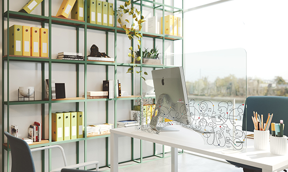
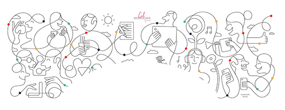
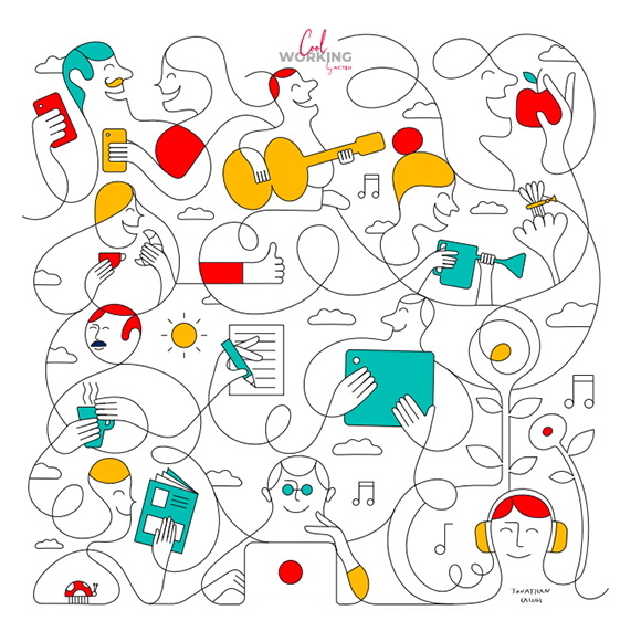
Jonathan Calugi x Cool Working by Actiu
As the world still battles Covid-19, Jonathan Calugi’s recent collaboration with office furniture Actiu reminds us of the importance of maintaining human connection and a positive outlook in life even when social distancing.
During the Spring 2020 lockdown, Jonathan worked with the Spanish office furniture manufacturer on creating a design for their new “Cool Working” range of protective screens.
Inspired by the brand’s Mediterranean culture, Jonathan created two artworks showing new ways of working, prioritizing people’s health and wellbeing while fostering collaboration and creativity.
The protective screens guarantee separation between users not only without losing interaction and visual contact between them but, thanks to Jonathan’s art, channelling ideas of positivity and connection.
See more of Jonathan’s work here.

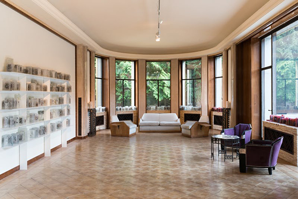
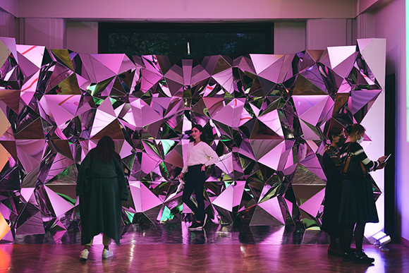
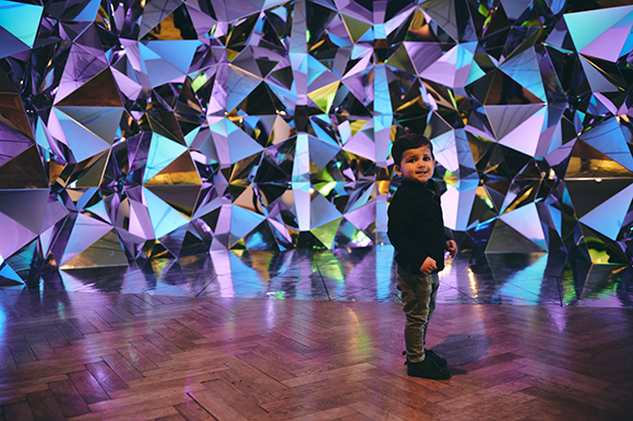
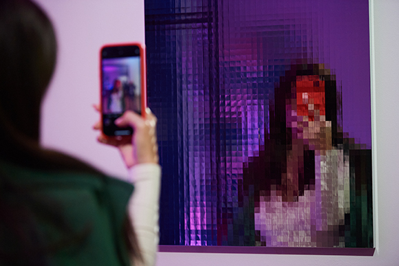
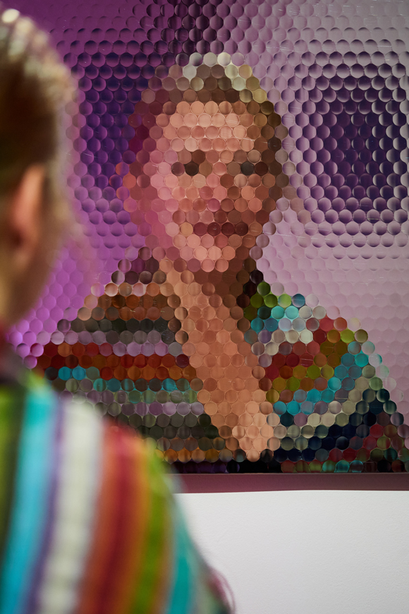
Prism Wall (III): A new Artwork by Kaz Shirane exhibited at Villa Empain Museum
“The Light House” at Villa Empain Museum in Brussels, Belgium, is Kaz Shirane’s first European exhibition, and for the occasion the Tokyo-based artist created a site-specific variation of his Prism Wall piece.
Curated by Louma Salamé, the group show explores light and its manifestations through the work of 21 contemporary artists - including James Turrell and Mona Hatoum - defending the idea that culture is like light, it leads us out of the darkness.
Kaz Shirane’s art is particularly fitting as, using mirrors, light and reflections, it places the audience at the centre of his works. Shirane’s oeuvre enables a symbiotic relationship between the artwork and the spectator, allowing the spectator to tailor their own unique and non-reproducible experience.
Prism Wall (III), the installation presented by Shirane, is a half-circle shaped wall, complete with a reflective floor, that envelops visitors into a fascinating and kaleidoscopic world made of light-reflecting mirrors and colour-changing lights.
Located on the Dining Room on the ground floor of the Art Deco-inspired Villa, the installation appears like a multi-faceted jewel in the splendid room overlooking the museum’s iconic swimming pool.
In addition to this colourful display, visitors can also discover new artworks from Kaz’s series “Mirror of Truth”: three new works whose various patterns produce fragmented reflections and question the viewer’s cognitive process.
See more of Kaz Shirane’s work here.
Photography credits:
Exhibition:
Fondation Boghossian - Villa Empain © Andrea Anoni
Vernissage:
Fondation Boghossian - Villa Empain © Nicolas Lobet
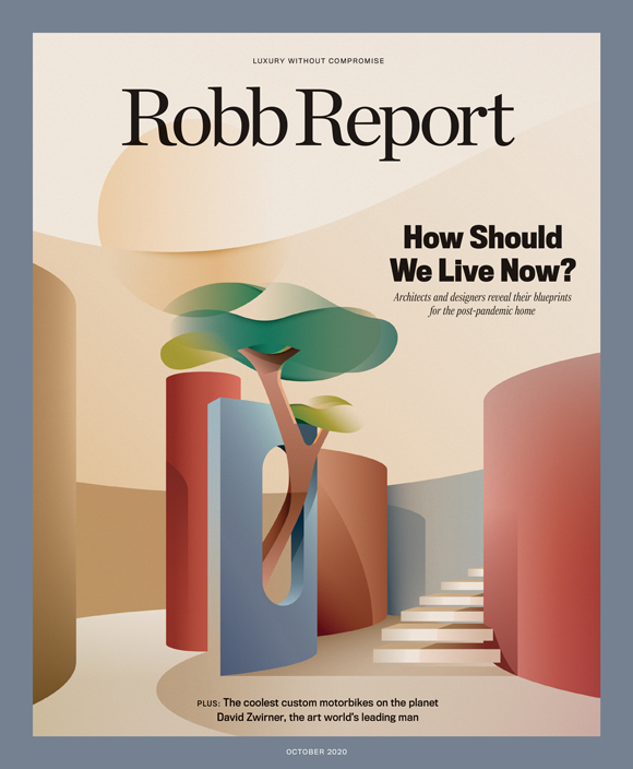
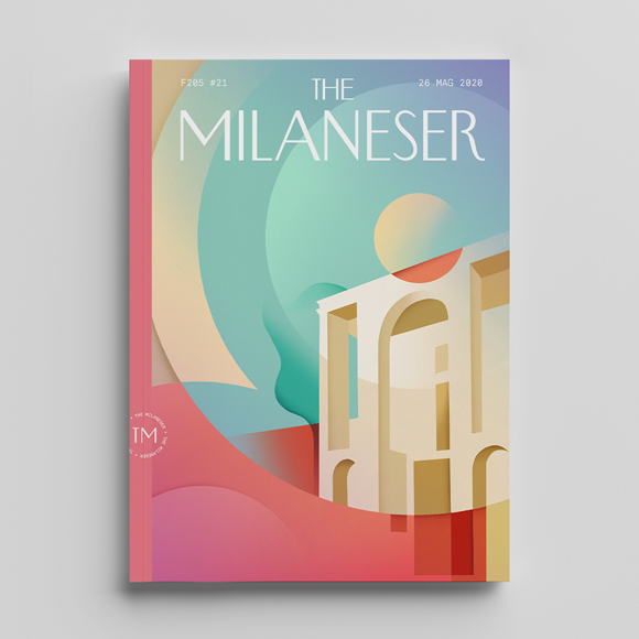
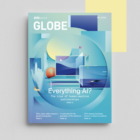
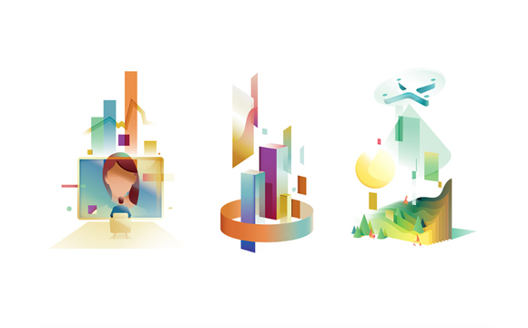
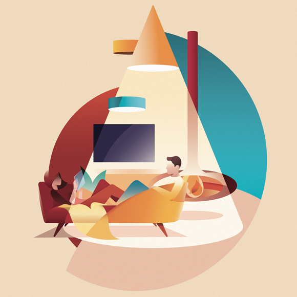
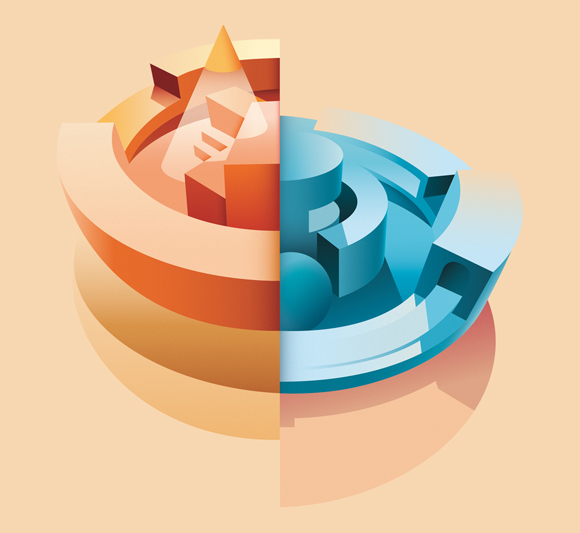

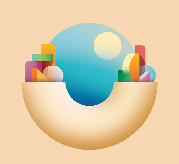


From Architecture to Artificial Intelligence: Ray Oranges’ Editorial Update
Ray Oranges’ latest editorial artworks brilliantly demonstrate the elegant versatility of his visual language. Approaching diverse subjects from the worlds of design, architecture and technology, Ray illustrates even the most abstract concepts with clarity and an innate sense of colour and composition.
For ETH Zurich and their Globe Magazine, Ray tackled the complex subject of Artificial Intelligence. Tasked to illustrate the cover, opening spread and spot illustrations for the main feature, Ray created a multi-layered language that perfectly captured the intricacies and moral dilemmas of the new technology. Meanwhile, for W&G Magazine he explored in a series of illustrations the concept of Heimat, including the very current nuance of “social cocooning”.
Ray’s love for architecture and design is well documented, and his second cover for American luxury-lifestyle magazine Robb Report pays homage to their 2020 Design Issue with beautifully evocative artwork, inspired by the destructured architecture in the time of Covid.
Ray also continued his collaboration with Monocle UK on a series of artworks about innovation for Expo 2020 Dubai and participated to
The Milaneser project, a fictional magazine along the lines of the Parisianer, with a stunning artwork of Milan’s iconic Triennale Museum created with iPad Procreate.
See more of Ray’s work here.
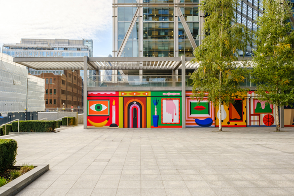
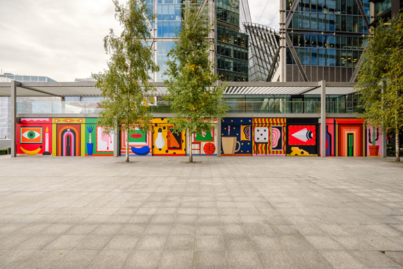
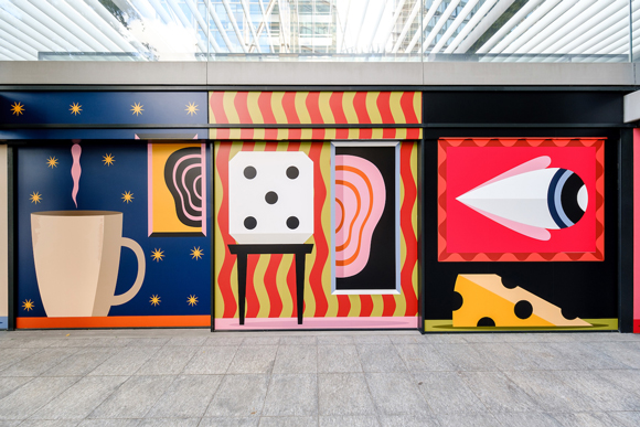
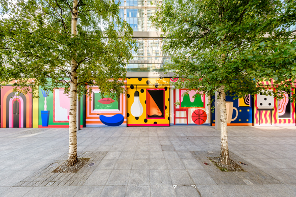
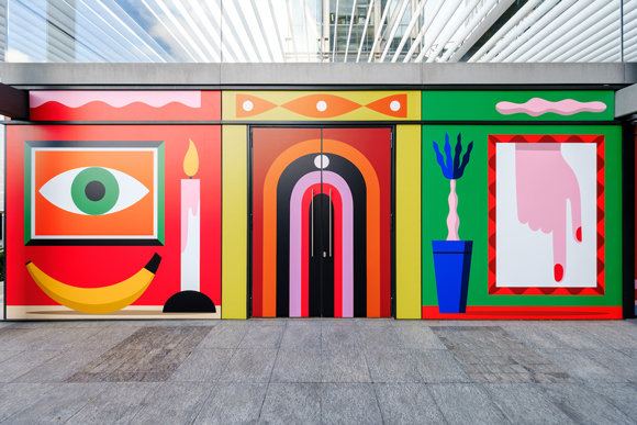
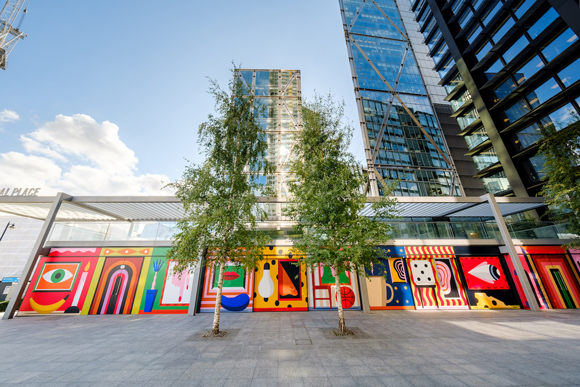
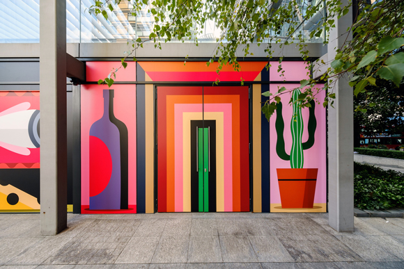
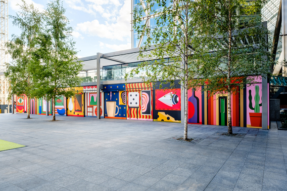
Eight Rooms: Agostino Iacurci at Principal Place Plaza, London
Agostino Iacurci piece for Principal Place, an office building in Shoreditch and home to Amazon HQ, was unveiled this week.
“Eight Rooms” is a stunning 30-meters-long artwork printed on vinyl that perches on Principal Place Plaza’s street level and features eight dream-like snapshots. Depicted in Agostino’s signature flat shapes and bold colours, the piece brings together a pop vibe and a delightful, playful touch that won’t go unnoticed by the public.
Known as one of London’s most vibrant and creative areas, Shoreditch is a lively hub where culture and art meet. After London’s 2020 dramatic lockdown, Brookfield Properties commissioned Iacurci the large-scale mural to give tenants, local workers, residents, and art-lovers across the City the chance to experience the arts up close.
In the words of Patricia Armocida, “Agostino Iacurci works have a style that is unmistakable, recognisable and simply poetic” and “Eight Rooms” contributes to creating in Principal Place a space for much needed personal reflection and social connection.
See more of Agostino’s work here.
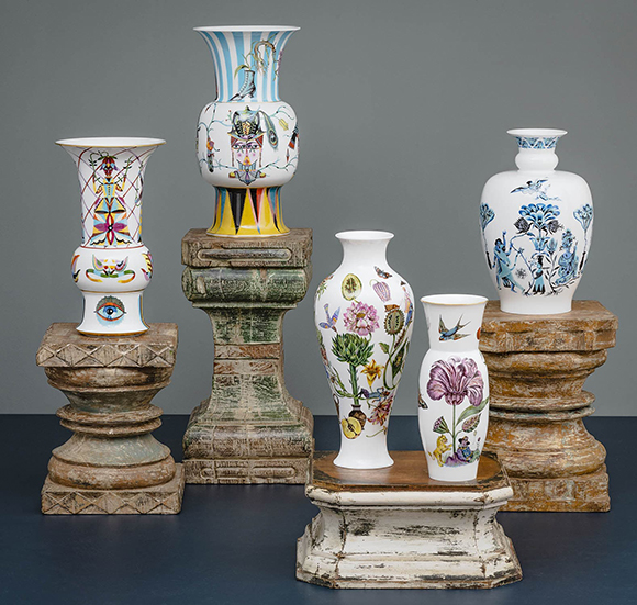
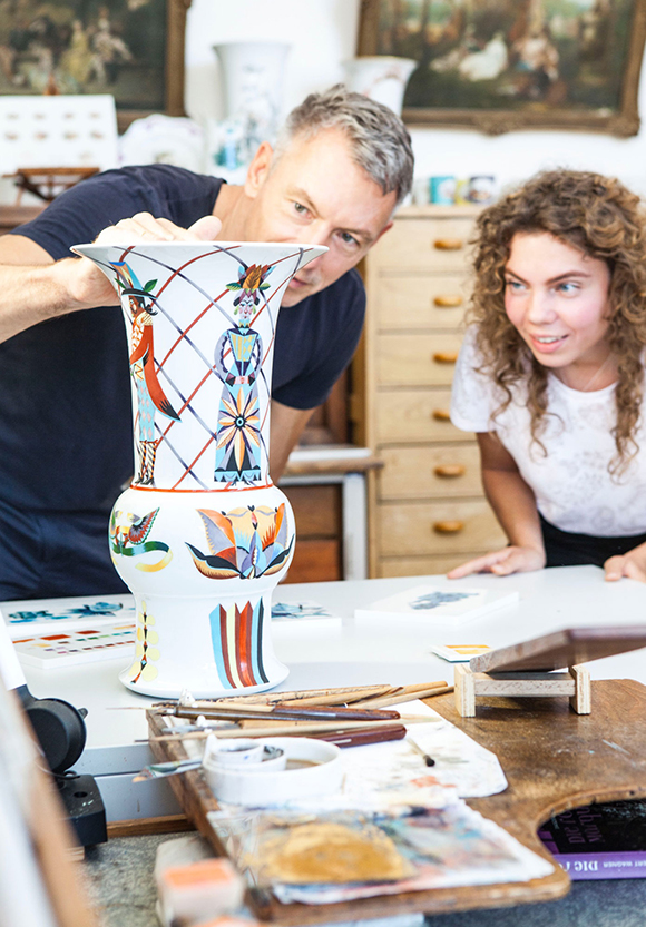
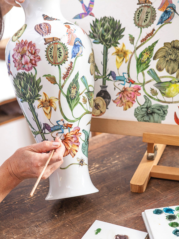
Meissen x Olaf Hajek
Olaf Hajek is a master of colour and an eclectic storyteller, and his collaboration with German porcelain manufacturer Meissen is a fascinating synergy of influences that blurs the boundaries between reality and imagination, art and craftsmanship.
The five vases, produced in a limited edition of ten pieces each, draw on the imagery of fantastic gardens and the secrets they guard and depict exaggerated personas in brilliant colours that are the hallmark of Olaf Hajek’s much-admired style.
Olaf embraces aspects of South American folklore, mythology, religion, history and geography with effortless warmth, liberating their evocative power such as the Rorschach-like portraits with festively decorated hats of the “Mr and Mrs Butterfly” vase.
The vivacious dialogue between seemingly distant worlds is taken to another level as Olaf’s colourful and surreal compositions grace Meissen designs created at the turn of the last century: the “Afternoon Garden” vase shape was first designed in 1890, whilst a 1927 shape suits as a perfect projection surface for Hajek’s imaginative “Lion Garden” fairy tale.
All vases have been designed by Olaf Hajek and hand-painted by Meissen’s master artisans. The entire collection is now on display at the “Blossom And Fruits” exhibition at the Museum Haus Löwenberg in Gegenbach, Germany.
See more of Olaf’s work here.